The
Complete
Shadcn UI Figma Kit
for Designers & Developers
The complete Figma design kit for building beautiful interfaces with shadcn/ui. Perfect for designers who want pixel-perfect handoff to developers. All components, variants, and design tokens in one file.


Trusted by 200+ designers worldwide
Everything in the Shadcn UI Figma Design System
Every component, variant, and design token you need, from idea to pixel-perfect handoff.
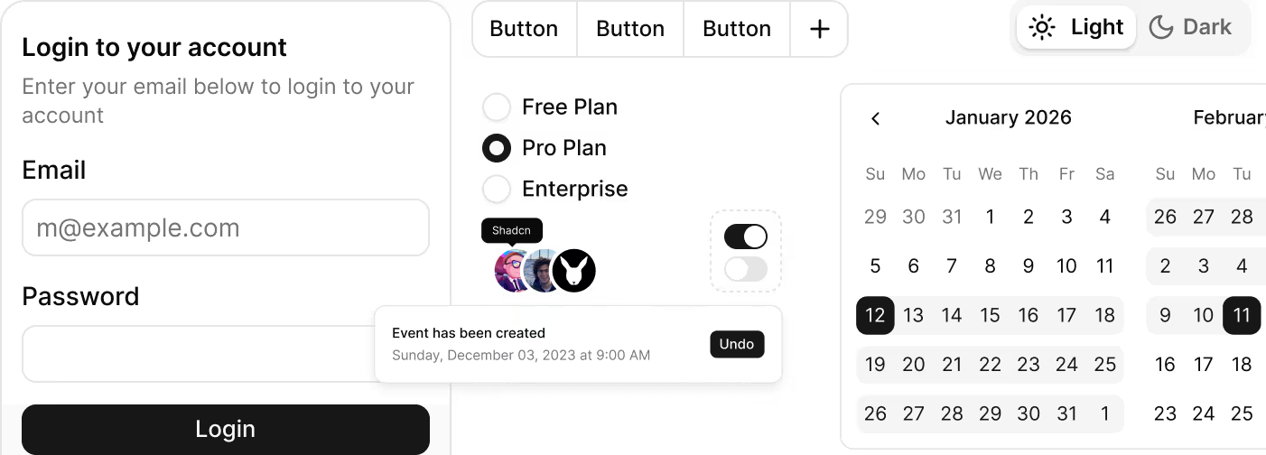
500+ Figma Components, Ready to Use
Every shadcn/ui component, variant, state, and size - already built with auto layout and named to match the code. Open the Figma file and start designing immediately.

Accelerate Your Figma Workflow
Prebuilt Shadcn UI components, blocks, and templates in Figma - designed to eliminate repetitive UI work and ship designs faster.

Dark Mode & Light Mode, Built In
Both modes are production-ready the moment you open the Figma file. Preview light and dark themes side by side - no patching needed.
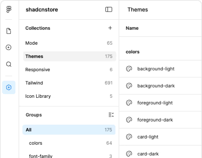
Design Tokens Synced with Code
Figma variable names match the Tailwind CSS variables in the codebase exactly. Designers and developers stay in sync by default - zero translation needed.
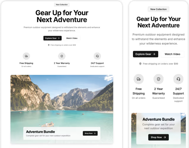
Responsive Breakpoints, Already Designed
Mobile, tablet, and desktop Figma variants all included. Present responsive designs in your first client review, not your third.
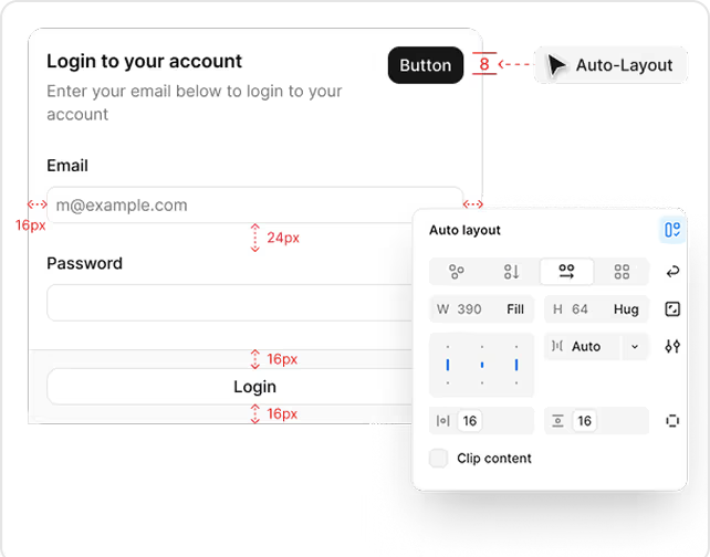
Figma Auto Layout, Not Magic Numbers
Every Figma component reflows correctly when resized - matching CSS flexbox behavior from the code. No broken frames, no pixel nudging.
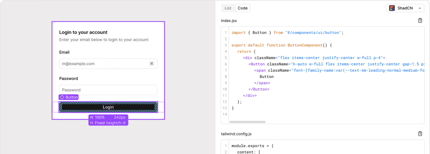
From Figma to Shadcn Code, Without Rework
Every Figma component maps directly to its shadcn/ui React counterpart - same props, same variants, same naming. Developers inspect and code exactly what they see. No guessing, no translation.
Drag & Drop Figma Page Builder for Shadcn UI
The Figma kit ships with a ready-made drag-and-drop builder. Pick your sections, preview themes, and hand off a complete landing page design — without leaving Figma.
Drag Sections onto the Canvas
Every section in the kit lives in a browsable library. Drag any block onto your page and it snaps into position. No nudging frames, no rebuilding layouts from scratch.
Search and Swap Any Block
Already placed a hero you want to change? Search for a replacement and swap it in one step. The surrounding sections stay exactly where they are, keeping your layout intact.
Preview Light and Dark Mode Live
Toggle between light and dark mode directly on the Figma canvas. See both versions of your page before you share with a developer or client, with no extra work required.
Explore Every Theme Side by Side
Duplicate your finished page with one click and apply a different color theme. Compare how the same layout looks across all theme without redoing a single frame.
shadcn/ui Create, Inside Figma
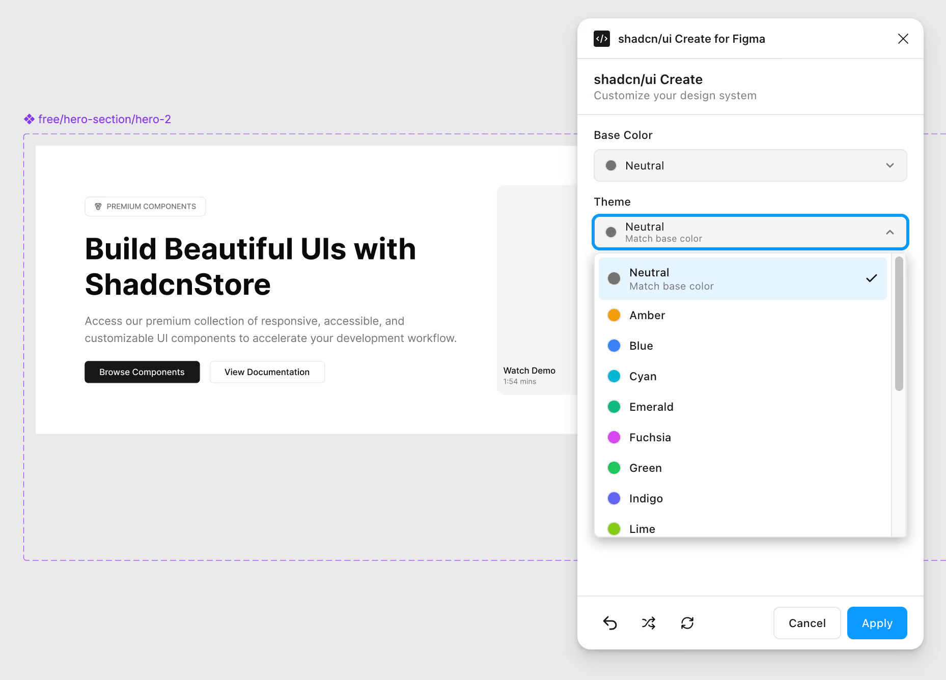
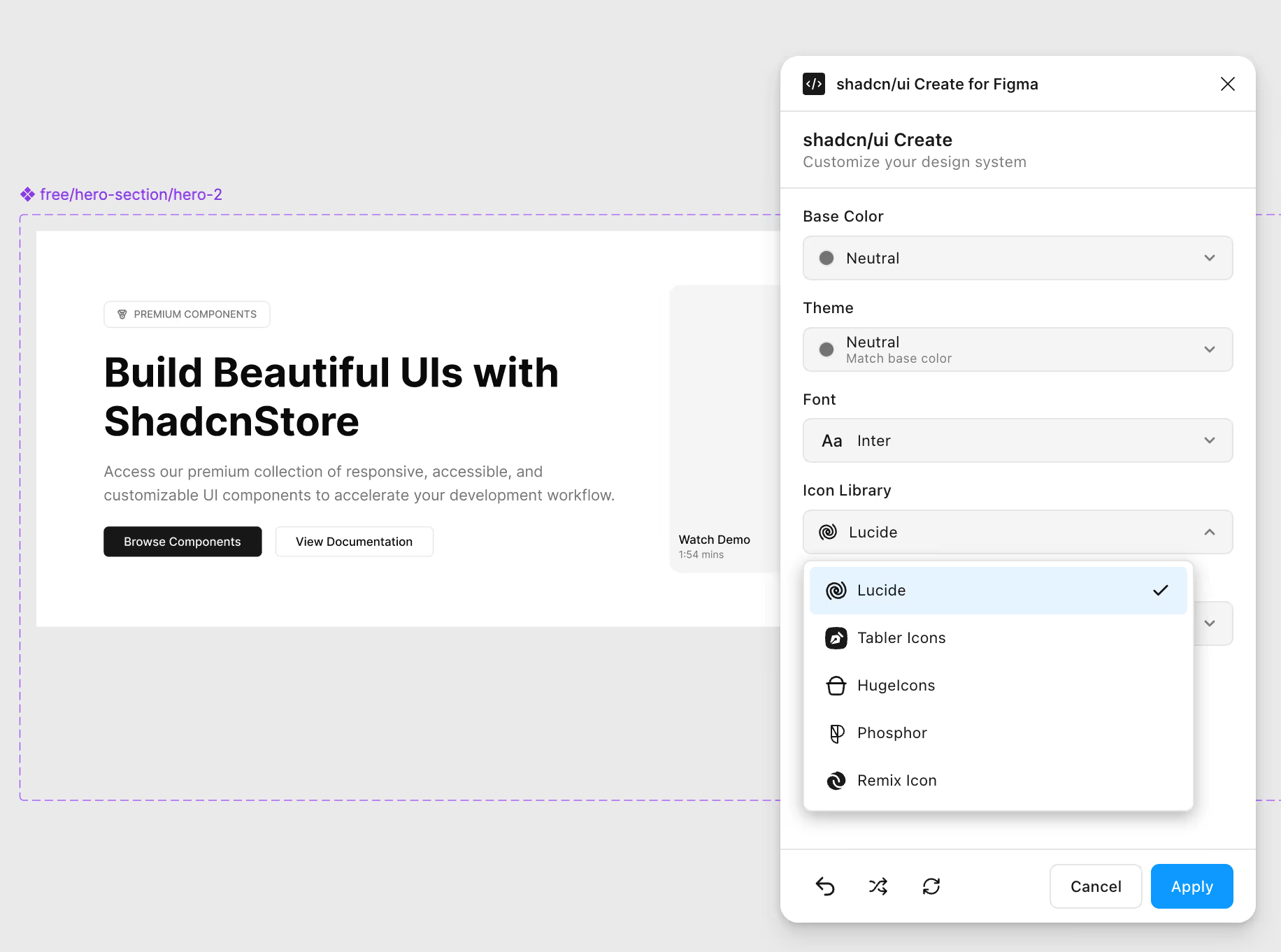
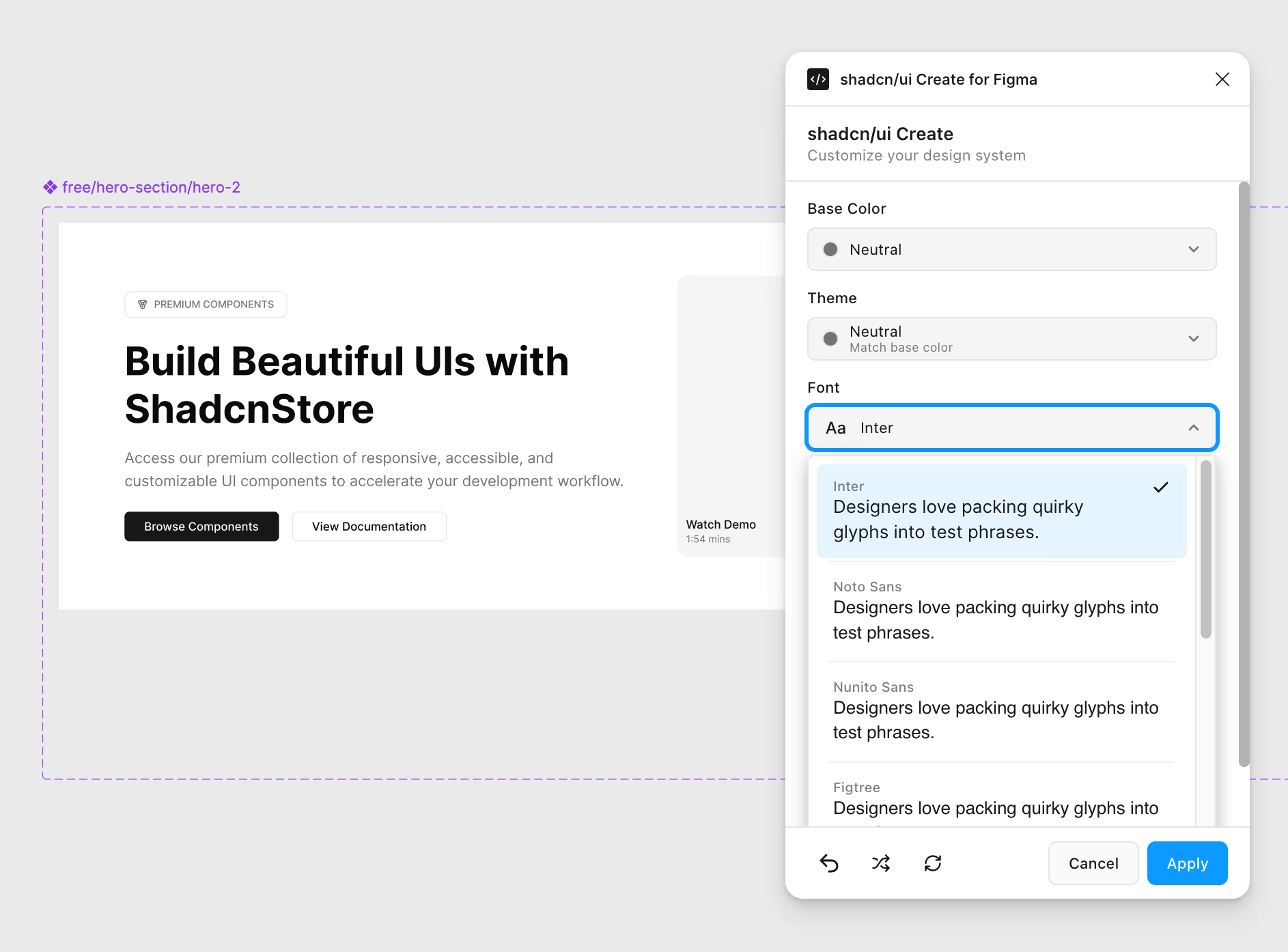
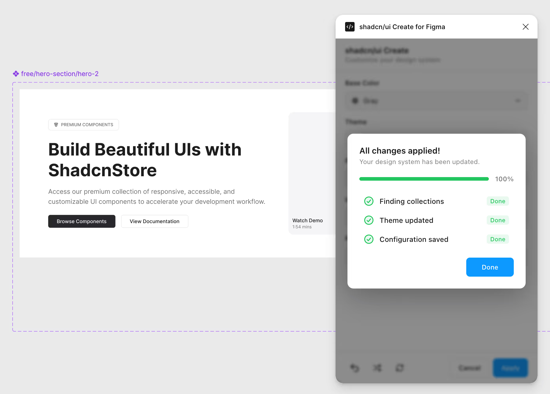
Configure your entire design system from a single panel. Pick your colors, fonts, icons, and corner radius. Apply once and it updates everywhere.
90 Color Combinations
Mix 18 accent colors with 5 neutral bases. Every combo matches the shadcn/ui Create output exactly. Design and code stay aligned.
One-Click Icon Library Switching
Switch your entire icon set with a single click. 180+ pre-mapped components update instantly. No manual swapping.
Typography and Radius
Choose from 10 font families with live preview. Adjust corner radius using simple presets. Clean controls, predictable results.
Smart, Fast, and Offline
Only what changed gets updated. No internet, no API key, no subscription. Runs fully inside Figma.
Who the Shadcn Figma Library Is Built For
Whether you're designing in Figma or building with shadcn/ui in code, this kit bridges the gap between design and development.
UI/UX Designers
Skip the tedious component rebuilding. Open the Figma kit and start designing with production-ready shadcn/ui components - complete with auto layout, variants, dark mode, and responsive breakpoints.
- 500+ components ready to use
- One-click theme switching
- Mobile, tablet, desktop variants
Front-End Developers
Get designs that match your code exactly. Same component names, same props, same Tailwind CSS tokens. No more translating vague mockups into implementation.
- 1:1 Figma-to-code component mapping
- Design tokens = CSS variables
- CLI install for instant scaffolding
Design Teams & Agencies
Ship client projects faster with a shared design system your entire team can use. Consistent components, standardized tokens, and faster client reviews across every project.
- Team licenses for shared access
- Pre-Built Themes
- Drag-and-drop page builder
Start Designing with the Shadcn UI Figma Kit in Minutes
From purchase to your first design - it takes less than 5 minutes. No complex setup, no plugins required.
-
Figma UI Kit Instant access
All 500+ components
Light and dark themes
Design tokens and variables
01
Get access to the kit
Pick a plan and the whole design system is yours, free tier included.
-
ShadcnStore UI Kit
Open in Figma
Duplicate to your drafts
Share
02
Duplicate it to your Figma
One menu item copies the file into your own drafts. No plugin, no import, no setup.
-
Assets Dev ModeButton Card Input Badge Tabs
--radius: 0.625rem
03
Design, then hand off
The variables map to shadcn/ui and Tailwind, so developers build what you drew.
Shadcn Figma Design System Documentation
Every part of the kit is documented: components, variables, theming, icons and the plugin.
- Figma kit overview What ships in the file and how it is organised.
- Getting started in Figma Duplicate the file and place your first component.
- Figma components Variants, properties and the shadcn/ui naming they follow.
- Figma variables How the variable collections become CSS custom properties.
- Theming the Figma kit Build a theme, switch modes, export the values to code.
- Icons in Figma Swapping between Lucide and the other icon sets.
- The ShadcnStore plugin Themes, icons, typography and radius from inside Figma.
- Drag and drop page builder Assembling a page from blocks on the canvas.
Working from the code side instead? Install the shadcn/ui components the kit is drawn from, or browse the block catalogue.
Every Shadcn Block, Drawn in Figma
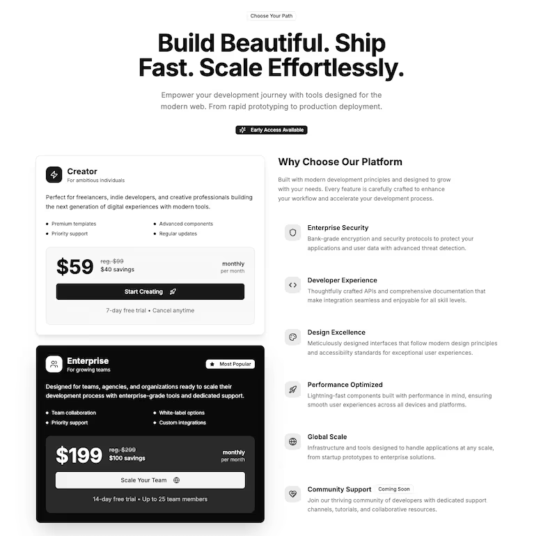
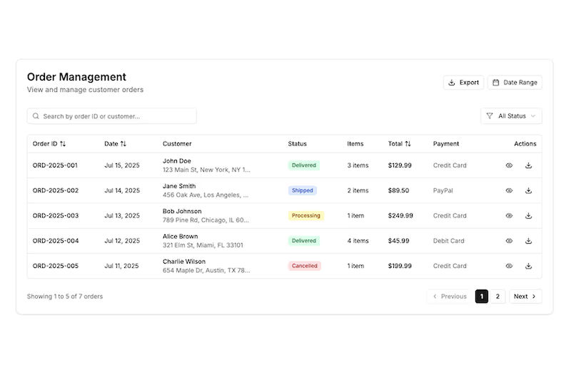
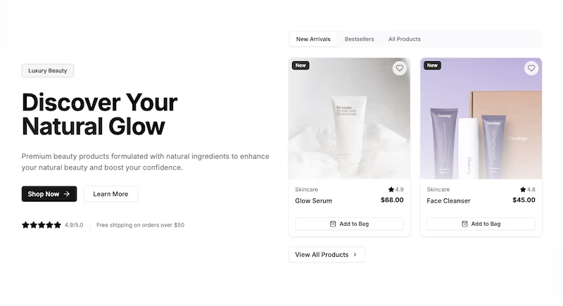
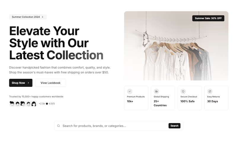
The same 269 blocks you install with the CLI are in the Figma file as editable frames, on the same components and the same tokens.
Free & Premium Templates for Faster Launches
Download our free dashboard templates and landing pages built with React, TypeScript, and shadcn/ui. Get 30+ pre-built pages, dark mode, and production-ready code.
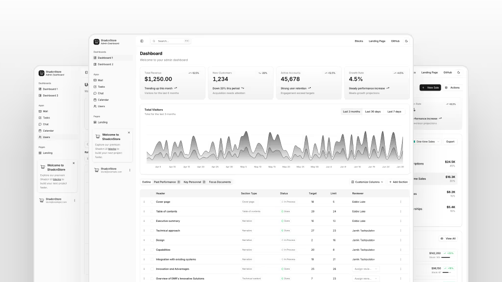
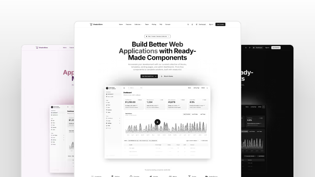
Or jump straight to dashboard templates, landing page templates, and frontend templates.
The Wall of Love
Join Thousands Sharing Their ShadcnStore Success Across the Web as They Build Faster, Design Better, and Launch With Confidence.

u/jd-solanki
 Reddit
Tried a few of the blocks after seeing this and honestly didn't expect them to be this smooth to work with 🤯. Everything dropped into my shadcn setup without any weird styling fights.\n\nThe marketing sections especially feel super polished — the spacing and typography just clic...

@neelbrahma
 x.com
x.com
📌 Save this: http://shadcnstore.com/blocks\n\nThe Marketing, E-commerce, and Application categories make it super easy to find exactly what you need. 🔍✨💯

@chhatbarjignesh
x.com
@shadcnstore really pulled up like "here's every block you'll ever need" and disappeared. I haven't written CSS in three days 😅✨ \n\nSend help 😂🙏🏻

u/javayhu
Reddit
I love how your template nails both admin dashboards and landing pages with Next.js and shadcn UI—that's exactly the kind of streamlined setup we use too.
u/jd-solanki
Reddit
Tried a few of the blocks after seeing this and honestly didn't expect them to be this smooth to work with 🤯. Everything dropped into my shadcn setup without any weird styling fights.\n\nThe marketing sections especially feel super polished — the spacing and typography just clic...
@neelbrahma
x.com
📌 Save this: http://shadcnstore.com/blocks\n\nThe Marketing, E-commerce, and Application categories make it super easy to find exactly what you need. 🔍✨💯
@chhatbarjignesh
x.com
@shadcnstore really pulled up like "here's every block you'll ever need" and disappeared. I haven't written CSS in three days 😅✨ \n\nSend help 😂🙏🏻
u/javayhu
Reddit
I love how your template nails both admin dashboards and landing pages with Next.js and shadcn UI—that's exactly the kind of streamlined setup we use too.

@nitinht1988
x.com
I dragged in 6 @shadcnstore blocks and suddenly my landing page looked like a funded startup. I'm not even mad 😭🔥😵💫

@BhushanSanghavi
x.com
@shadcnstore I swear, ShadcnStore blocks are like LEGO for UI. Click, place, boom, website 🎉🚀

@websfreak
x.com
@shadcnstore The blocks are production-quality: responsive, accessible, with dark mode. Great building blocks for any React stack.👌💯

@KanalRaval
x.com
Quick win: pull a hero from Marketing blocks, a CTA block, and a footer — you've got a launchable🚀 landing.
@nitinht1988
x.com
I dragged in 6 @shadcnstore blocks and suddenly my landing page looked like a funded startup. I'm not even mad 😭🔥😵💫
@BhushanSanghavi
x.com
@shadcnstore I swear, ShadcnStore blocks are like LEGO for UI. Click, place, boom, website 🎉🚀
@websfreak
x.com
@shadcnstore The blocks are production-quality: responsive, accessible, with dark mode. Great building blocks for any React stack.👌💯
@KanalRaval
x.com
Quick win: pull a hero from Marketing blocks, a CTA block, and a footer — you've got a launchable🚀 landing.

@himanivision
x.com
#UXDesigners 🎨 \nIf you are looking to build something which looks beautiful ✨ and also easy to handoff,\nthe marketing blocks on ShadcnStore give clean hero, feature, testimonial sections you can hand off to devs. 🤝\nCopy-paste friendly.

@harkewauran
x.com
ShadcnStore looks great — flexible, customizable, and fits well for projects that need full control over UI. I've actually been using the Chronicle dashboard template for three different projects, and it has saved me a lot of development time thanks to its clean structure.

@sagar27888
x.com
This looks amazing! 🚀\n\nSuper clean UI and production-ready components. Perfect for anyone building with Shadcn/UI, React, or Tailwind.\n\nGreat work this will genuinely help devs speed up their builds! 🙏🔥
@himanivision
x.com
#UXDesigners 🎨 \nIf you are looking to build something which looks beautiful ✨ and also easy to handoff,\nthe marketing blocks on ShadcnStore give clean hero, feature, testimonial sections you can hand off to devs. 🤝\nCopy-paste friendly.
@harkewauran
x.com
ShadcnStore looks great — flexible, customizable, and fits well for projects that need full control over UI. I've actually been using the Chronicle dashboard template for three different projects, and it has saved me a lot of development time thanks to its clean structure.
@sagar27888
x.com
This looks amazing! 🚀\n\nSuper clean UI and production-ready components. Perfect for anyone building with Shadcn/UI, React, or Tailwind.\n\nGreat work this will genuinely help devs speed up their builds! 🙏🔥
Simple & Transparent Pricing Plans
Whether you're an individual, team, or agency, we offer flexible pricing. Start with free blocks and unlock the full collection when you're ready.
For First 500 Users





Common Questions About the Shadcn UI Figma Kit
Everything you need to know about the Shadcn UI Figma design system — from setup and licensing to billing and design-to-code handoff.
Getting Started
Features & Design
Licensing & Usage
Billing & Support
Unlock the Shadcn UI Figma Design Kit
Get a complete Shadcn UI Figma kit with 500+ components, 269 blocks, auto layout, design tokens, dark mode, and responsive variants. Move from Figma to Code faster with a design system built for clean developer handoff.
30% off for first 500 customers • No subscription required