Call-to-action sections that ask at the right moment#
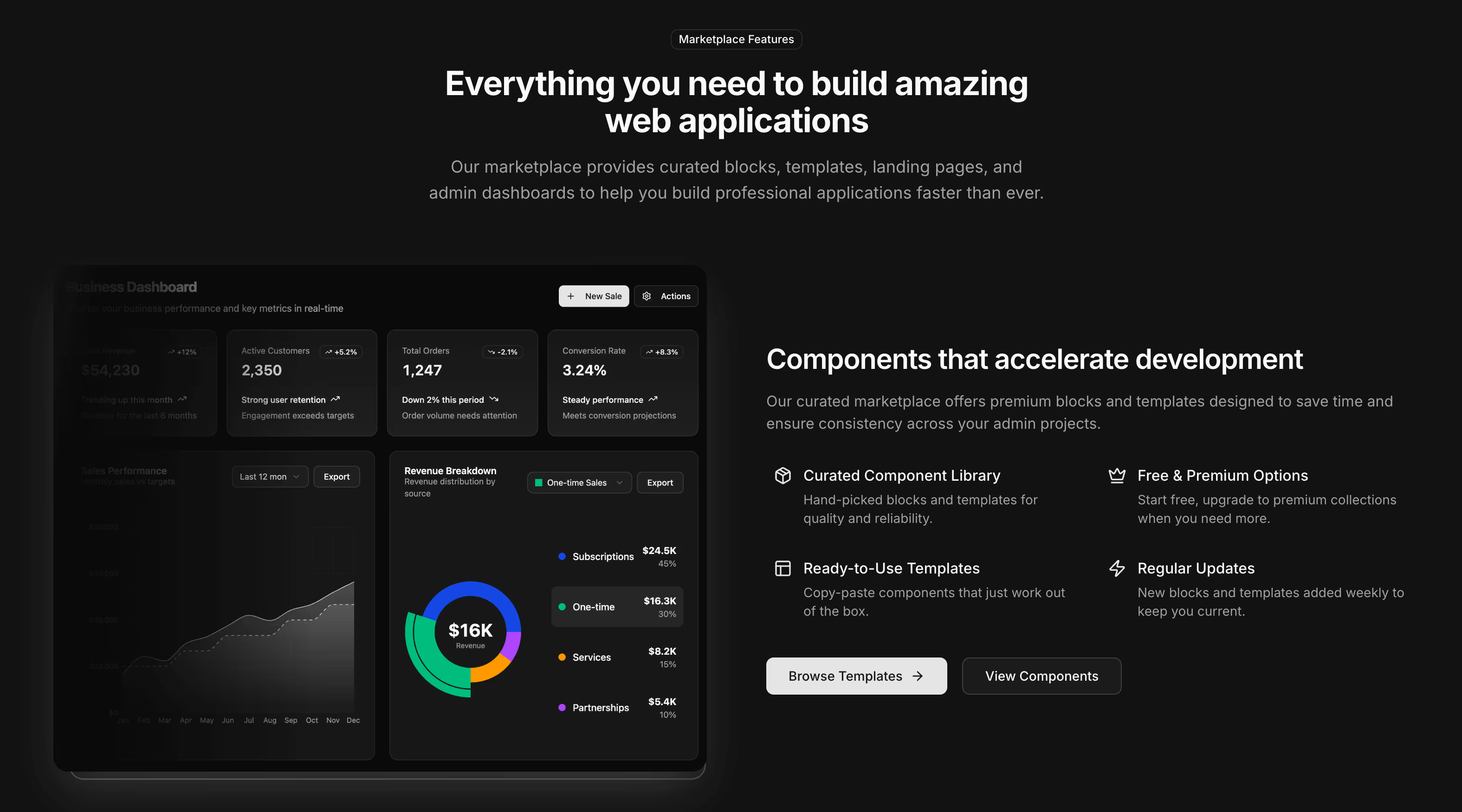
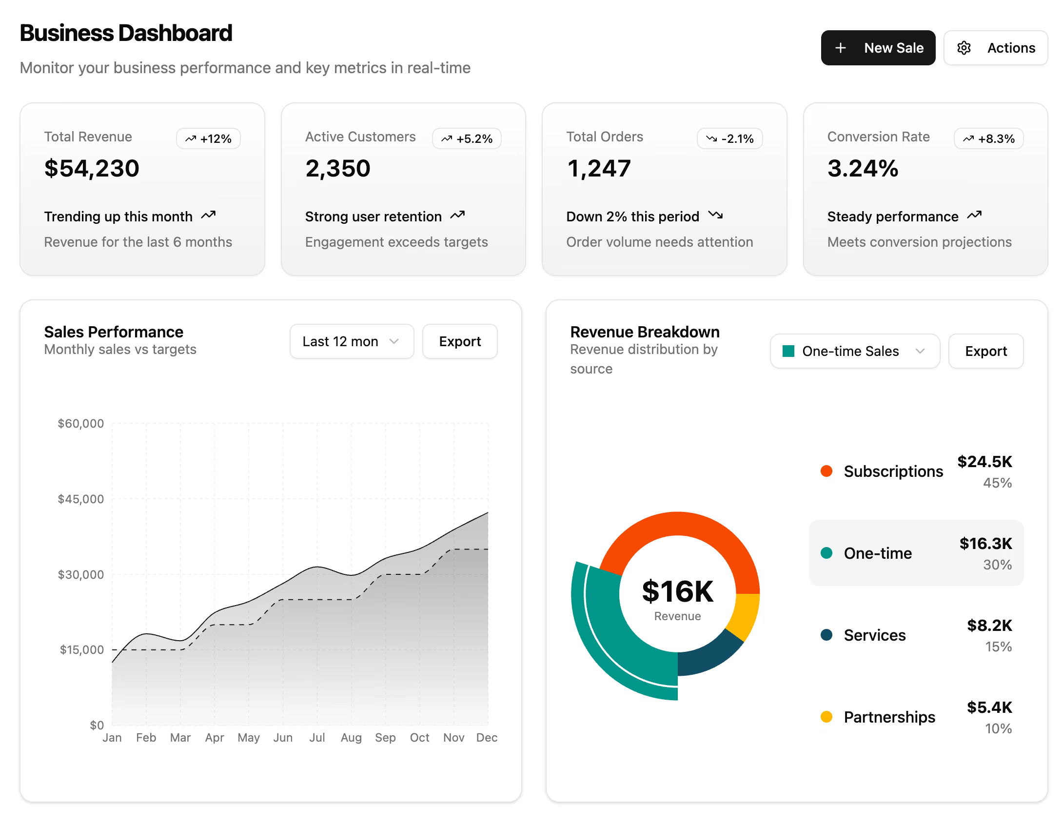
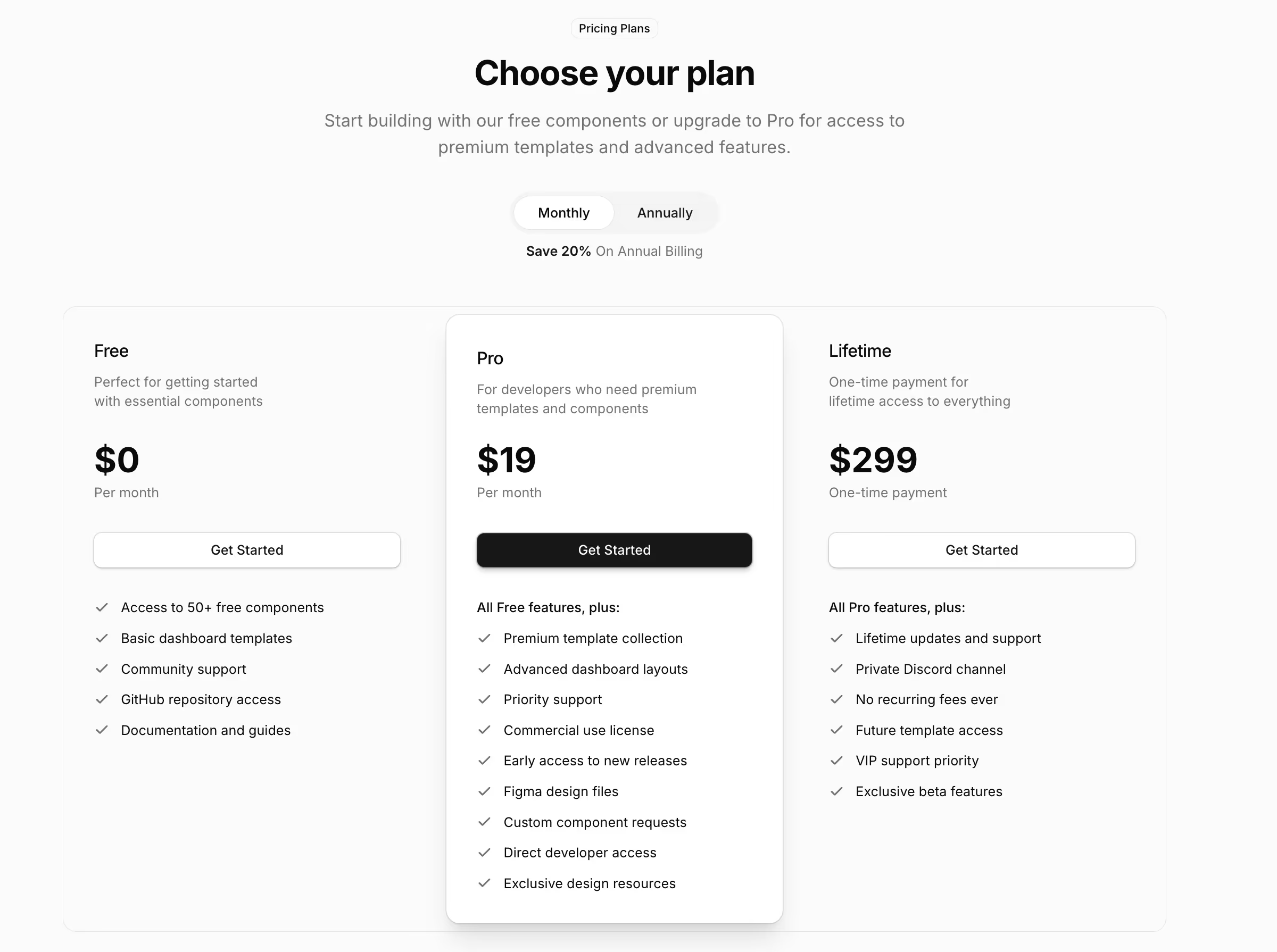
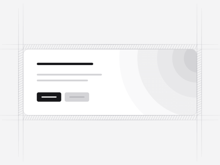
A call to action does not create intent, it collects it. That makes placement most of the job and the layout the rest. These thirteen cover the single-line band, the split layout with supporting links, the newsletter variant and the animated closers.
The thirteen CTA sections#
- CTA Section 1: a single-line band with a live badge and two actions. Free.
- CTA Section 2: a community subscribe card with an inline email field and avatar proof. Free.
- CTA Section 3: a split layout putting documentation and tutorial links beside the primary button. Free.
- CTA Section 4: a centred call to action with two buttons and no-credit-card reassurance.
- CTA Section 5: an enterprise layout with feature showcase cards.
- CTA Section 6: a newsletter signup pairing the ask with the perks and social proof.
- CTA Section 7: a high-impact productivity closer with gradient buttons and a row of trust indicators.
- CTA Section 10: the plainest of the paid closers, for a business site that wants no ornament at all.
- CTA Section 8: a team showcase with hover effects, for a closer that sells the people rather than the product.
- CTA Section 9: a split layout with organised resource links and image hover animations.
- CTA Section 11: an enterprise closer over an animated perspective grid floor, under a mono display headline.
- CTA Section 12: a payments closer with an animated routing grid, two actions and a metric row.
- CTA Section 13: a global-expansion closer on a configurable WebGL wave field, with inline email capture.
One action, or one and a half#
One primary action, and at most one quiet secondary. Several of these pair a solid button with a text link, which lets somebody who is not ready read the documentation without competing with the main action. Two equally weighted buttons is a choice, and a choice is friction at the exact point you were trying to remove it.
Where a call to action works#
After the argument. Under the pricing table, at the end of a feature story, or below an FAQ section that has just resolved the last objection. A call to action near the top of a page usually just repeats the hero button and dilutes both.
Writing the button label#
Name the thing that happens, not the transaction. Start free trial, book a demo, get the download. Submit, learn more and get started are three ways of telling somebody nothing, and get started is the most common button on the internet precisely because it is the easiest to write and the least informative to read.
Where the action has a cost or a commitment, say so next to the button rather than after the click. CTA 4 carries the no-credit-card line for exactly this reason: the reassurance belongs at the moment of hesitation, not on the page after it.
Newsletter calls to action#
CTA 6 is built for it, pairing the signup with what a subscriber actually receives and a line of social proof. That pairing matters because an email field on its own asks for something and offers nothing in return. Say what arrives and how often, and the conversion rate stops being a mystery.
The animated closers#
CTA Section 11, CTA Section 12 and CTA Section 13 carry rendered layers, the last using WebGL. They suit a launch page or the single closing section of a long page, not a band repeated three times down a site. All of them fall back to the static composition under a reduced-motion preference.
What sits around a CTA#
A footer follows it, and on a launch page a banner above the fold carries the same offer for anybody who never scrolls. For a product that is not shipping yet, a waitlist page is the honest version of this section.