Stats sections and animated counters#
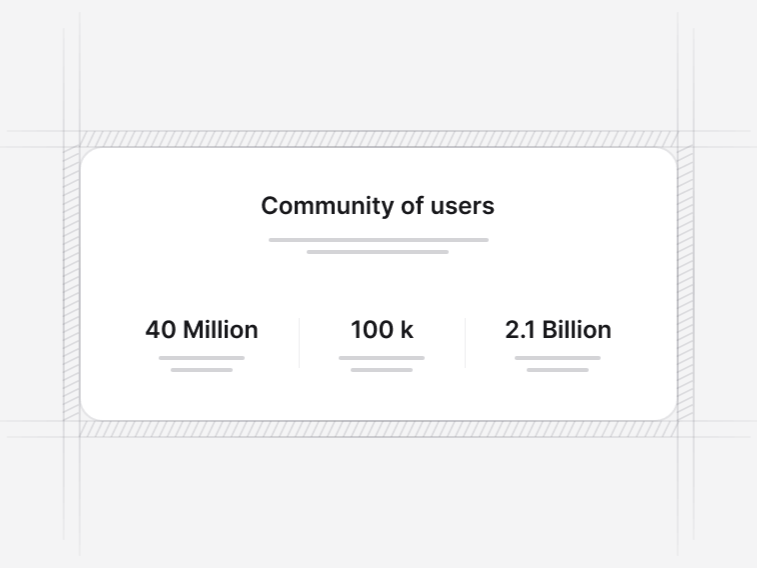
A number on a landing page is a claim. These sections are built so the claim is easy to read and hard to misread: a large figure, a label that says what it counts, and room for the qualifying line that keeps it honest.
The eight stats sections#
- Statistic 1: a metrics grid with progress indicators, for figures that sit against a target. Free.
- Statistic 2: a side-by-side layout pairing company metrics with a growth narrative. Free.
- Statistic 3: platform statistics with trend indicators and progress bars.
- Statistic 4: a four-metric growth grid with year-over-year context and a closing call to action.
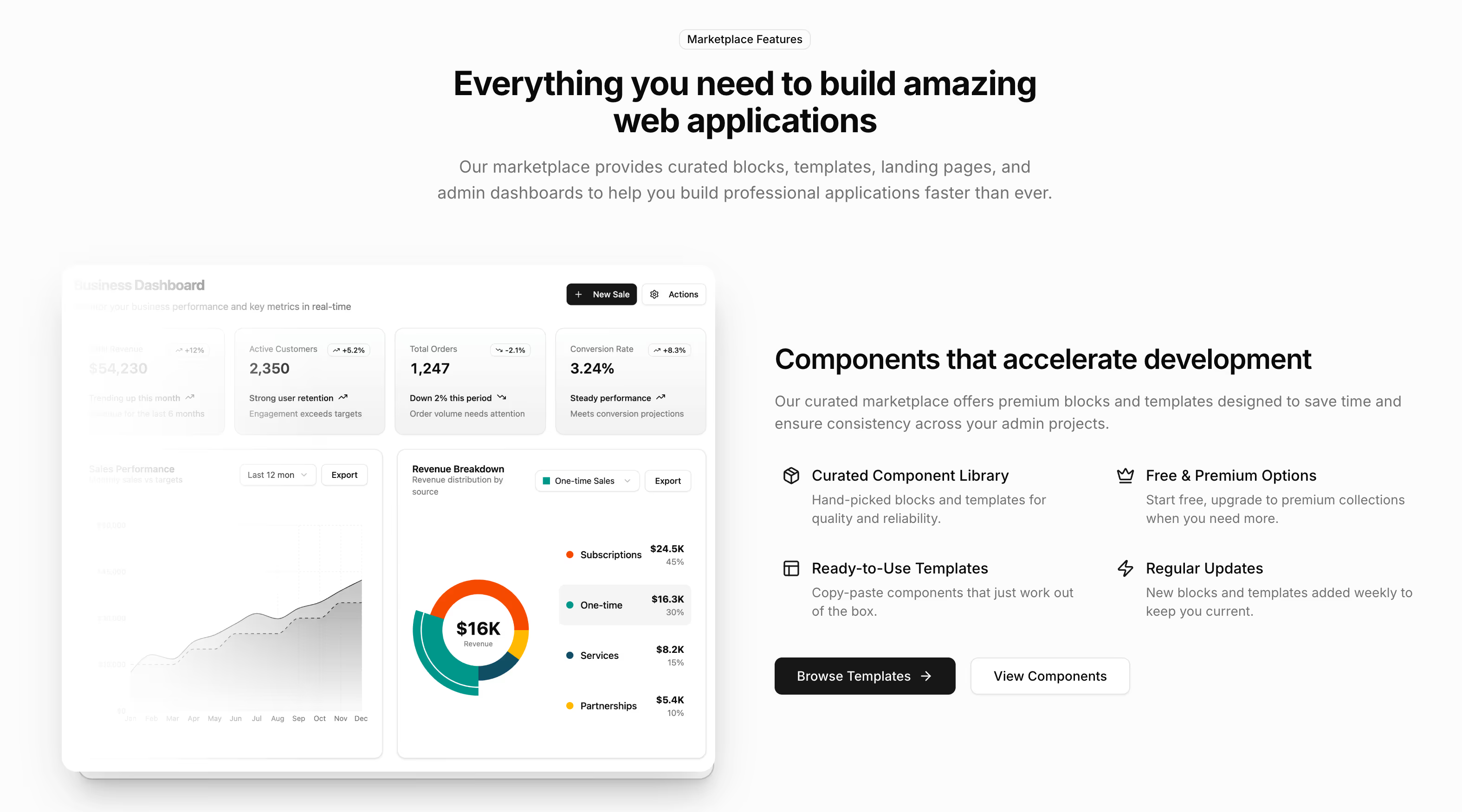
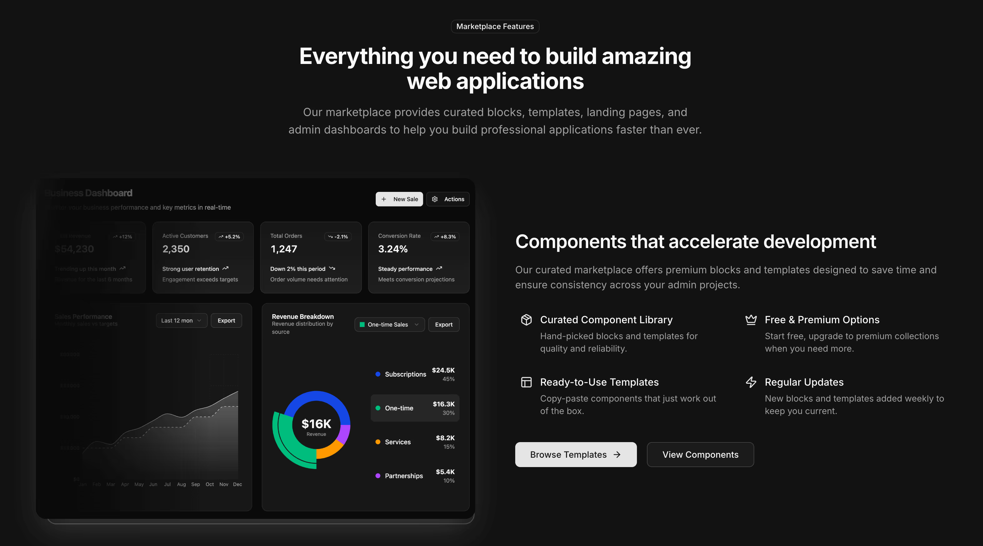
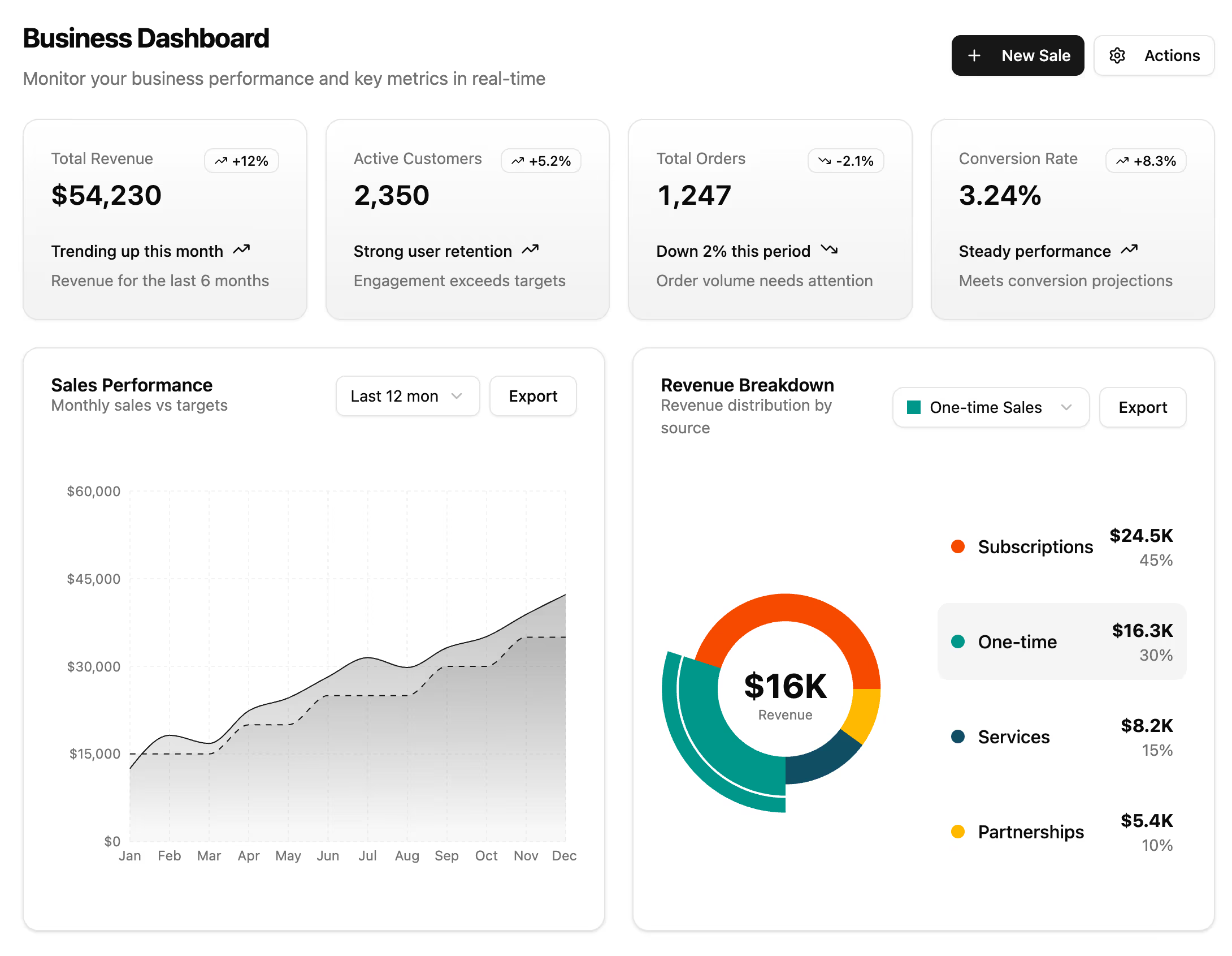
- Statistic 5: a business dashboard with summary cards and detailed analytics.
- Statistic 6: a clean metrics grid for key performance indicators and nothing else.
- Statistic 7: an analytics board pairing sales by category and recent transactions with four summary figures.
- Statistic 8: a sales analytics section with a monthly revenue table, top customers and performance figures.
How the counters animate#
The counter layouts run from zero to the final value once the section enters the viewport, and they settle into the number rather than stopping dead on it. The animation is driven by an intersection observer, so it fires when the section is actually seen instead of on page load, and it runs once rather than every time somebody scrolls past.
Where a visitor has asked for reduced motion, the final value renders immediately. A counter is decoration, and decoration is the first thing that should stop when somebody has said movement makes them unwell.
Writing a number that survives scrutiny#
- Give the period. A figure without a timeframe cannot be checked, so it will not be believed.
- Give the base with a percentage. Ninety percent growth from ten customers is a different sentence from ninety percent from ten thousand.
- Round consistently. Mixing an exact figure with a rounded one in the same row reads as cherry-picking.
- Leave the slot out rather than filling it. Four honest numbers beat six with two invented.
Each layout keeps room for a short qualifying line under the figure for exactly this reason.
Stats sections versus dashboard KPI cards#
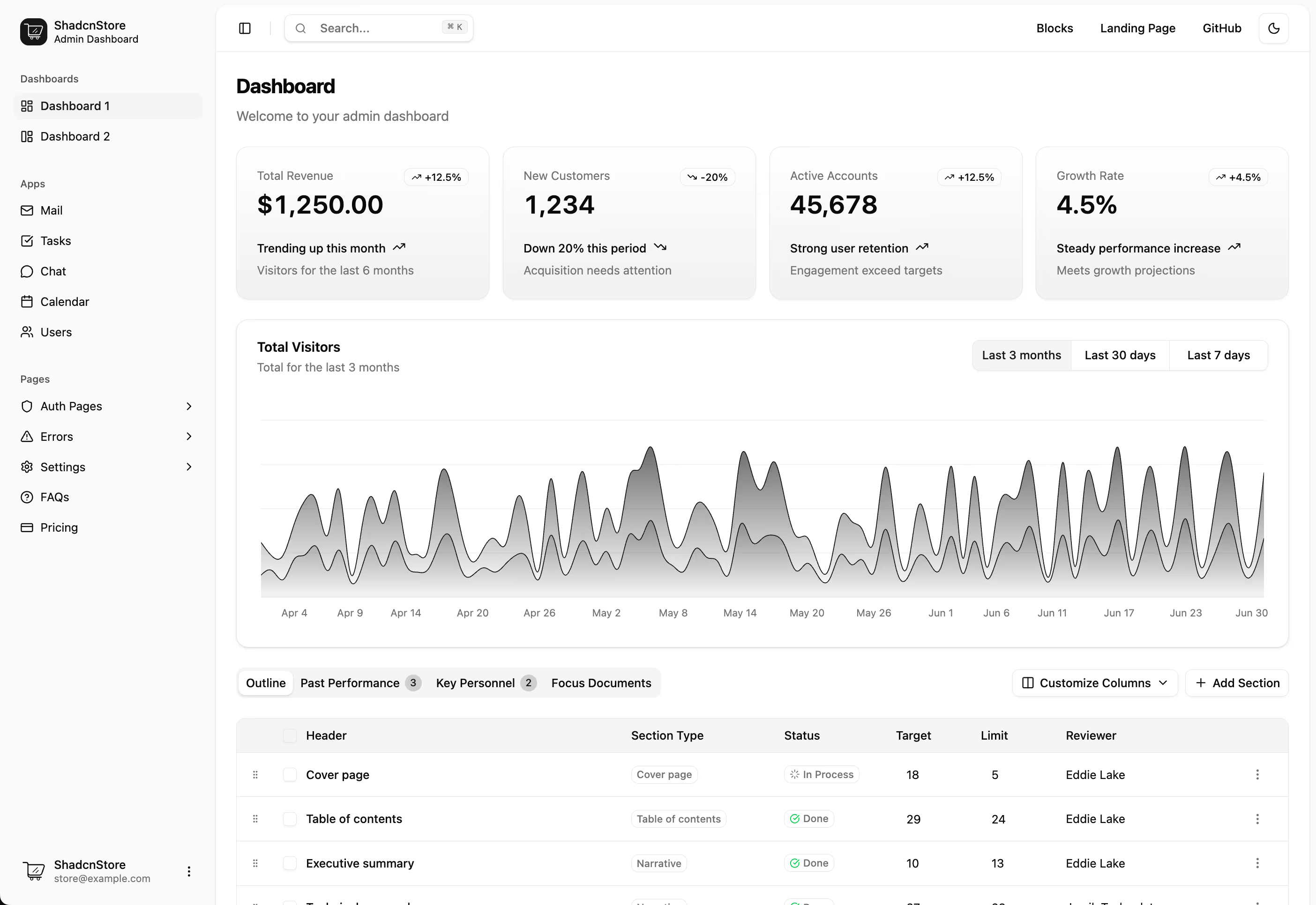
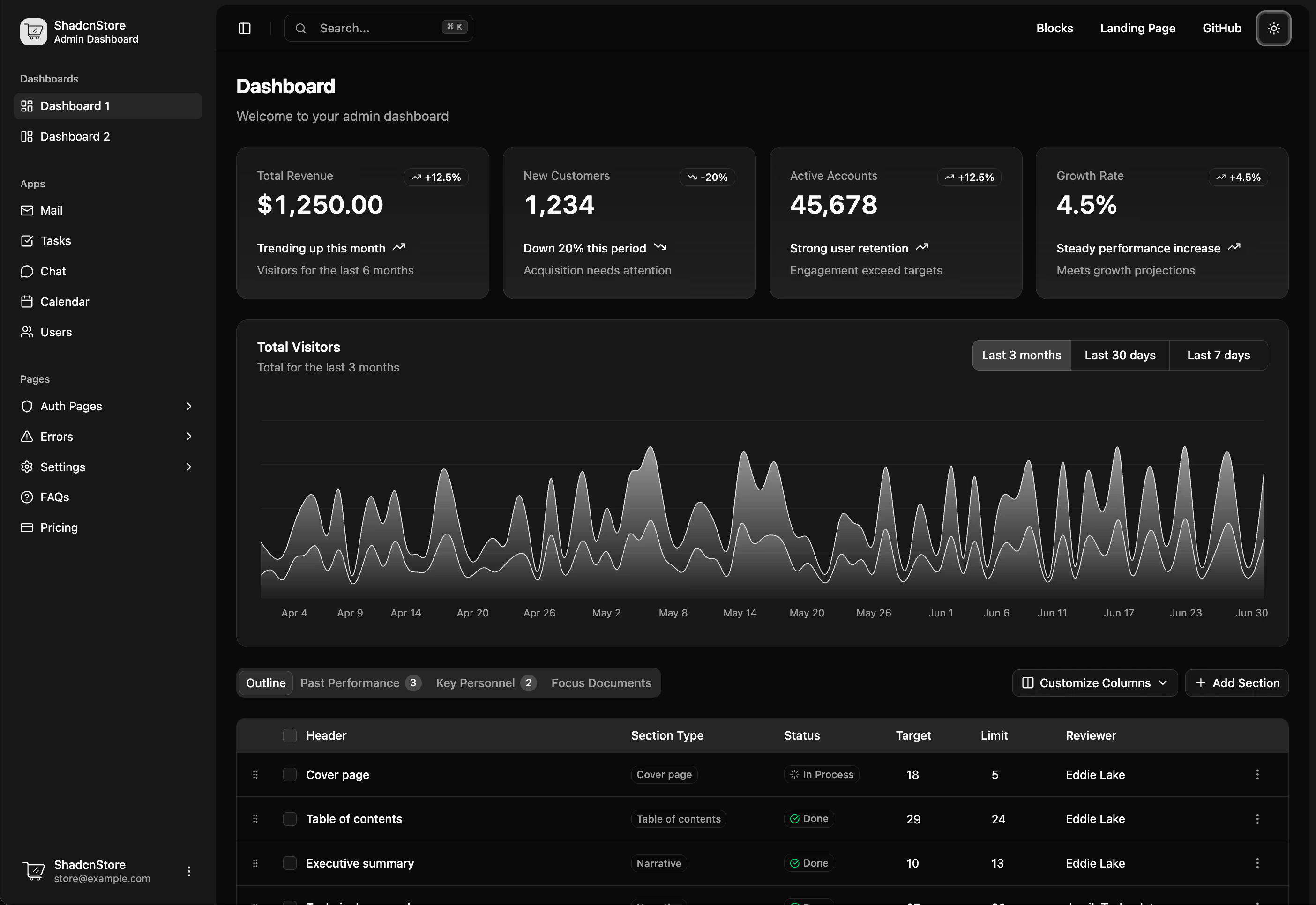
These are marketing statistics: large type, generous spacing, sized for a full-width landing page section. The KPI cards and dashboard widgets are the product equivalent, with denser type, card chrome and trend indicators against a previous period, built to sit in a grid inside an app shell. The two are not interchangeable, and using one in the other place is immediately visible.
Where a stats section belongs on the page#
Under the hero when the numbers are the strongest opening argument, or after the features section when they are evidence for a claim already made. A logo cloud does the same job with names rather than figures, and testimonials do it with words. Most pages need one of the three, not all three in a row.