Product detail pages, where the sale is made or lost#
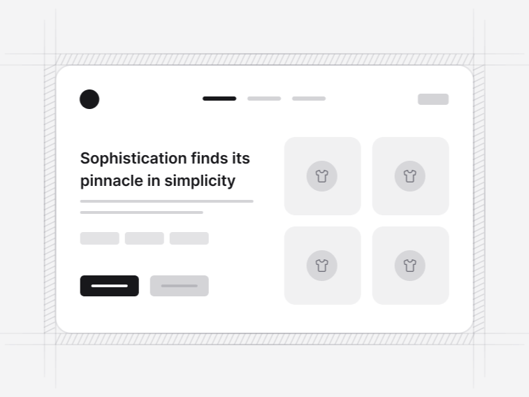
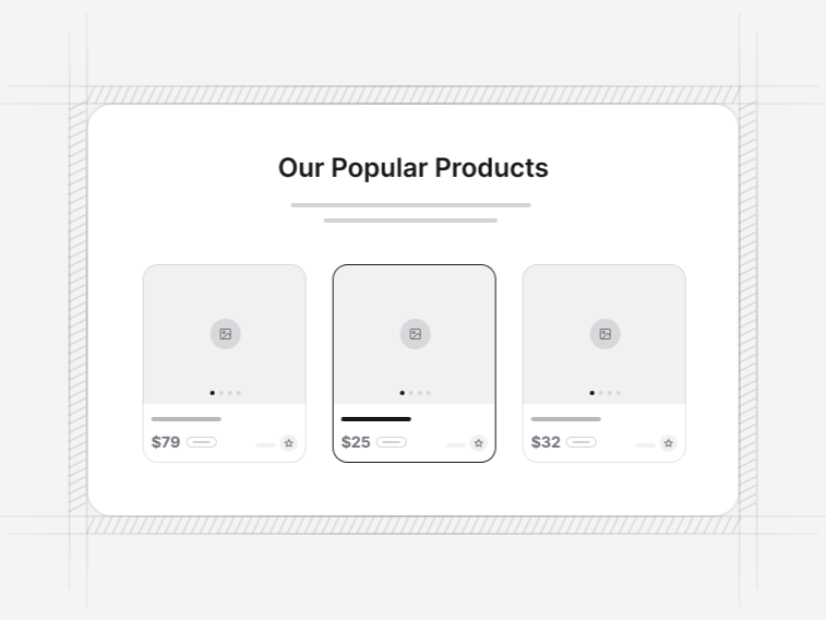
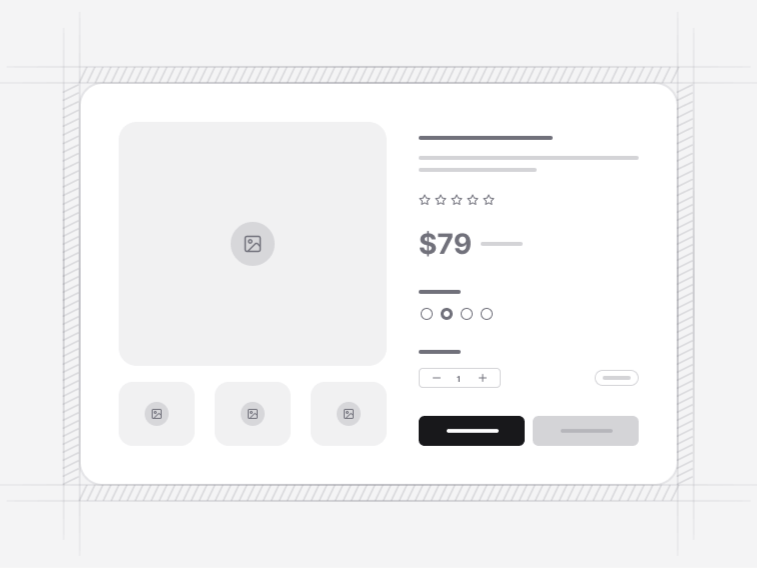
A product page has to hold images, variants, price, availability and the buy action without any of them fighting. They cover the standard layouts, the quick view that opens from a grid and the long-form product story.
The product detail blocks#
- Product Overview 1: an image carousel with a size grid and colour swatches. Free.
- Product Overview 2: a thumbnail carousel with a size guide link and a free-delivery threshold.
- Product Overview 3: a furniture page with colour options, delivery choice, a lead-time explanation and recently viewed.
- Product Overview 4: financing, a quantity select, a postcode delivery check and returns detail.
- Product Overview 5: tabbed overview and specifications with a gallery dialog.
- Product Overview 6: a quick view dialog with gallery, variant selection and add to cart.
- Product Overview 7: a product story whose pinned panel swaps to the section being read, with buy controls above the argument for them.
Variants that behave#
Size, colour and option selection is real state driving the gallery, the price and the availability line together. Choosing a sold-out combination disables the add-to-cart action on the spot rather than failing at the cart step, which is the single most common way a product page loses an order it had already won.
The quick view#
Product Overview 6 opens from a grid without losing the shopper place in the listing. It is the piece that makes a long product grid shoppable, because it removes the back-button round trip that browsing otherwise requires. Keep it to gallery, variant and add to cart; a quick view carrying the full page is just a slower page.
Delivery, lead times and the awkward facts#
Product Overview 3 explains a long lead time rather than burying it, and Product Overview 4 checks delivery by postcode before the cart. Stating the inconvenient thing on the product page costs a few orders and prevents the returns, chargebacks and one-star reviews that come from stating it after payment.
Long-form product stories#
Product Overview 7 pins a panel that follows the section being read and keeps the buy controls above the argument for them. That ordering is deliberate: a reader who is already convinced should never have to scroll back up to act.
What sits around a product page#
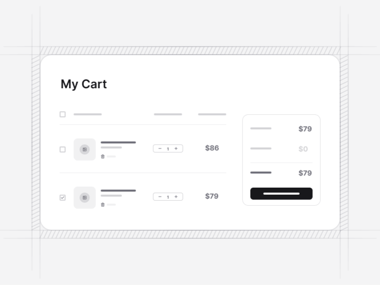
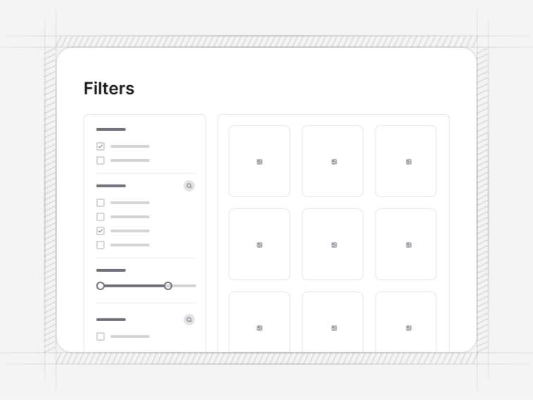
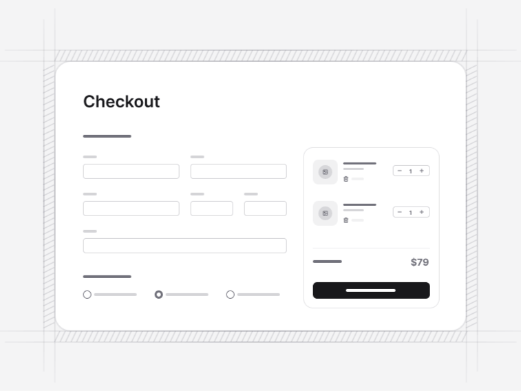
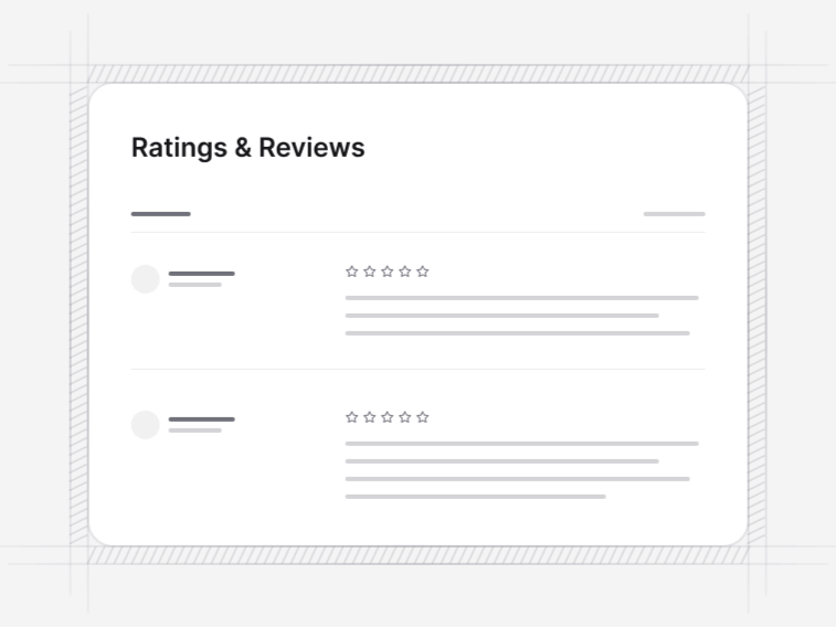
Reviews below the buying decision with the average visible near the price, a cart as the next step, and filters on the grid the shopper arrived from.