Hero sections, and the one job they have#
A hero has a few seconds to say what the product does and why it matters. The fourteen here differ in how they spend those seconds: on social proof, on showing the interface, on navigation, or on a single arresting image.
What a hero section contains#
- A headline that names the outcome, not the category
- A supporting line that says who it is for or how it works
- One primary action, and at most one quiet secondary
- Something that makes the claim credible: a number, a logo row, faces, or the product itself
- Media, where you actually have media worth showing
The layouts here reserve space for each of those, so replacing the sample content does not collapse the composition.
The fourteen hero sections#
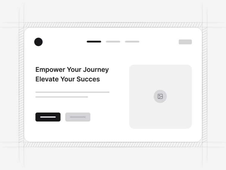
- Hero Section 1: a split hero with a badge, an avatar group and a trusted-by line under the call to action. Free.
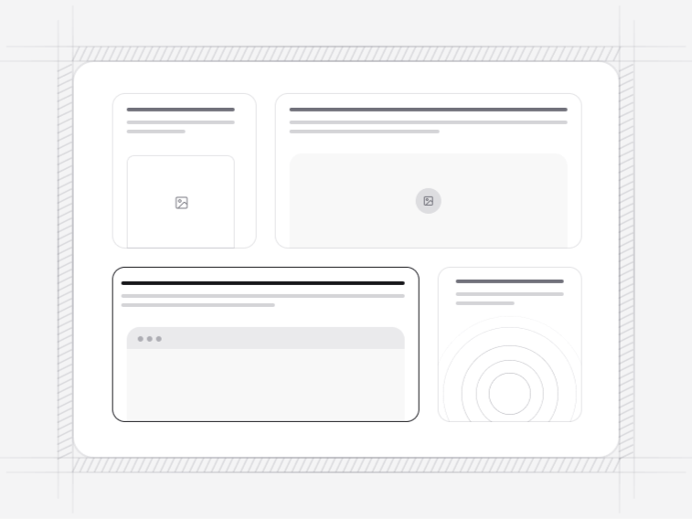
- Hero Section 2: a split hero built around a fixed-ratio media card, for one product image or a short video. Free.
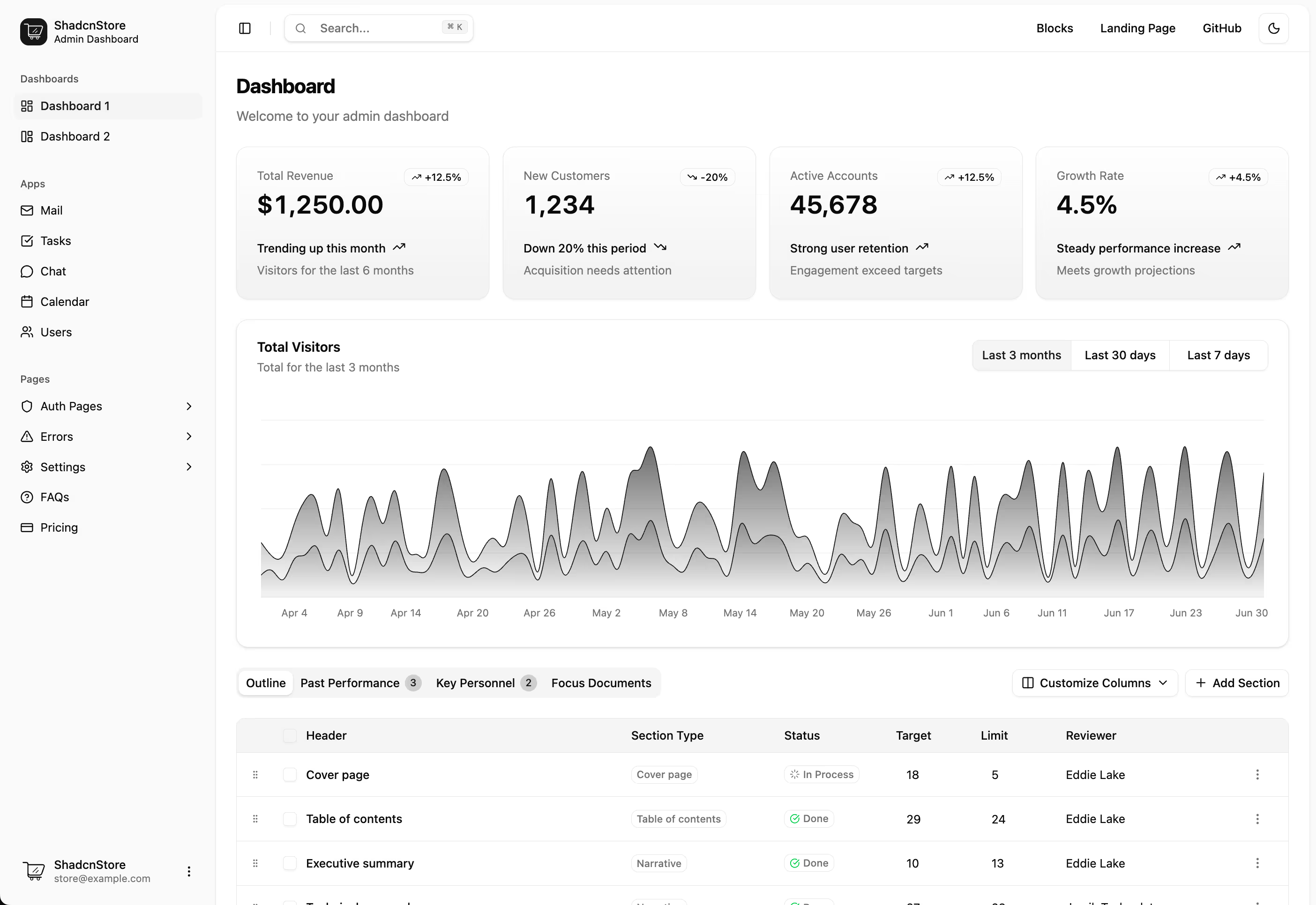
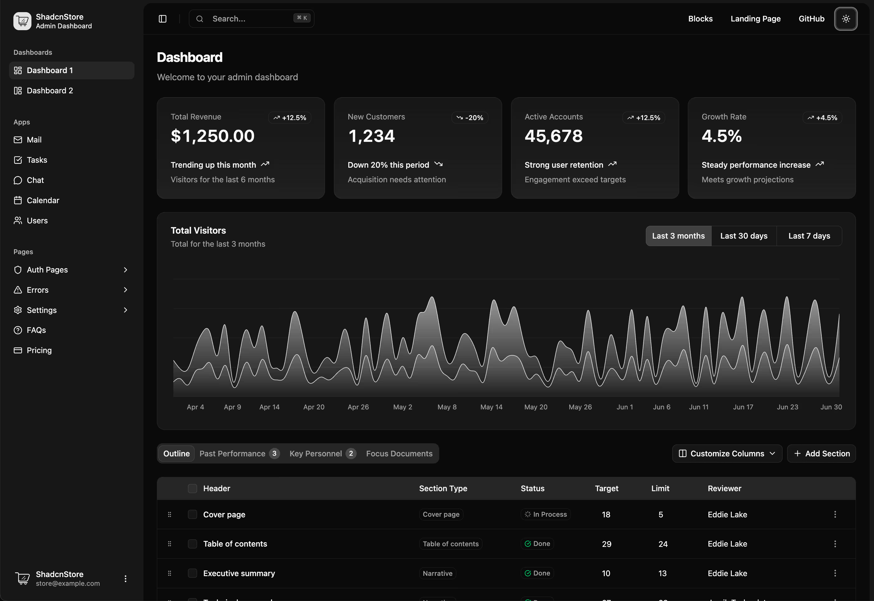
- Hero Section 3: a centred hero with a dashboard preview above a logo row of named customers.
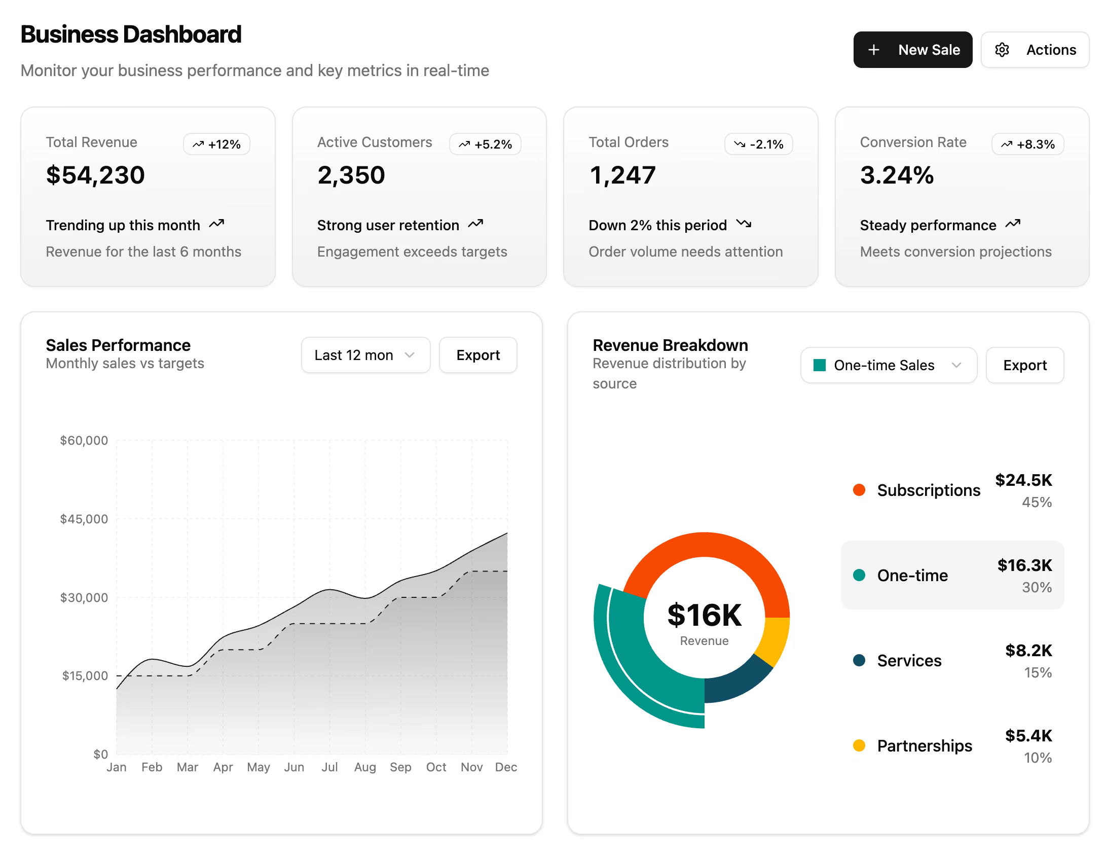
- Hero Section 4: four headline metrics carried as cards directly under the call to action.
- Hero Section 5: a hero with its own navigation bar, avatar proof and a full-bleed destination image.
- Hero Section 6: a search-led hero with tabs and location, type and price-range selects over an image grid.
- Hero Section 7: an AI product hero with a token-derived gradient and a looping chat demo.
- Hero Section 8: an editorial property hero whose photograph grades from midday to dusk across a draggable seam.
- Hero Section 9: a centred hero in an inset panel, the stages of an authorisation fanned in 3D and dragged by hand.
- Hero Section 10: a fitness hero on a full-bleed running photo printed as a halftone, with a pointer-led reveal lens.
- Hero Section 11: three rows of work drifting in alternating directions on a tilted plane that straightens as you scroll.
- Hero Section 12: a product-launch hero under a drifting WebGL aurora, with a browser-framed screenshot and a stat row.
- Hero Section 13: a split hero on a node web that links itself and leans toward the cursor, beside a live signal console.
- Hero Section 14: a waitlist hero lit by counter-rotating beams, with a sheened headline, inline email capture and a wordmark marquee.
Choosing a hero by what you can show#
- You have an interface worth seeing: Hero Section 3 with its dashboard preview, or Hero Section 12, which frames a screenshot in browser chrome.
- You have customers worth naming: Hero Section 1 with its avatar group, or Hero Section 5 with membership statistics.
- You have one strong photograph: Hero Section 2 built around a media card, or the editorial layouts that treat the image as the composition.
- You have search or booking as the first step: Hero Section 6, with tabs and a filter widget above the fold.
- You have numbers: Hero Section 4, which carries four metrics as cards under the call to action.
- You have none of the above yet: the plain split layouts, which are honest about being pre-launch rather than filling the frame with stock photography.
The animated and WebGL heroes#
Several heroes carry a rendered layer: a drifting aurora, a node web that leans toward the pointer, counter-rotating beams, a halftone photograph with a reveal lens. They differ in cost. The WebGL heroes suit a launch or campaign page rather than every page of a site, and they are the wrong choice above documentation.
All of them respect the reduced-motion setting, rendering the still composition instead. Motion in a hero is the first thing a visitor sees, which makes it the first thing that should stop when somebody has asked for less of it.
The hero is your largest contentful paint#
Whatever sits at the top of the page is almost always the element Core Web Vitals measures, so a hero is a performance decision as much as a design one. The image-led layouts declare explicit width and height so the browser reserves the space before the file arrives, which is what stops the rest of the page jumping down when it does.
Two things are worth doing to whichever hero you pick. Serve the hero image at the size it renders rather than the size it was exported, and mark it as high priority so it is fetched ahead of everything below the fold. A hero that loads late costs more than a hero that looks plain.
Writing a headline that survives the layout#
Write the headline before choosing the hero. Every layout here holds a two-line headline comfortably and a three-line one adequately; none of them rescues a headline that needs four. If the sentence cannot be cut to that, the supporting line is where the rest belongs.
Building the page under the hero#
A navbar sits above it, and the floating navbar variant is built specifically for a full-bleed hero. Below, a logo cloud backs the opening claim before a visitor has decided to keep reading, then a features section explains the product and a call to action closes once the case is made. For a shop, the storefront heroes are the equivalent built around products rather than a claim.