KPI cards and the dashboard widgets around them#
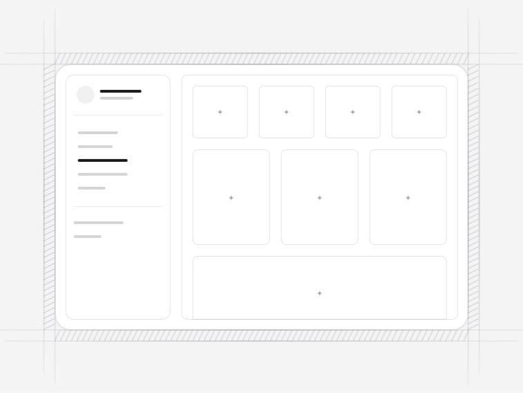
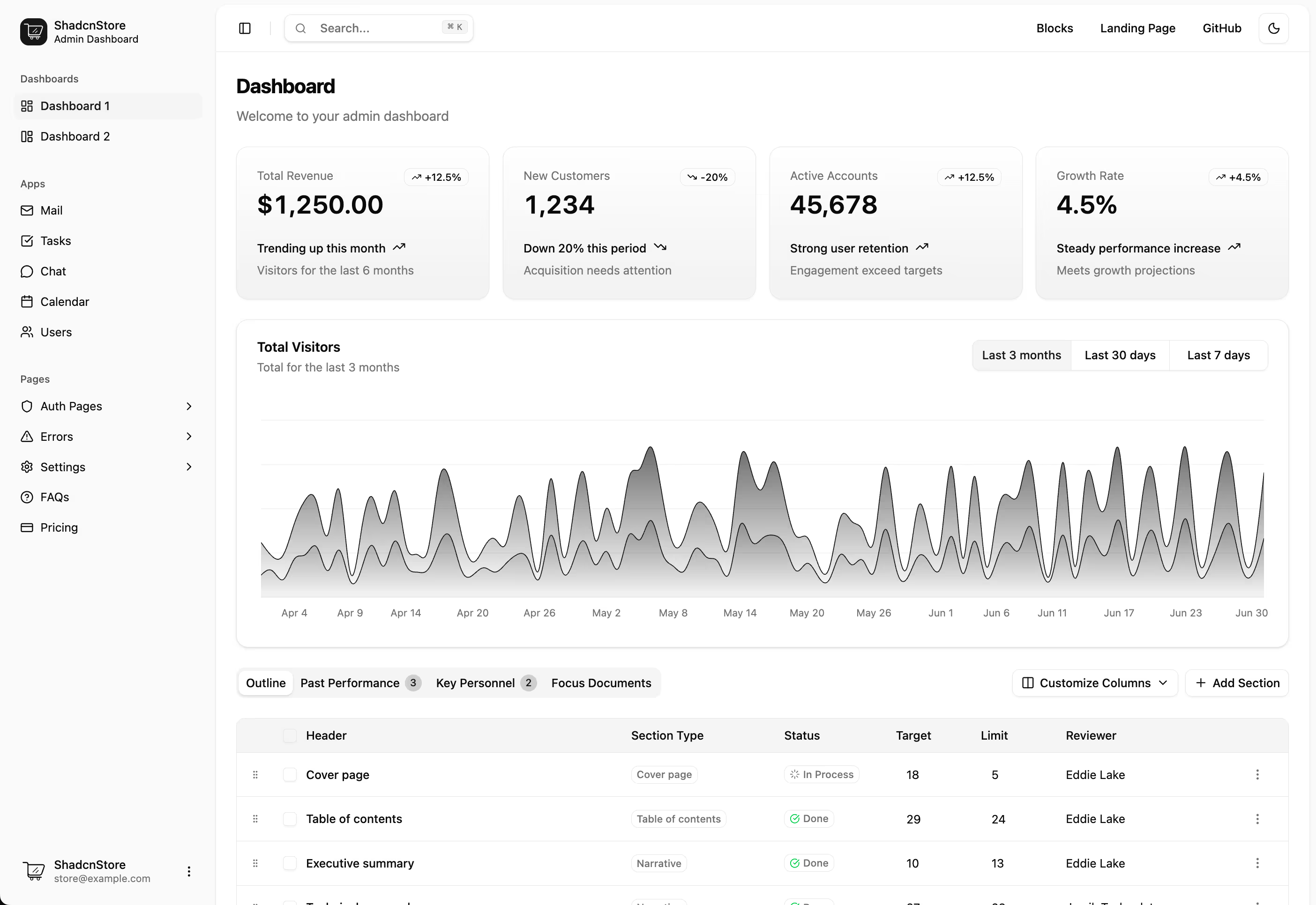
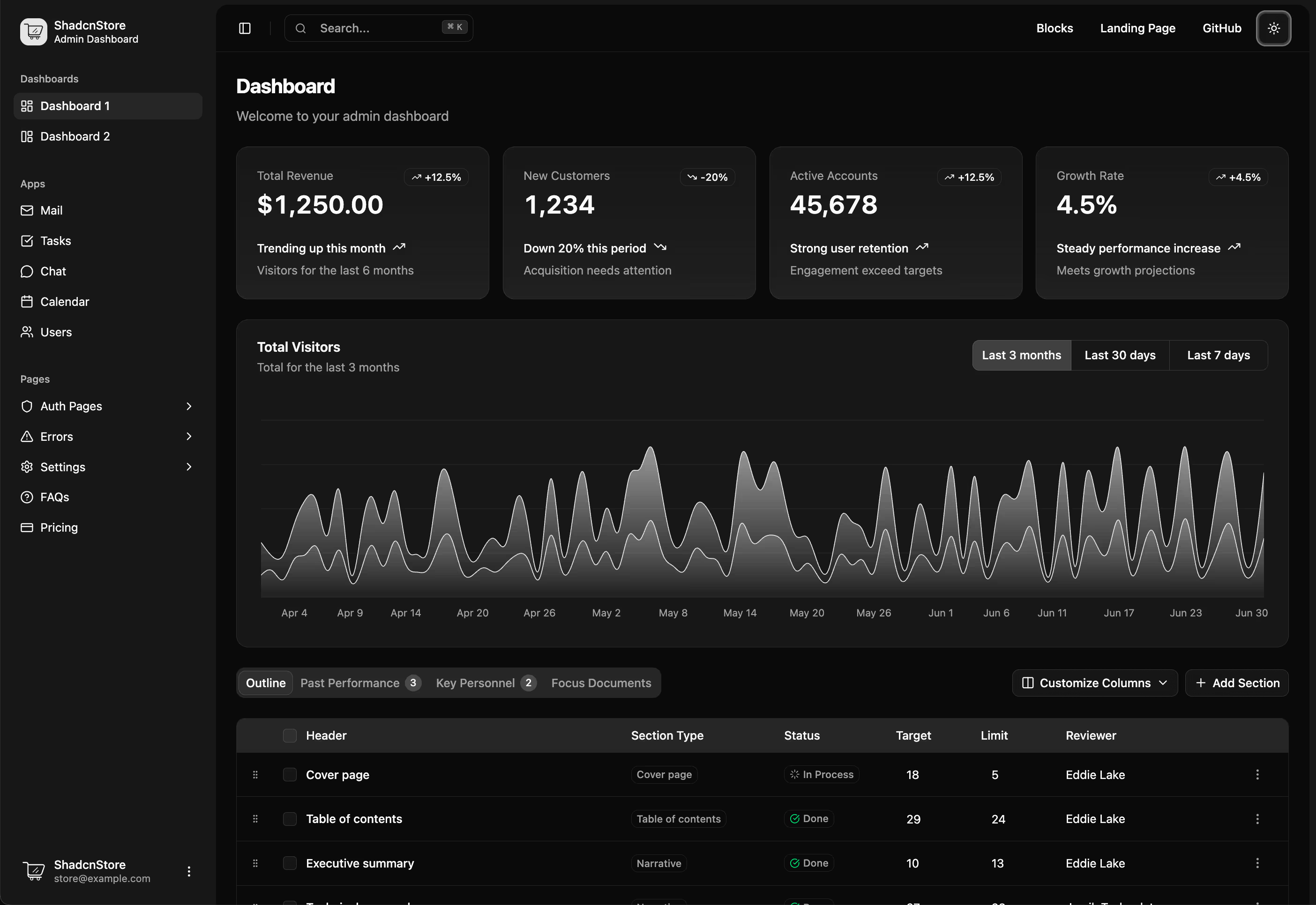
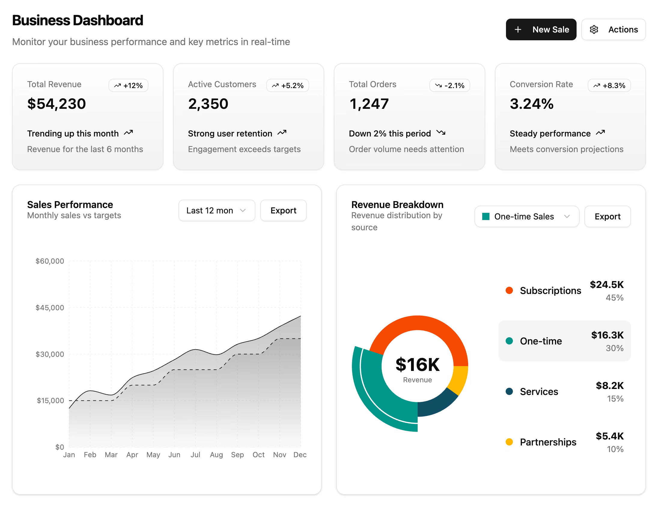
A dashboard is mostly small cards. A number with a period, a list with a status, a ring with a percentage. They are easy to build badly, because the hard part is not the layout, it is deciding what a card is allowed to claim. These widgets are sized for a dashboard grid and written so the honest version is the default.
The widgets in this collection#
- Widget 1 (analytics overview): product sales and volume with trend indicators and recent activity. Free.
- Widget 2 (market trends): a channel list with a per-item actions menu, for a card that has to be operable and not only readable. Free.
- Widget 3 (active tasks): assignee avatars, stage labels and progress per task, for a project surface.
- Widget 4 (top performers): a ranked list of companies with sector labels and change figures.
- Widget 5 (social channels): progress bars and metrics with an engagement area chart inside the card.
- Widget 6 (product comparison): two products side by side with percentage change, icons and metrics.
- Widget 7 (usage against quota): token consumption with a trend line, a per-model breakdown and an estimated cost. Built for metered and AI products.
What belongs on a KPI card#
- The number, at a size that reads before anything else on the card
- What it counts, in words a new employee would understand
- The period it covers, because a number without one is unfalsifiable
- A comparison, but only where a previous period genuinely exists
- A route to the detail, since the next question is always which records
The trend slot is optional rather than always filled. A green arrow against an invented baseline is worse than a bare number, because it invites a decision the data cannot support.
KPI cards versus marketing stats#
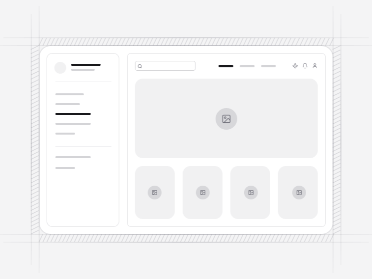
These are product widgets: dense type, card chrome, trend indicators, sized to sit in a dashboard grid inside an app shell. The marketing stats sections are the landing page equivalent, spaced for a wide page and making a claim rather than reporting a measurement. Using one in the other place is the most common reason a dashboard looks like a brochure.
The usage and quota widget#
Widget 7 solves a problem most metered products hit in their first year: it shows consumption against a quota with the cost estimate a customer will otherwise open a support ticket about. Stating the estimate on the dashboard is cheaper than answering it one ticket at a time.
Building the rest of the dashboard#
Widgets are the top row. Below them, charts carry the trends and a datatable carries the records. Complete app screens cover the cases where a widget is not enough and the whole surface needs designing.