Home / Blocks / Marketing / Blog Sections
4 blocks in this section

Shadcn Blog Card Grids

Blog listing layouts plus the article page itself: a full guide layout with a scroll-spy table of contents and a complete prose scale.

Jump to a blog section block

4 blocks in this collection

Free Pro

  1. Blog Section 1 Free
  2. Blog Section 2 Pro
  3. Blog Section 3 Pro
  4. Blog Section 4 Pro

How it works

Three steps to working code

Install a block and the files land in your repository. Nothing calls back to us.

  1. terminal

    $ npx shadcn@latest add @shadcnstore/blog-section-1

    ✓ Checking registry

    ✓ Installing dependencies

    01

    Run one command

    Every preview above prints its own. The CLI writes the block and the components it needs into your project.

    Installation docs
  2. your project 3 files added

    components/

    ├─ ui/

    ├─ button.tsx

    └─ navigation-menu.tsx

    └─ blog-section-1.tsx

    02

    Get real files

    React, TypeScript and Tailwind v4, with no framework imports. Next.js, Vite, Remix and Astro all work.

  3. blog-section-1.tsx

    <Menu.Trigger

    - asChild

    + render={<button />}

    />

    03

    Edit it as your own

    Built on Base UI, not Radix, so keyboard and focus behaviour come from the primitive.

Blocks that hold state already carry the use client directive the Next.js App Router needs.

Guide

Blog card grids and the article page#

A blog needs two designs that agree with each other: the index somebody scans and the post they land on from search. These cover the index layouts a visitor scans before they choose anything.

The blog sections in this collection#

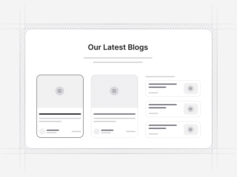
  • Blog Section 1: a three-card layout with categories, titles and call-to-action links. Free.
  • Blog Section 2: a grid of recent posts with images, titles, authors and tags.
  • Blog Section 3: a horizontally scrollable stories row with gradient borders and avatars.
  • Blog Section 4: a responsive news grid with images, titles and metadata.

Connecting a headless CMS#

Each card takes a post object with a title, an excerpt, an image, an author and tags, so mapping a response from Contentful, Sanity, WordPress or a folder of MDX is a transformation rather than a rewrite. Nothing in the card assumes where the data came from or what the fields are called upstream.

Posts without a cover image#

The image slot falls back to a neutral surface rather than stretching a placeholder photograph across the card. This matters more than it sounds on a blog index, where older posts almost always predate whatever image policy you have now, and a mixed feed of real photos and stock filler looks worse than a mixed feed of photos and plain surfaces.

What belongs on a blog card#

  • The title, at a size that survives two lines without breaking the grid
  • A category, which is the fastest filter a reader applies
  • A date, unless the content is genuinely evergreen and you would rather not show one
  • An author where the byline carries weight, and not where it does not
  • An excerpt written for the card rather than the first sentence of the post truncated

A blog is not a changelog#

Release notes belong in a changelog, which is scanned for a version number, not read. A blog post explains one thing at length and is found through search. Publishing releases as blog posts buries the writing that brings people in, and publishing essays as changelog entries makes the changelog unusable for the support reply it exists to serve.

Where blog sections sit#

As the blog index itself, or as a three-card strip on a landing page showing recent writing. For records that are not articles, the listing cards are the right shape, and a newsletter call to action under the index is the highest-converting position on a content site.


FAQ

Blog Sections questions, answered

What people ask before choosing a block from this collection.

Yes. Each card takes a post object with a title, excerpt, image, author and tags, so mapping a response from Contentful, Sanity, WordPress or a local MDX folder is a transformation rather than a rewrite. Nothing in the card assumes where the data came from.
The image slot falls back to a neutral surface rather than stretching a placeholder photograph. That keeps a mixed feed tidy, which matters most on a blog index where older posts often predate whatever image policy you have now.
The listing grids cover the index. The guide article layout, with a table of contents that tracks the reading position, is the one to use for the post page, so an index and a post do not need two unrelated design languages.
Blog Section 1, the three-card layout with categories and call-to-action links, is free. The recent-posts grid, the scrollable stories row and the news grid are Pro under the pricing licence.

Documentation

The components behind these blocks

How to install, customise and combine the shadcn/ui components this collection is built from.

Free & Premium Templates

Launch Faster with Complete Templates

Love these blocks? Get our free dashboard and landing page templates with 30+ pre-built pages and all the components you need. Premium templates with advanced features launching soon at $69.

Free Templates Now
30+ Pages Included
Premium Coming Soon