Complete application screens#
Some screens are not a component with a prop, they are a design problem: a kanban board, a chat thread, a file manager, an issue list. These nine are the whole surface, with the state that makes them work rather than a picture of one.
The nine app screens#
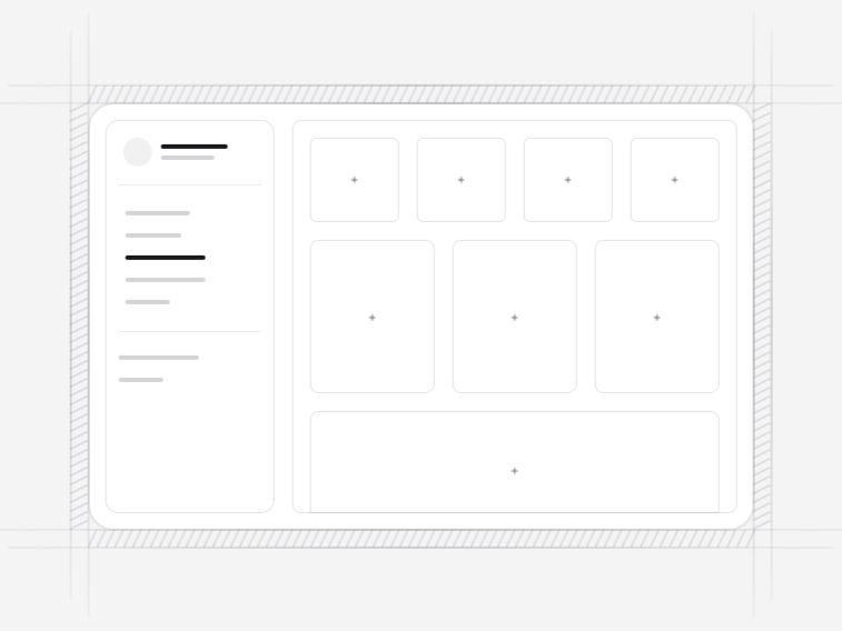
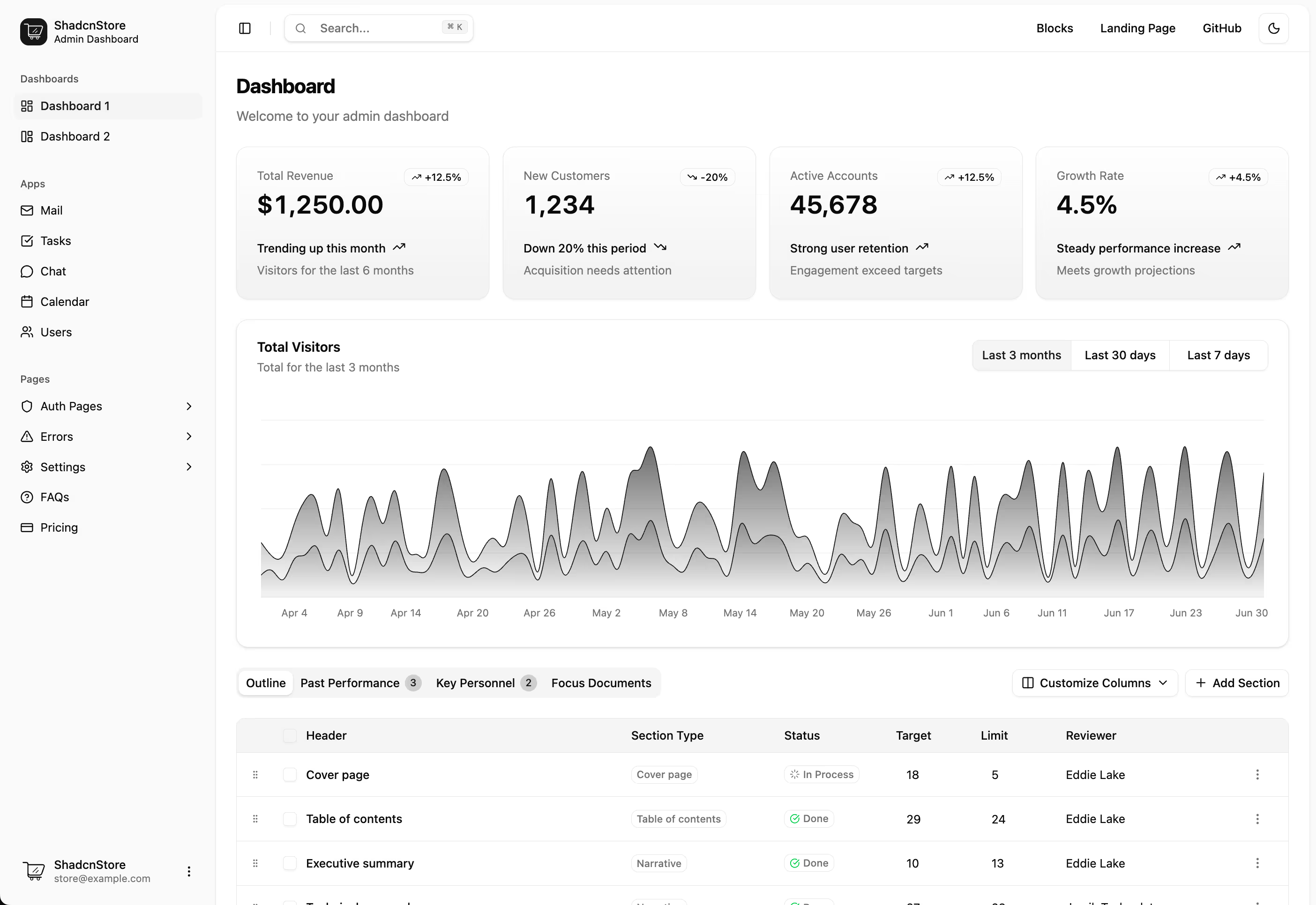
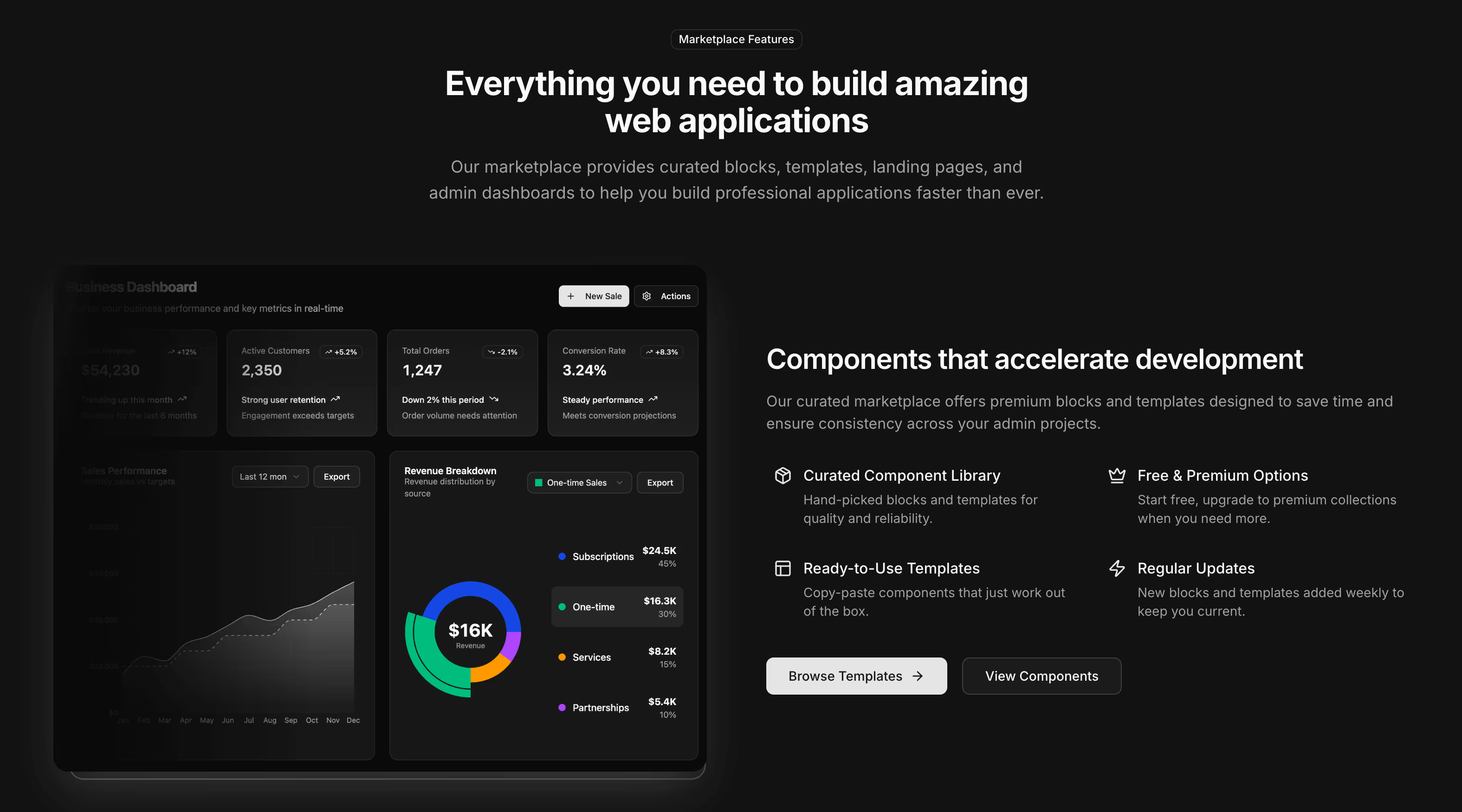
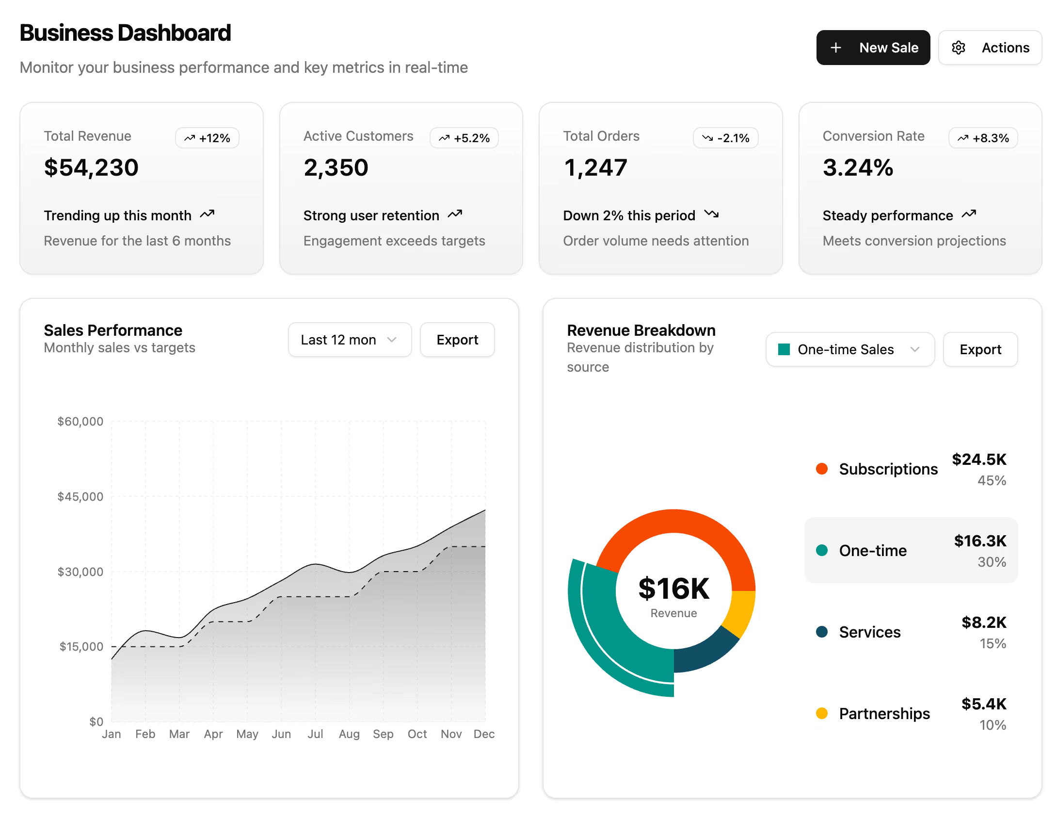
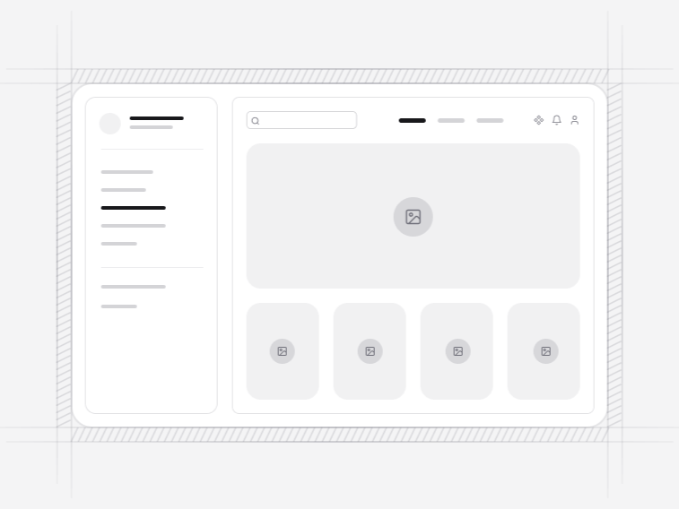
- App 1 - Dashboard: a simple dashboard with sidebar navigation and stats. Free.
- App 2 - Task Board: a kanban task board with working drag and drop between columns.
- App 3 - Messages: a chat interface with a conversation list, a grouped thread, disciplined autoscroll, typing state and a responsive composer.
- App 4 - File Manager: a file manager with grid and list views over one shared selection, bulk actions, search and a preview sheet.
- App 5 - Issue Tracker: a keyboard-first issue list with grouping, inline status editing, selection and a detail sheet.
- App 6 - Settings: a settings suite with account, notification-matrix and team panels that keep unsaved work across tabs.
- App 7 - Patient Intake: a persisted, branching intake wizard with repeatable record rows.
- App 8 - Team Invites: an invitation flow with paste-many email chips and permission previews.
- App 9 - Billing Statement: a print-ready statement with line items and adjustments.
The kanban board#
App 2 is a working board, not a screenshot of one. Cards move between columns, order is real state, and wiring it to your own persistence is a save call rather than a rewrite. Drag and drop is the part teams most often build twice, because the first attempt usually ignores keyboard users and touch.
Autoscroll, and why chat is hard#
App 3 gets the detail that separates a usable chat from an irritating one: it does not yank you to the bottom when a new message arrives while you are scrolled up reading. It also groups consecutive messages, shows typing state, and grows the composer responsibly rather than pushing the thread off screen.
Selection that survives a view change#
App 4 offers grid and list views over one shared selection, so switching layout mid-task does not lose what somebody picked. That sounds obvious and is wrong in most file managers, because the two views are usually built as separate components with separate state.
Unsaved work#
App 6 keeps unsaved changes when you move between settings tabs and warns before you leave with them. Losing a half-filled form to a tab click is the kind of small betrayal people remember about an internal tool long after they have forgotten what it does well.
These are screens, not applications#
Each one holds its own state and talks to no backend. You replace the sample data and connect the actions. That boundary is what keeps them usable over any stack, and it is why the work went into the interaction rather than a data layer you would have replaced anyway.
Where app screens sit#
Inside an app shell, which provides the navigation and header context these screens deliberately leave out. Datatables cover the record-list case where a detail pane is not needed, and widgets fill a dashboard around them.