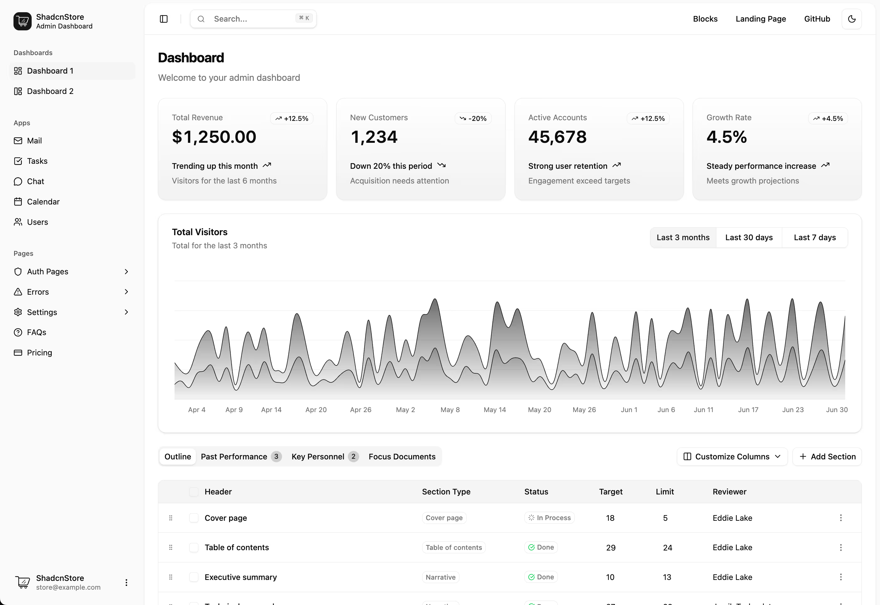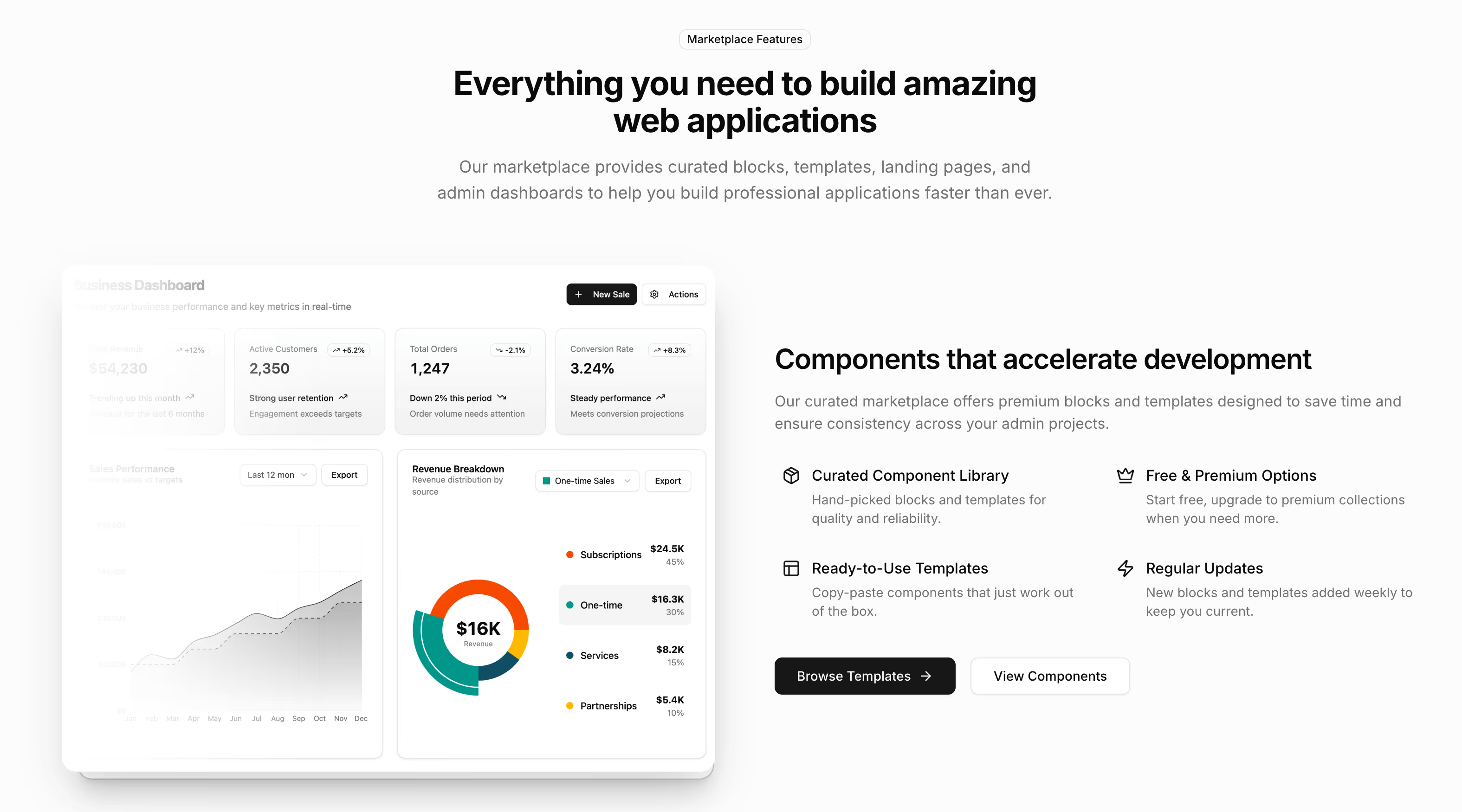





Shadcn UI marketing blocks for complete landing pages#
A landing page is not one component, it is a sequence of them making an argument in order. These sections cover that whole sequence, from the header a visitor lands under to the footer they leave from, built with shadcn/ui and Tailwind CSS and ready for your own copy.
What is a shadcn marketing block?#
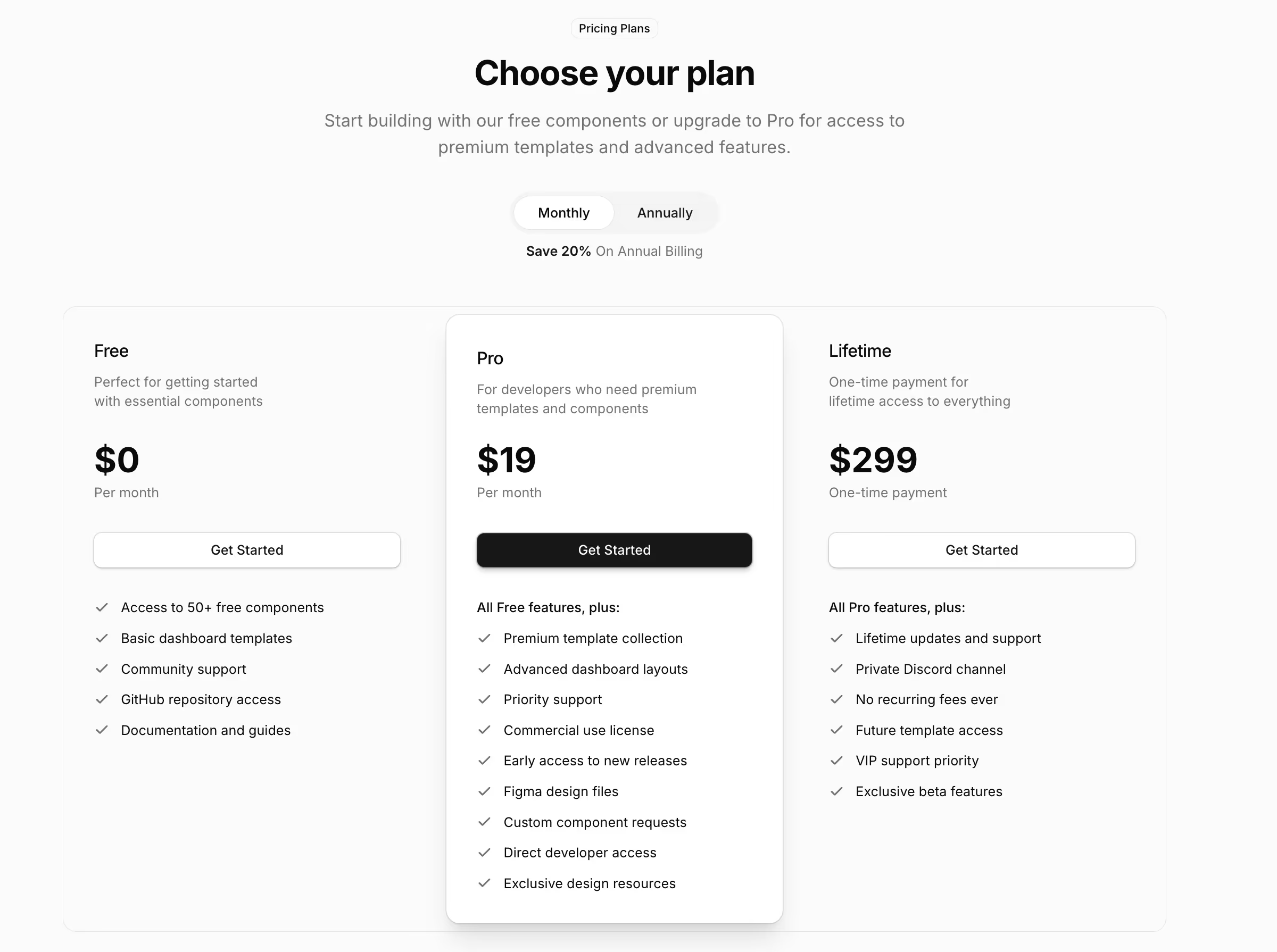
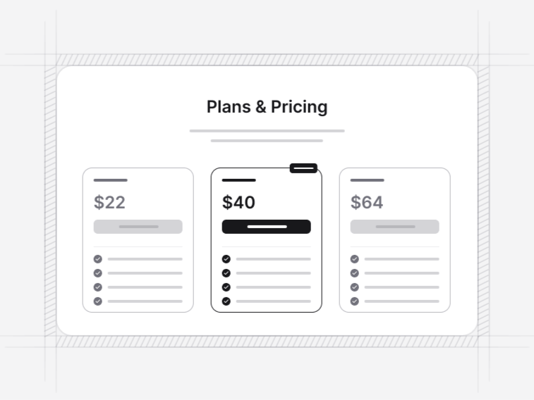
A marketing block is a finished page section rather than a primitive. A pricing table with a billing switch and per-plan feature lists, not a Card and a Button you assemble yourself. The shadcn CLI writes the section into your project as source code, so it becomes part of your codebase instead of a package you configure from outside.
A section in this collection usually brings:
- A layout that holds its proportions when your copy is longer than the sample
- A mobile arrangement that was designed, not inherited from a narrower desktop
- Content in a typed data file, so adding a plan, a quote or a menu group is a data change
- Focus and keyboard behaviour from the Base UI primitives underneath
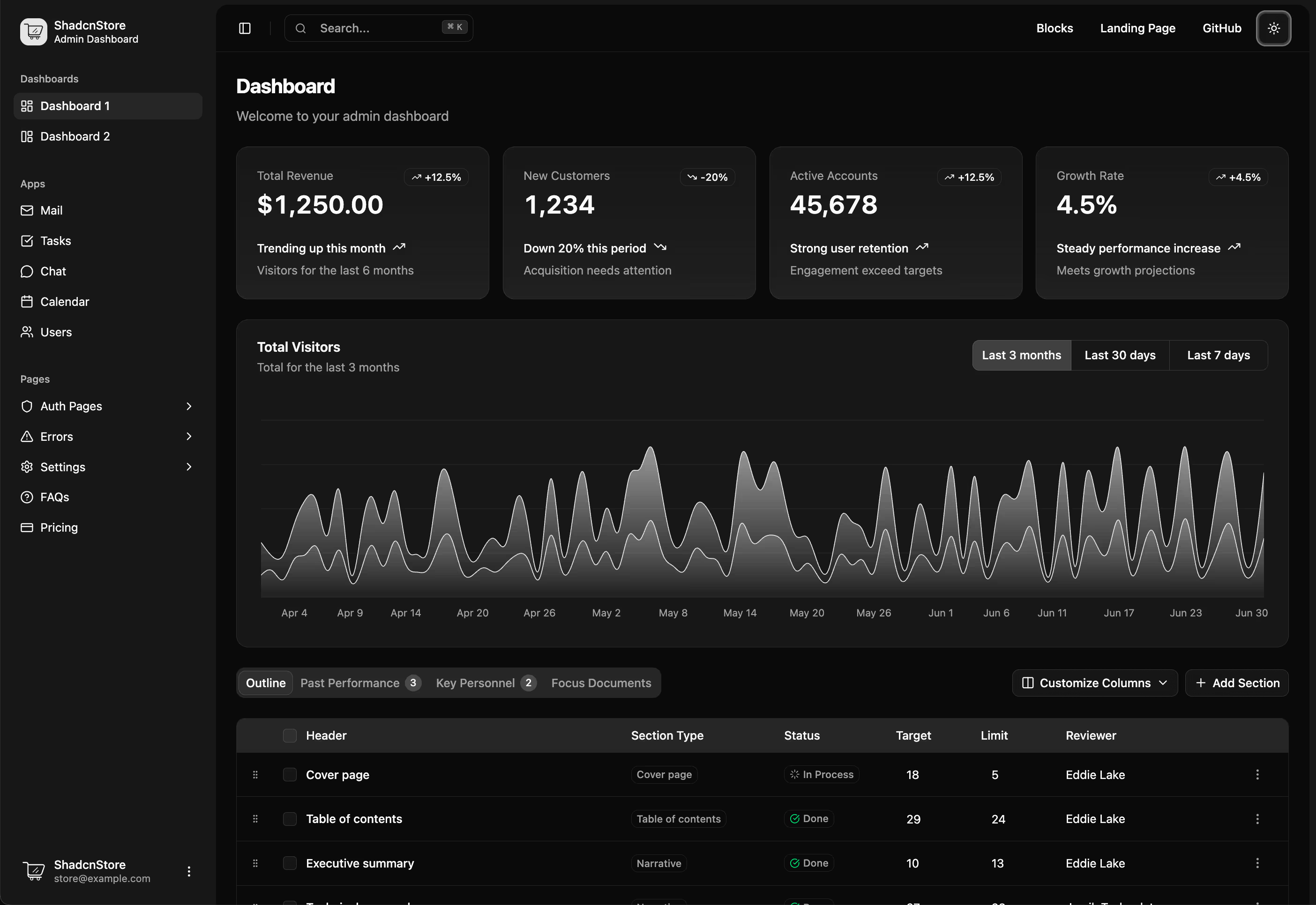
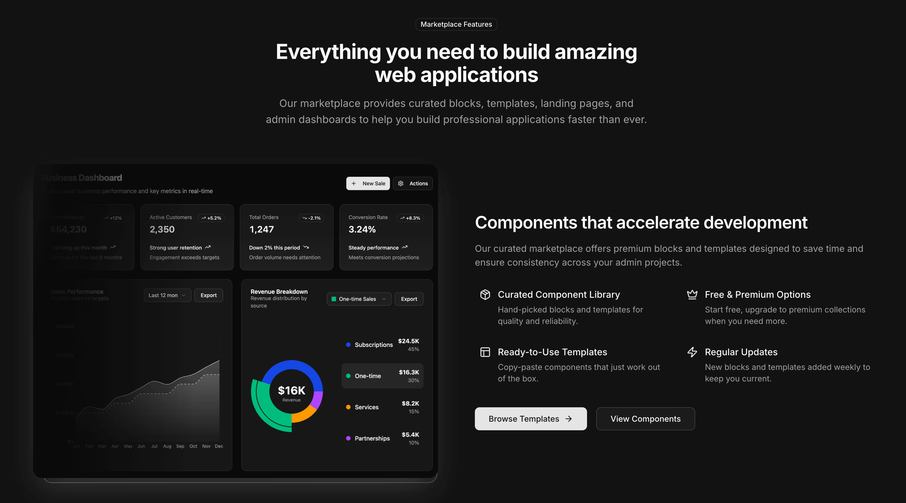
- Light and dark handled by theme tokens rather than a duplicated stylesheet
A landing page in the order it is read#
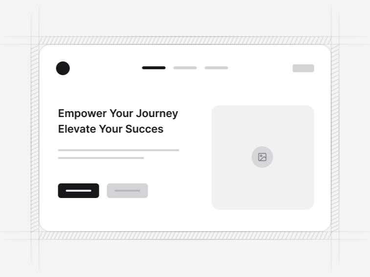
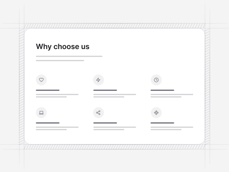
Open with a navbar and a hero section. Back the opening claim immediately with logo clouds or the social proof built into the hero itself. Explain the product through a features section or a bento grids when one capability deserves more space than the rest.
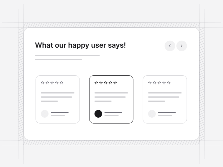
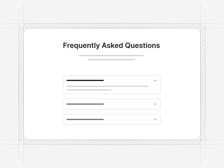
Put testimonials beside the claims they support rather than in one lump at the end. Then pricing tables, a comparison table when the plan cards cannot hold the detail, an FAQ section for what the page leaves open, and a CTA section once the case is made. Close with a footer section.
Sections beyond the landing page#
- Stats sections: counters and metric grids for the numbers a company can actually defend.
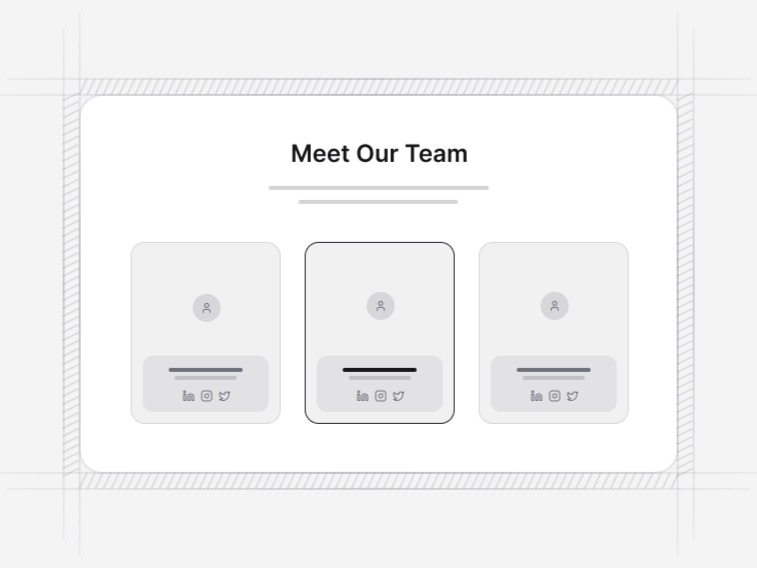
- Team sections: grids and a carousel for an about page, with roles, portraits and social links.
- Blog sections: index layouts plus a guide article page with a table of contents that tracks the reading position.
- Contact sections: forms with real validation, paired with maps, office details or common questions.
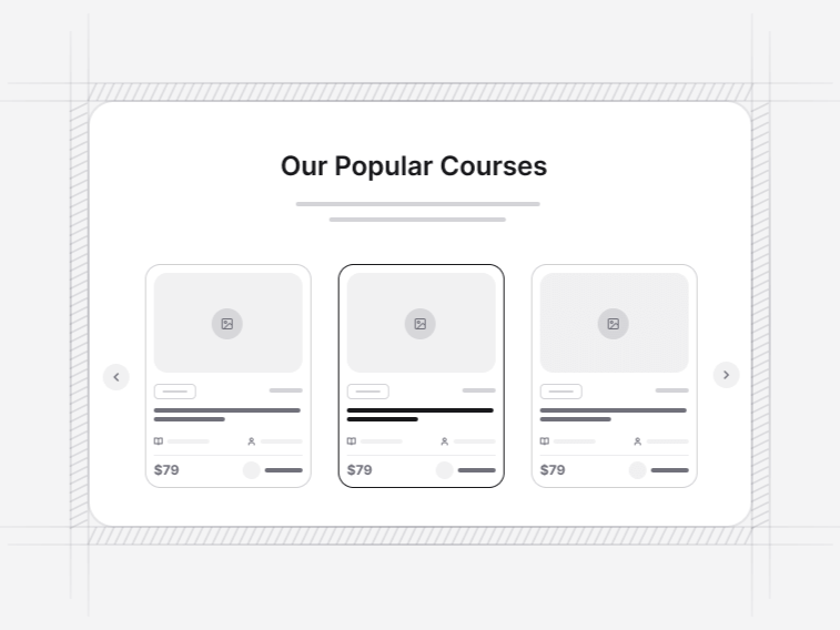
- Listing cards: repeating records a visitor scans and picks from, such as properties, jobs, courses or events.
- Banners: a dismissible announcement bar, a countdown promo, a consent bar and a site alert set.
- Product updates: release timelines with copyable version anchors, and boards that publish order rather than dates.
- Waitlist pages: position in line, referral mechanics, invite gates and a countdown that converts itself on launch day.
Where marketing blocks are used#
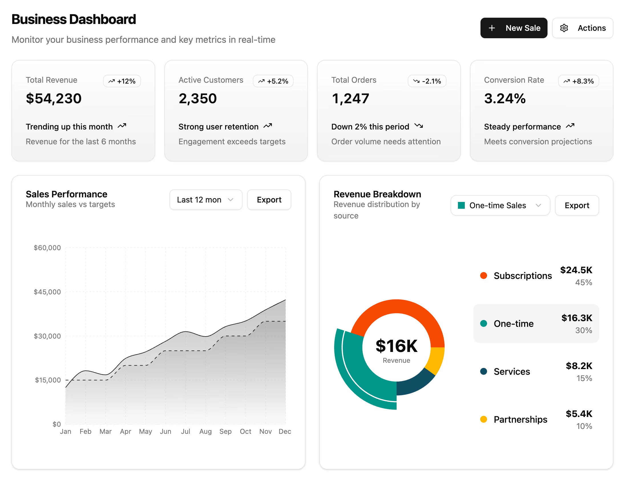
- SaaS launches: a dashboard-preview hero, a feature story, pricing with a billing switch, and an FAQ that answers the licensing question before support has to.
- Agencies and studios: a service listing, a team section and a contact form, where the work and the people are the product.
- Developer tools: a docs navbar, a changelog with linkable versions, and a comparison table against the alternatives your audience already knows.
- Pre-launch products: a waitlist page with a real position, a countdown banner, and nothing else until there is something to sell.
- Content sites: blog card grids, a newsletter footer, and an announcement bar that remembers it was dismissed.
Take a finished page instead#
If you would rather start from an assembled page than compose one, the landing page templates put these same sections together with the navigation and routing already wired. The Figma kit covers the design side, using the same names and tokens as the code.