Product filters, and the counting most of them get wrong#
A filter sidebar is easy to draw and hard to make correct. The layout takes an hour; the arithmetic behind the option counts takes considerably longer, and getting it wrong is why so many shops show a facet with twelve results that returns none. These five cover the layouts and the counting.
The five filter blocks#
- Category Filter 1: a horizontal bar with dropdowns and an active-filter display. Free, and the right choice when there are only three or four things worth filtering by.
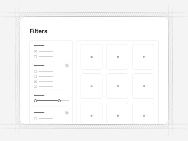
- Category Filter 2: a sidebar with expandable categories and subcategories, for a catalogue with real depth.
- Category Filter 3: a fuller sidebar with toggle-based selection and results that update as choices change.
- Category Filter 4: the mobile-first drawer, with a live result count that settles as you choose and applied-filter chips that stay visible after it closes.
- Category Filter 5: faceted search with correct exclude-own-facet counting, options that disable in place at zero, and a computed no-results suggestion.
Filter bar or filter sidebar#
A horizontal bar keeps the products higher on the page and reads better when the facet set is small. A sidebar carries more facets and lets somebody see the whole filter vocabulary at once, which matters when the catalogue is deep enough that people do not know what they can filter by.
The usual mistake is choosing the sidebar for a shop with four facets, which leaves a column of white space beside the grid, or choosing the bar for a shop with fifteen, which buries most of them behind a dropdown nobody opens.
Exclude-own-facet counting#
When somebody has selected Blue under colour, the counts shown next to the other colours must be computed as if no colour were selected, while still respecting every other active filter. Count colours against the fully filtered set instead and every unselected colour reads zero, which is technically true and completely useless.
Category Filter 5 implements that correctly. Options that genuinely reach zero disable in place rather than disappearing, so the list does not reflow under the pointer mid-click, and the vocabulary stays visible so somebody can see what they have ruled out.
Filters on a phone#
Category Filter 4 is a drawer, and the detail that makes it work is the result count updating as choices change. Somebody applying four filters blind and finding two products has wasted four taps; seeing the count settle at two before applying is what lets them back off one. Applied filters then stay visible as chips after the drawer closes, which is the part most mobile filter implementations drop.
When a filter combination returns nothing#
The empty result is a designed state, not an accident. Category Filter 5 computes a recoverable suggestion that names the filter to relax rather than printing a bare no-results message, which turns a dead end into one click back to a populated list. Every active filter stays visible so somebody can see exactly what they asked for.
Filters over any grid#
These work over a product grid most obviously, but nothing in them assumes a product. The same bars and sidebars filter a listing grid of properties, jobs or courses without modification. Upstream, product categories handle the coarse split that filters should not have to, and a storefront hero sets the context above both.