Signup forms and the onboarding that follows#
A signup form has one job, and almost every version of it fails the same way: by asking for things the account does not need yet. These layouts cover the short form, the multi-step wizard for products that genuinely need more, and the onboarding that should carry the rest.
The signup layouts in this collection#
- Signup Page 1: a card form with social options and the terms and privacy links under the button. Free.
- Signup Page 2: the multi-step form with progress tracking, for a flow with two or three genuine stages.
- Signup Page 3: the simple form with social authentication given the prominent position.
- Signup Page 4: a labelled card with a confirm-password field and social options above the fields.
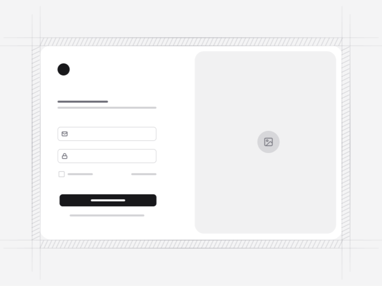
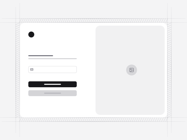
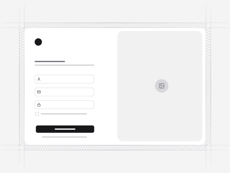
- Signup Page 5: a two-column layout with an illustration, for products where the sign-in screen carries brand.
- Signup Page 6: a split-screen signup with the card beside a product panel.
- Signup Page 7: the strict wizard. Each step blocks until it validates, and a review step lets somebody check everything before submitting.
One step or several#
Use one screen whenever the account can be created from an email and a password. Every extra field measurably costs completions, and anything you can ask after the account exists should be asked then, when the person has something to lose by leaving.
A multi-step form is right when the stages are genuinely different questions, such as an account, then an organisation, then an invite list. Signup Page 7 is the version to reach for, because it blocks per step rather than collecting everything and failing at the end. Being told on the final screen about an error three screens back is the worst outcome a wizard can produce.
Password rules people can follow#
Requirements are shown before the field is filled rather than as an error after submission, and the strength indicator updates as somebody types. Telling a person the rules only once they have broken them is the most common failure in this form, and it is entirely avoidable.
The confirm-password field is optional in these layouts. It is worth including when there is no email confirmation step, and worth dropping when there is, since a reveal toggle solves the same problem with less typing.
Social signup without the wall of buttons#
Where social options are offered, one method reads as the default rather than presenting six equal choices. A row of identical provider buttons is a decision handed to somebody who did not want to make one. The buttons call whatever handler you pass, so no identity provider is baked into the markup.
What these forms leave to your server#
They validate, disable the submit while a request is in flight, render the error and the success path, and nothing else. No account is created, no password is hashed, no token is issued. That boundary is what keeps the same screens usable over your own backend, a managed auth provider or a framework starter kit.
The rest of the account flow#
Signup is one screen of four. The verification pages handle the email confirmation or two-factor step immediately after, the login form is where everybody returns, and password recovery catches the ones who cannot. All four share a layout language, so an account flow does not change design halfway through, and they land inside the app shell once somebody is in.