A data grid is mostly the states around the rows#
Printing records into a table takes an afternoon. What takes months is everything around them: sorting that survives a reload, filters somebody can send as a link, a selection that stays put when the view changes, and the loading, empty and error screens the table spends a surprising amount of its life in. These data grids are built around that second part.
The datatables in this collection#
- Datatable 1 (user management): search, filters, pagination and per-row action menus, with avatars, roles, login status and two-factor badges. The free one, and the right starting point for a first admin screen.
- Datatable 2 (user records): the same job with statistics cards above the grid, role icons, plan details, filter dropdowns and bulk actions.
- Datatable 3 (product inventory): images, SKU tracking, quantity badges, star ratings and stock alerts, sized for a catalogue rather than a user list.
- Datatable 4 (orders console): analytics cards, a command palette, tabs, column visibility control, a multi-filter system and a full status workflow. The densest of them.
- Datatable 5 (server-state table): sort, filter and page state synced to the URL, saved views, faceted filters, async states and a record detail panel. This is the one for data that lives on a server.
Client-side or server-side data#
Datatables 1 to 4 sort and filter in the browser, which is correct up to a few thousand rows and much simpler to wire. Past that the browser is doing work the database should, and Datatable 5 is the answer: it drives its state from the URL, so the page, the sort and the filters are query parameters your loader can read directly.
URL state matters for a second reason. A filtered view becomes a link, so a colleague can be sent the exact screen instead of a set of instructions. That single property is what turns a report into a tool.
Selection, bulk actions and the action bar#
Row selection is real state, with a bulk action bar that appears when something is selected and a select-all that distinguishes the current page from every matching record. Getting that distinction wrong is how bulk operations delete the wrong thing, so it is explicit rather than implied by a header checkbox.
What a data grid does on a phone#
Each table chooses which columns matter and drops the rest, rather than keeping all twelve and pushing the grid into a horizontal scroll. Which column survives is a decision made per table, because the answer for an orders console is not the answer for an inventory list. It is the only approach that reads well, and it is why these are separate blocks rather than one component with a prop.
Using these with TanStack Table#
The grids are composed from the shadcn/ui table primitives, so a TanStack Table instance can drive them without touching the markup. Nothing in the presentation layer assumes where sorting, filtering or pagination are computed, which means you can start with the built-in client-side state and move to TanStack or a server loader later without redesigning the screen.
Where a datatable sits in the product#
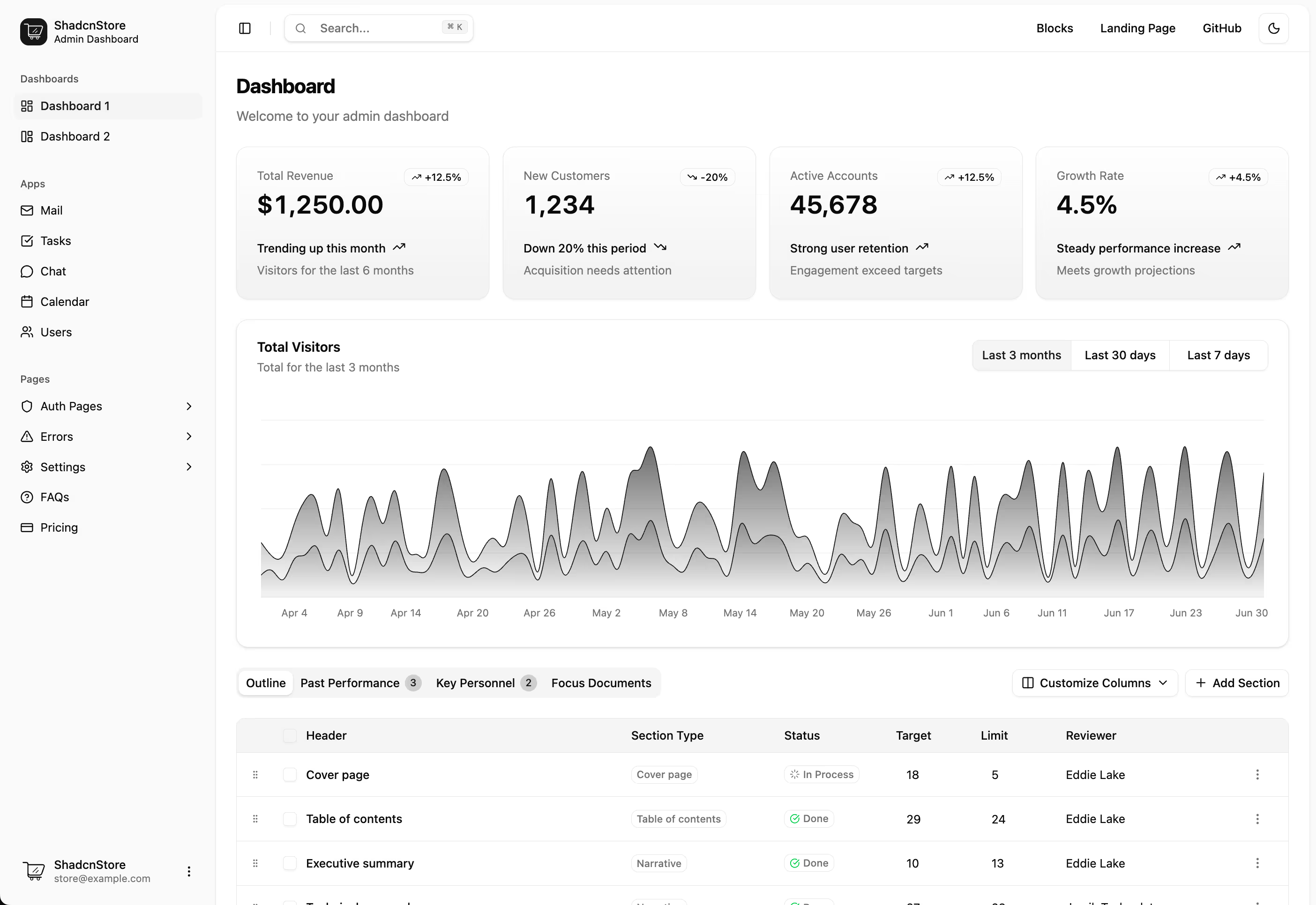
Inside an app shell, usually under a row of KPI cards and beside the charts that show the same data as a trend. For a shop, the order history table is the same idea aimed at orders, and complete app screens cover the cases where a list needs a detail pane rather than a row of actions.