Dashboard charts that read your theme#
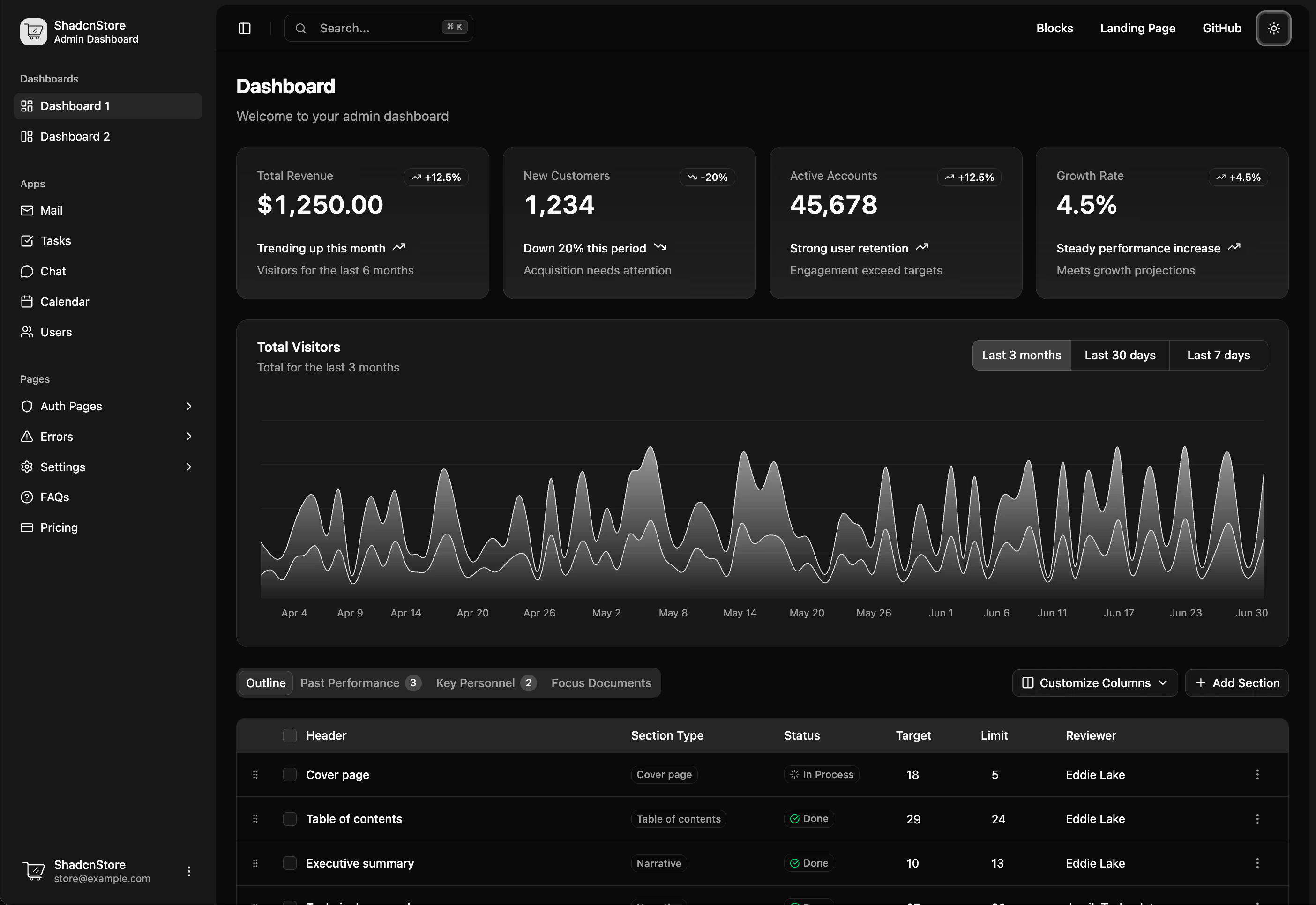
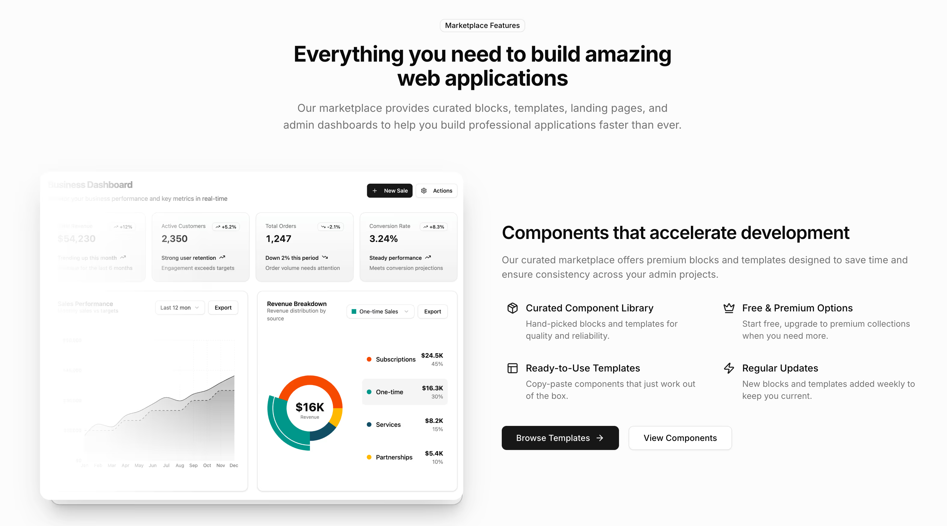
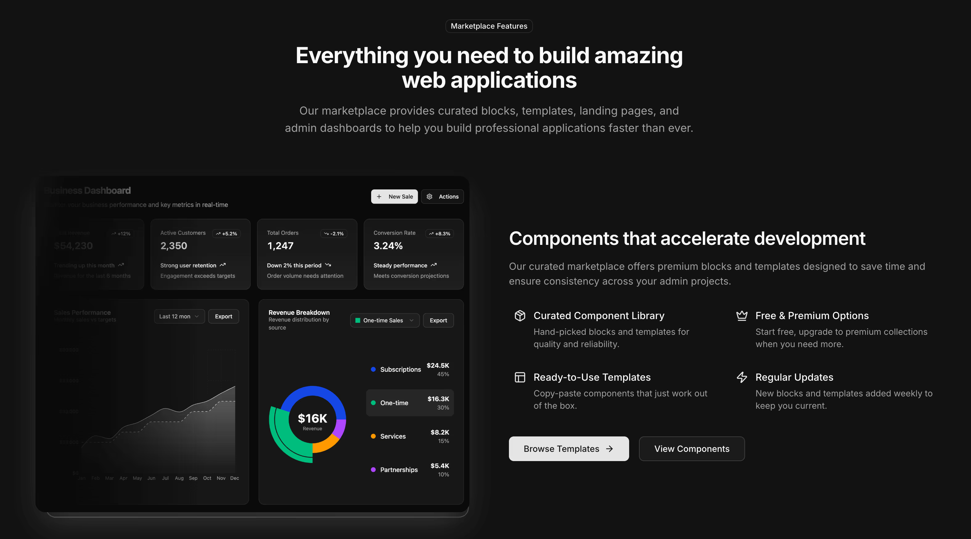
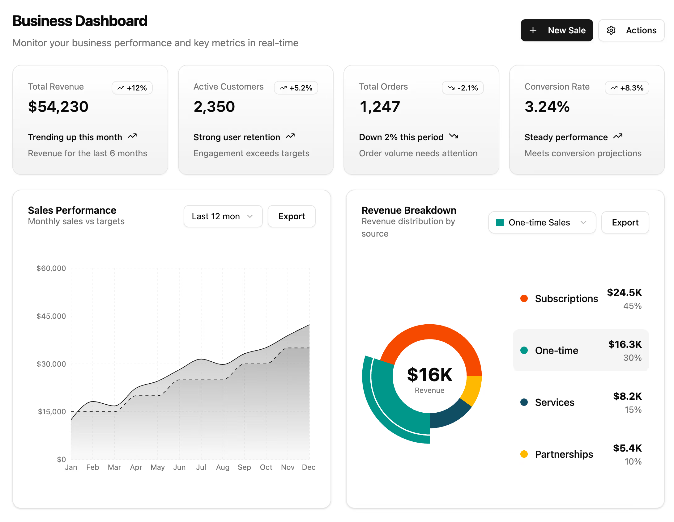
A chart that ships its own colour scale is a chart that will clash with your product the day somebody changes the accent colour. These are built on Recharts, the same library shadcn/ui charts use, and take their colours, grid lines and tooltips from CSS variables, so they follow the theme in both light and dark mode without a second configuration.
The six chart sections in this collection#
- Chart 1 (sales and conversion): a combined bar and line chart on dual axes, showing monthly volume against a conversion rate. Free, and the simplest useful pairing of a count with a percentage.
- Chart 2 (revenue against target): bars for performance with a line for the target and growth percentages, plus interactive time-period filters.
- Chart 3 (product analytics): sales and volume metrics with trend indicators and an activity feed beside the chart.
- Chart 4 (tabbed financials): income as an area chart, expenses as a radial chart and profit as bars, switched by tabs so one card covers three questions.
- Chart 5 (time-range earnings): an area chart with one day, five day, one month, six month and one year tabs, redrawing per range.
- Chart 6 (radial performance): radial progress rings with a department breakdown and visitor statistics.
Which chart type answers which question#
- Line and area: a value over time, where the shape of the trend is the point.
- Bar: comparison between categories, or a count per period where individual values matter more than the slope.
- Combined bar and line: a count and a rate together, which needs two axes and is the pairing most dashboards actually want.
- Radial and gauge: progress toward a known maximum. A radial reads badly for anything unbounded, so use it for quota, capacity or completion and nothing else.
- Stacked: composition, when the total matters as much as the parts.
Gauge and radial progress charts#
Chart 6 is the dedicated radial section, with progress rings sized for a dashboard card, and Chart 4 carries a radial view inside its tabbed layout. Both are gauge-shaped in the sense that matters: a value drawn against a fixed maximum, with the number printed rather than left to be estimated from the arc.
Worth stating plainly: this collection covers time series, categorical comparison and radial progress. It does not include a Gantt chart, a Sankey diagram or a geographic map. If a project timeline is what you need, the resource timeline calendar is the closer fit, since it draws bookings against hours with overlap handling.
Making a chart honest#
Axes start at zero unless there is a stated reason not to, because a truncated axis turns a two percent change into a cliff. Tooltips print the real value rather than a rounded one. Empty and loading states are part of the card instead of a chart drawn over no data, which is how a dashboard ends up confidently showing zero when a query has simply failed.
Charts inside a dashboard#
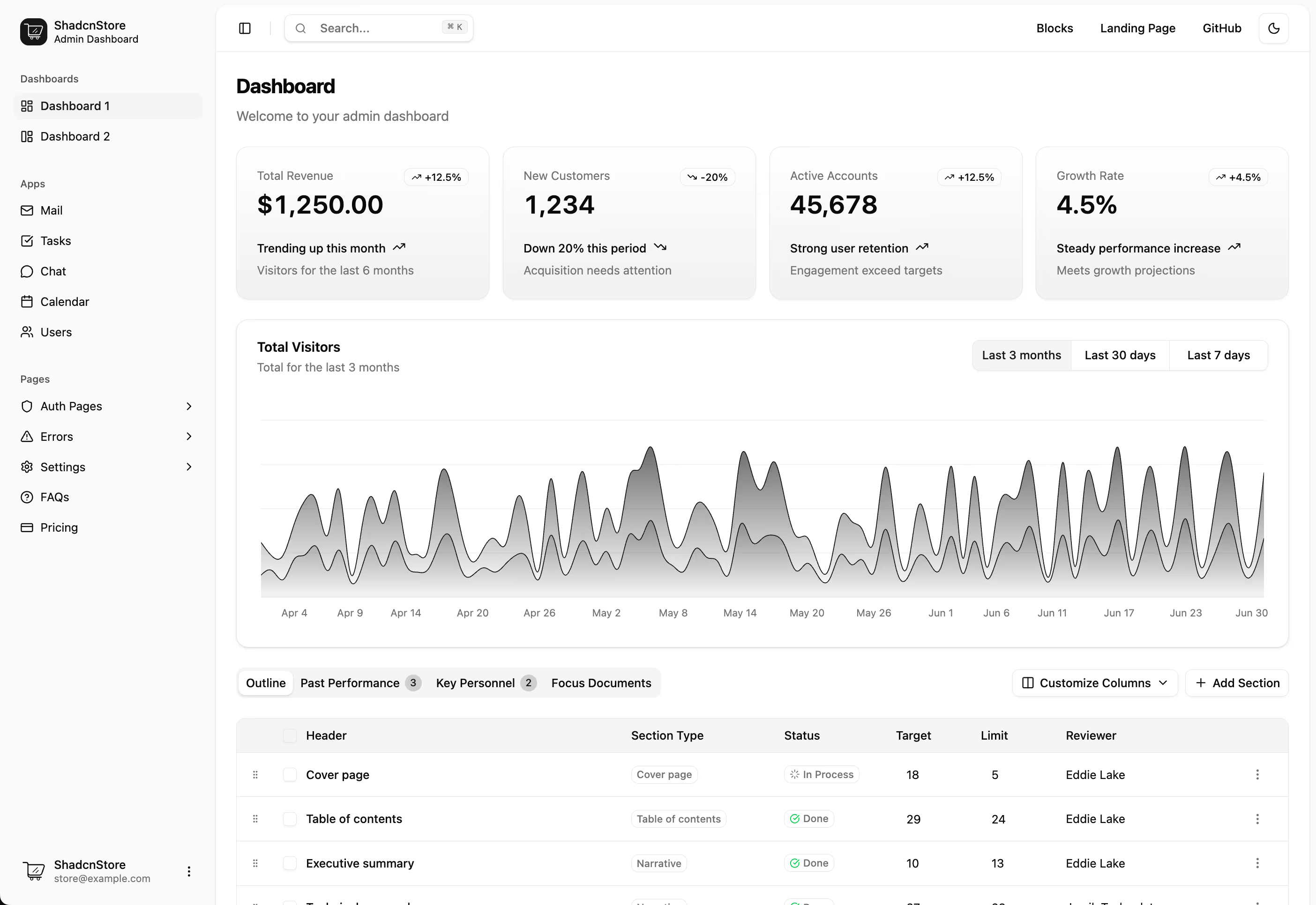
A chart section rarely stands alone. Put it inside an app shell, under a row of KPI cards that carry the headline numbers, and beside a datatable holding the records the chart summarises. For a marketing page rather than a product, the stats sections are the right size.