Product category blocks, the step before the grid#
A category block earns its place when a grid of products would answer the wrong question. If somebody arriving on your home page could plausibly want any of six unrelated departments, the extra click is cheaper than the wrong grid.
The seven category blocks#
- Product Category Card 1: a four-up grid of subjects with a view-all action. Free.
- Product Category Card 2: image-based cards with overlay text and trending badges. Free.
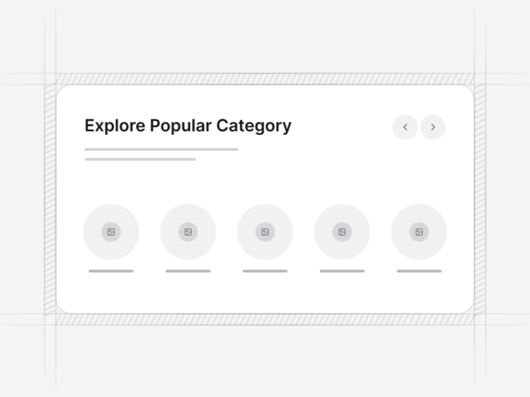
- Product Category Card 3: a seven-column strip of small image tiles.
- Product Category Card 4: a grid with icon avatars and item-count badges.
- Product Category Card 5: a detailed list with icons, subcategories and search.
- Product Category Card 6: a curated layout with status badges such as trending and featured.
- Product Category Card 7: a three-up grid badged for new arrivals, best sellers and sale.
How deep the catalogue is#
Under about a dozen departments, a card or image grid is the right shape and everything is visible at once. Past that, Product Category 5 is the answer: a list with subcategories and search, because scanning tiles stops working when there are forty of them and no reader gets to the bottom.
Images, icons or counts#
Product Category 2 is built around photography and needs one usable image per tile, which is a real commitment. Where you do not have that, the icon and count layouts read far better than a grid of stock pictures that do not match your products. Item counts are also genuinely useful, since a department with four products and one with four hundred deserve different expectations.
Badges that mean something#
Trending, new and featured badges only work if they change. A permanent trending badge is furniture, and shoppers learn to ignore it within one visit. Drive them from real data or leave them off.
How many products behind each tile#
A category with three products and a category with three hundred should not look identical. The count badges in Product Category 4 are the cheapest fix, and where the imbalance is severe the honest answer is to merge the thin departments rather than dress them up. A shopper who clicks a tile and finds two items learns not to trust the next tile.
Naming categories#
Use the words customers use, not the internal merchandising term. The category name is also a URL and a heading, so it carries search weight, and a department called Solutions ranks for nothing and helps nobody.
Where categories sit#
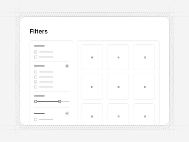
Directly under the storefront hero, and often repeated as a strip further down for the visitor who scrolled past. Each one leads to a product grid with filters, which is where the coarse split you made here stops being enough.