Team sections that introduce people, not headcount#
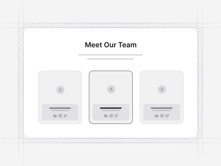
A team section works when it makes a company feel like a set of people rather than a logo. These nine differ in how much they say about each person and how many they can hold before the page turns into a directory.
The nine team layouts#
- Team Profile 1: an agent grid whose cards carry listing counts, languages and a profile link. Free.
- Team Profile 2: a four-up grid with a count under each portrait. Free.
- Team Profile 3: a twelve-column carousel with avatars, roles and a view-all action.
- Team Profile 4: a four-up grid carrying a portrait, a name and a role and nothing more.
- Team Profile 5: an instructor grid pairing the avatar with course and student counts.
- Team Profile 6: a four-up grid with full-bleed portraits and role captions.
- Team Profile 7: a three-up grid with call and email actions on every card.
- Team Profile 8: a corporate grid with a role badge on each portrait.
- Team Profile 9: an executive layout pairing portraits with location, experience and project counts.
Grid or carousel#
A grid shows everyone at once and suits a company of up to about a dozen. Past that the section becomes the longest thing on the page. Team 3 is the carousel, which keeps it short and lets the founders be read first without hiding the rest of the team.
Photographs, and what to do without them#
Use the initials fallback rather than mixing one studio portrait with five phone snaps. An inconsistent photo set reads worse than no photos at all, and the avatar component falls back to initials on the same coloured surface, which looks deliberate. If you can only photograph half the team, photograph none of them until you can do the rest.
Roles, links and what each card should say#
Name and role are the minimum. A social or profile link earns its place when the person maintains one; a dead LinkedIn from a previous job does not. Team 7 puts direct call and email actions on the card, which suits agents and consultants where contact is the point, and suits almost nobody else.
Each member is one entry in a typed data file, so adding a person is a data change rather than a markup change, and role badges are optional per member for the common case where only some of the team have public profiles.
Keeping it current#
A team section is the page that goes stale fastest and the page a candidate checks hardest. Somebody who left six months ago still smiling on the about page says more about the company than the copy does. If you cannot commit to editing it, use a smaller leadership set rather than the whole company.
Where a team section belongs#
On an about page, or near the end of a landing page once the product case is made. It pairs naturally with a stats section for company numbers and a contact section as the next step, and testimonials do the credibility job that a team photo cannot.