Home / Blocks / Marketing / Contact Sections
6 blocks in this section

Shadcn Contact Form Sections

Choose a focused form or give visitors more context with company details, an office map, team contacts, social links, or nearby FAQs.

How it works

Three steps to working code

Install a block and the files land in your repository. Nothing calls back to us.

  1. terminal

    $ npx shadcn@latest add @shadcnstore/contact-section-1

    ✓ Checking registry

    ✓ Installing dependencies

    01

    Run one command

    Every preview above prints its own. The CLI writes the block and the components it needs into your project.

    Installation docs
  2. your project 3 files added

    components/

    ├─ ui/

    ├─ button.tsx

    └─ navigation-menu.tsx

    └─ contact-section-1.tsx

    02

    Get real files

    React, TypeScript and Tailwind v4, with no framework imports. Next.js, Vite, Remix and Astro all work.

  3. contact-section-1.tsx

    <Menu.Trigger

    - asChild

    + render={<button />}

    />

    03

    Edit it as your own

    Built on Base UI, not Radix, so keyboard and focus behaviour come from the primitive.

Blocks that hold state already carry the use client directive the Next.js App Router needs.

Guide

Contact sections that get a useful message#

A contact form is a filter as much as an inbox. The fields decide whether you receive a useful enquiry or three follow-up emails establishing what the person wanted. These six differ in what they put beside the form.

The six contact layouts#

  • Contact Form 1: a minimal form with the essential fields. Free.
  • Contact Form 2: the form alongside company information cards.
  • Contact Form 3: the form with a location map and office details.
  • Contact Form 4: a two-column layout with the form beside contact details.
  • Contact Form 5: the form paired with frequently asked questions.
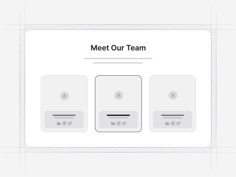
  • Contact Form 6: the form with team member cards and social links.

Which layout for which business#

Contact Section 1 when the form is the whole page. Contact Section 3 when a physical address matters, which is most local and appointment-based businesses. Contact Section 5 when a measurable share of your messages are questions already answered somewhere, since putting those answers beside the form reliably reduces the volume.

How the validation behaves#

Fields validate on blur and again on submit, errors are tied to their input with the correct accessible attributes, and the message names what to fix rather than saying the form is invalid. Announcing errors properly is the part most hand-built forms miss, so it is handled here rather than left to you.

What the form does not do#

It sends nothing. The block is the interface, including the submitting state, the success confirmation and the failure path when the request does not complete. You wire the submit handler to your own endpoint, a form service or a server action, so no third-party provider is baked into the markup.

Spam protection is the same story. A captcha or token check belongs on your server; a client-side block cannot honestly claim to stop anything, and the submit handler is where you add it.

Asking for less#

Every field costs completions. Name, email and message are usually enough, with anything else earning its place by changing how you route or answer the enquiry. A company-size dropdown on a form nobody segments by is pure friction.

What sits around a contact section#

An FAQ section is the highest-value neighbour and Contact Section 5 already carries one. A team section above it makes the message feel addressed to somebody, and the footer should repeat the direct contact details for people who never fill in forms.


FAQ

Contact Sections questions, answered

What people ask before choosing a block from this collection.

No, and that is intentional. The blocks are the interface, including validation, error states and the submitted confirmation. You wire the submit handler to your own endpoint, form service or server action, so no third-party service is baked into the markup.
Fields validate on blur and again on submit, errors are tied to their input with the correct accessible attributes, and the message is specific about what to fix. Announcing errors properly is the part most hand-built forms miss, so it is done here rather than left to you.
Contact Section 1 when the form is the whole page. Contact Section 3 when a physical address and a map matter, which is most local businesses. Contact Section 5 pairs the form with common questions, which measurably cuts the number of messages you have to answer twice.
No. Adding a captcha or a token check belongs on your server, and a client-side block cannot honestly claim to stop anything. The submit handler is the place to call it.
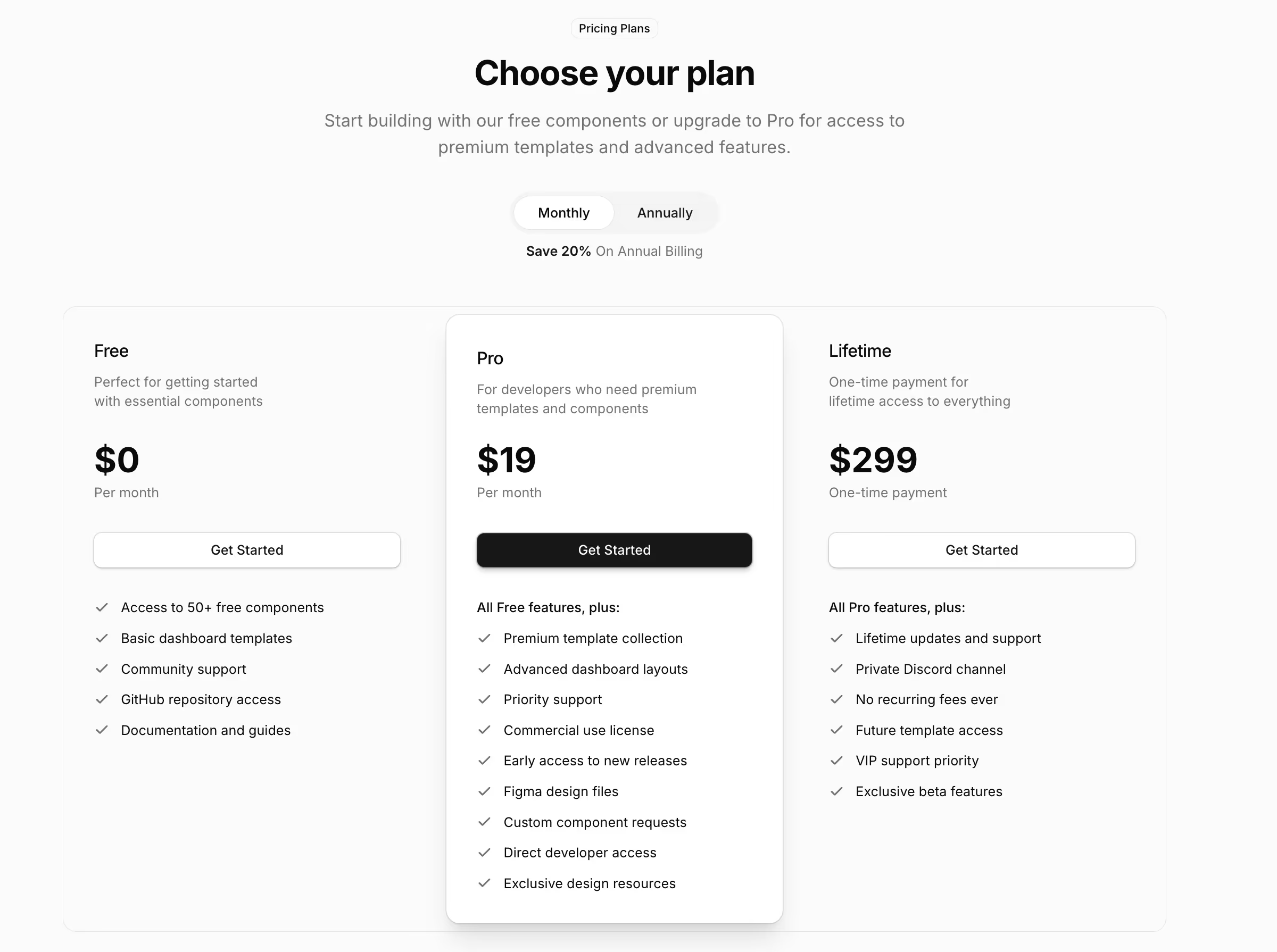
Contact Section 1, the minimal form with essential fields, is free. The information-card, map, two-column, question and team variants are Pro. See the pricing page.

Documentation

The components behind these blocks

How to install, customise and combine the shadcn/ui components this collection is built from.

Free & Premium Templates

Launch Faster with Complete Templates

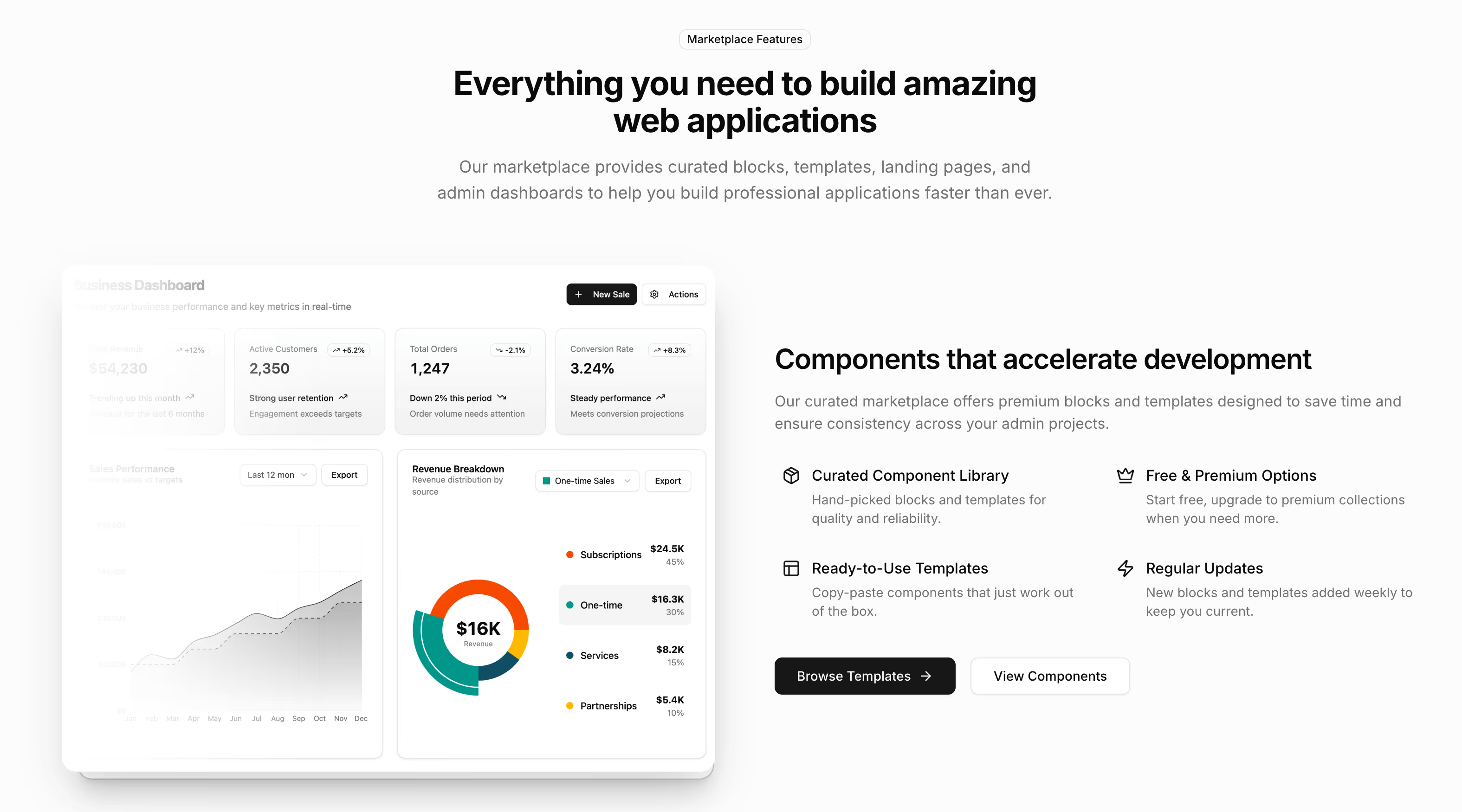
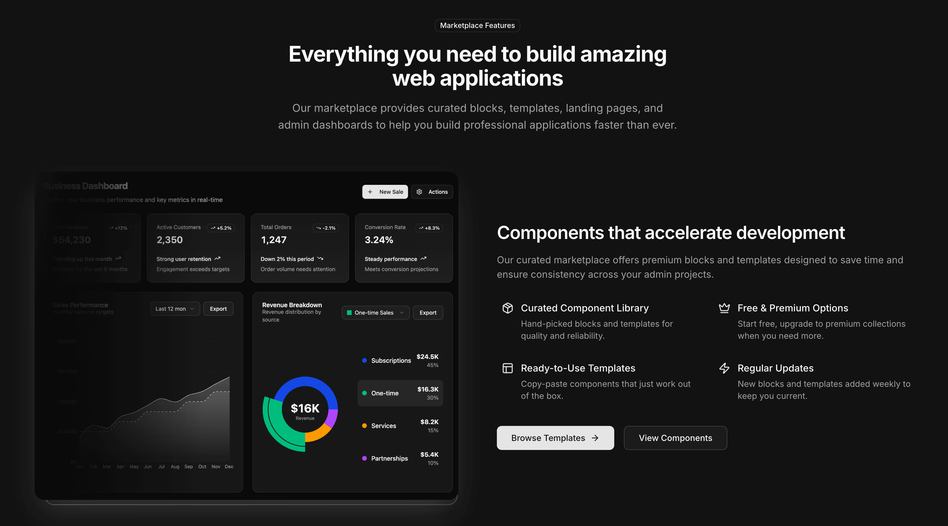
Love these blocks? Get our free dashboard and landing page templates with 30+ pre-built pages and all the components you need. Premium templates with advanced features launching soon at $69.

Free Templates Now
30+ Pages Included
Premium Coming Soon