Checkout forms where the states are the work#
A checkout is the screen with the least tolerance for a rough edge. Every field that validates late, every button that can be double-clicked, every error that does not say what to fix costs a real order. They cover the layouts and, more importantly, the states around them.
The checkout blocks#
- Checkout Form 1: the straightforward form with the essential fields. Free, and enough for a small shop with one shipping option.
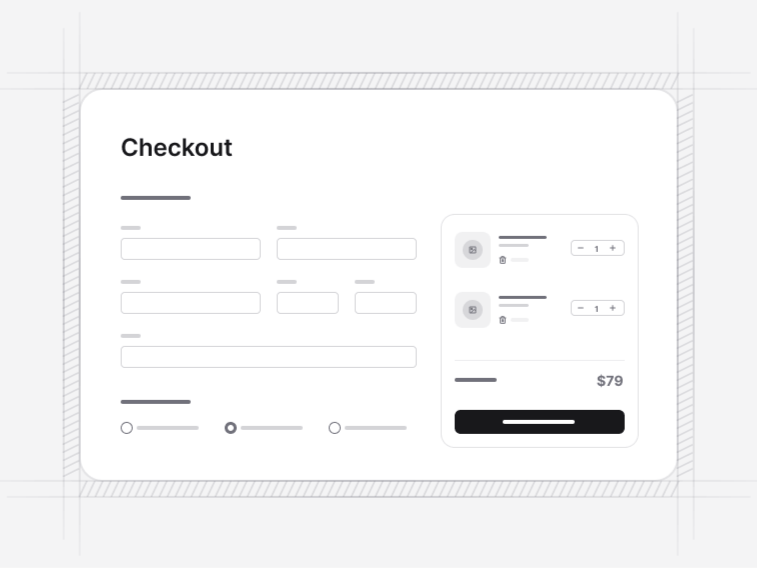
- Checkout Form 2: a single-page checkout with the order summary beside the fields, which is the fastest layout when the form is short.
- Checkout Form 3: the guided multi-step version with a progress indicator and per-step validation.
- Checkout Form 4: a checkout built around saved presets, for returning customers with stored addresses and cards.
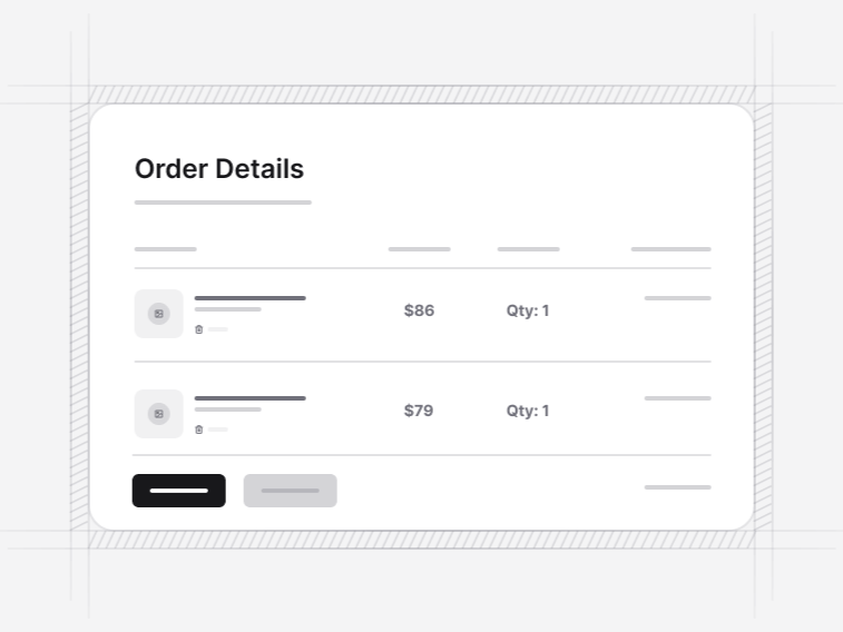
- Checkout Form 5: the order confirmation page, with a fulfilment timeline, line items and totals.
- Checkout Form 6: the advanced input set. An async address combobox, delivery preference tags, a date range picker, phone entry with one-time-code verification and currency-formatted totals.
Single page or multi-step#
Single page wins whenever the form fits on one screen without scrolling past the summary, because every step transition is a place to abandon. Multi-step wins when address, delivery and payment each need real attention, or when the delivery options depend on the address and cannot be shown before it.
Whichever you pick, the order summary stays visible. A checkout that hides the total while asking for a card is asking somebody to trust a number they can no longer see.
Guest checkout and accounts#
The forms do not require an account, and that is deliberate. Forcing registration before purchase is one of the most reliably measured causes of abandonment. Offer the account after the order, when the person has an order number worth saving.
Address entry that does not fight the customer#
Checkout Form 6 uses an asynchronous combobox for the address, calling whatever lookup service you supply, with manual entry always available underneath. Autocomplete that cannot be escaped is worse than none, because there is always an address it does not know, and that customer still wants to buy.
The same block covers phone verification with a one-time code, a delivery date range and currency formatting that respects the locale rather than assuming a dollar sign.
Payments and where the risk sits#
None of these blocks takes a payment. They render the card fields, the disabled submit while a request is in flight and the declined state, and they hand off to your server. A front-end block that claimed to process a payment would be misdescribing where the risk and the compliance actually live.
What that leaves you is the part worth having: a form that behaves correctly while the network is slow, and error copy that names the fix rather than saying something went wrong.
Before and after the checkout#
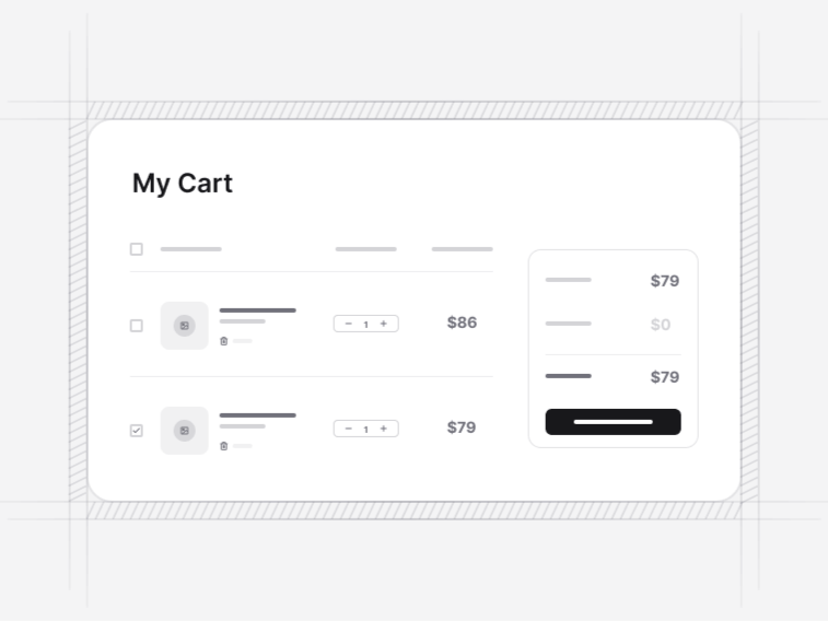
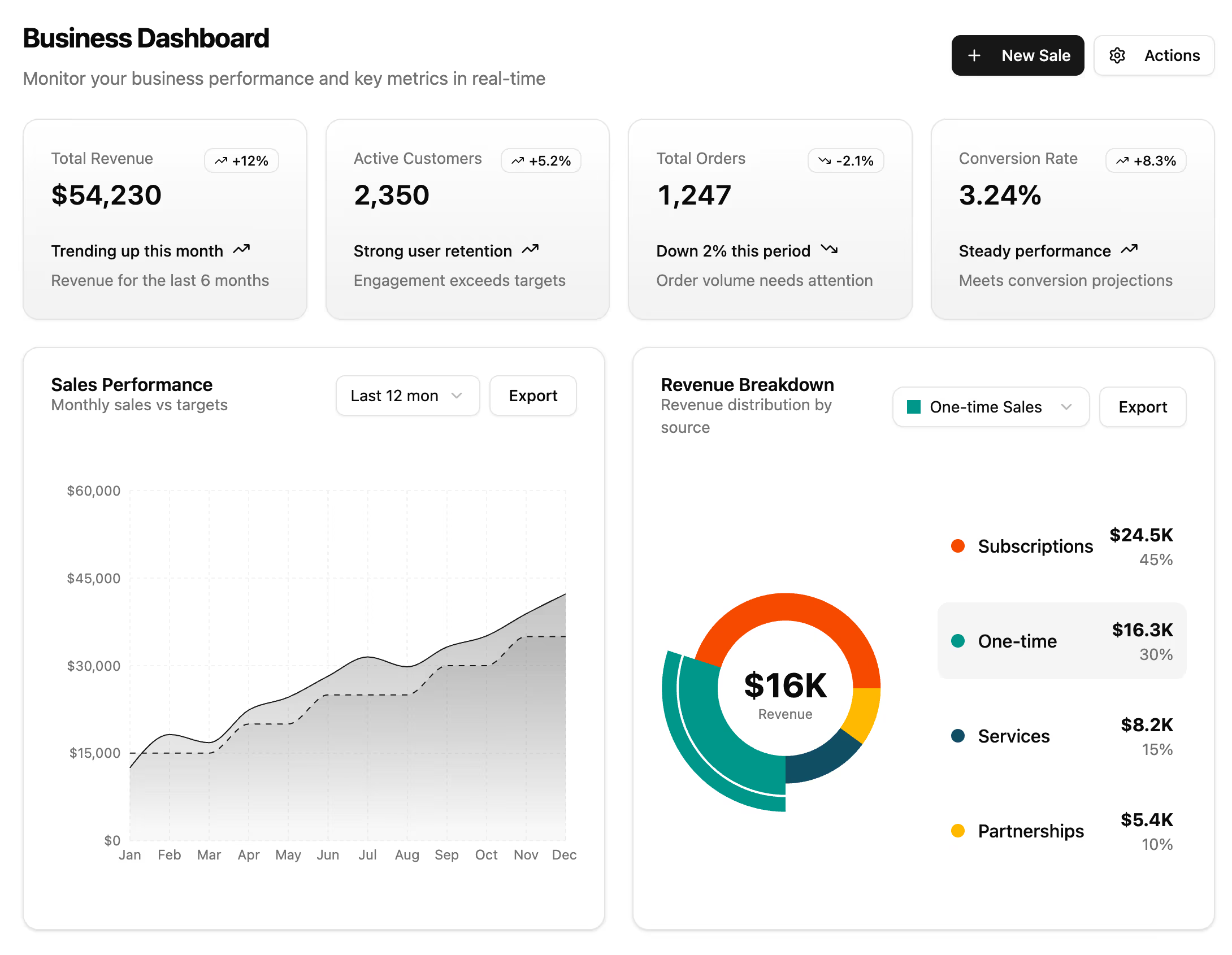
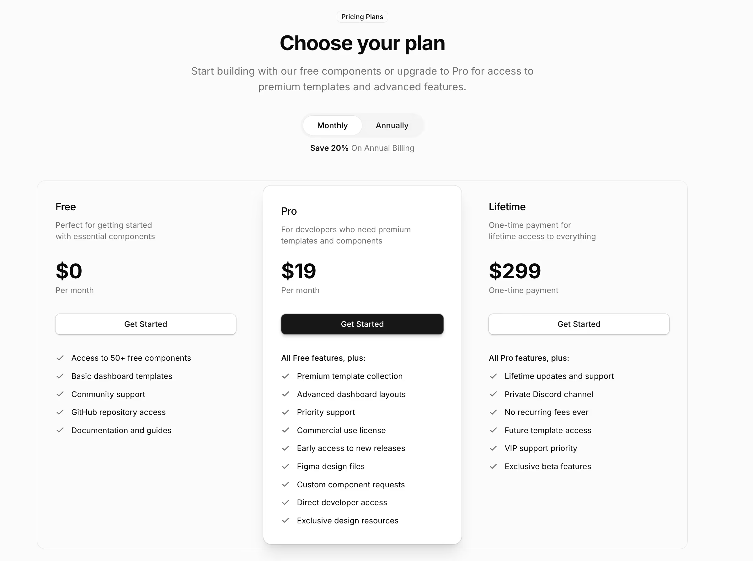
A shopping cart comes immediately before, and the confirmation hands off to order history for a customer who wants to look it up later. Upstream, the product detail page is where the variant and quantity were chosen, and for a subscription the pricing table is what sets the expectation the checkout has to match.