Feature sections that explain rather than list#
A features section has to turn a list of capabilities into a reason to care. The layouts here differ mainly in how much room they give each item, which is really a decision about how much explaining a feature needs.
The twelve feature layouts#
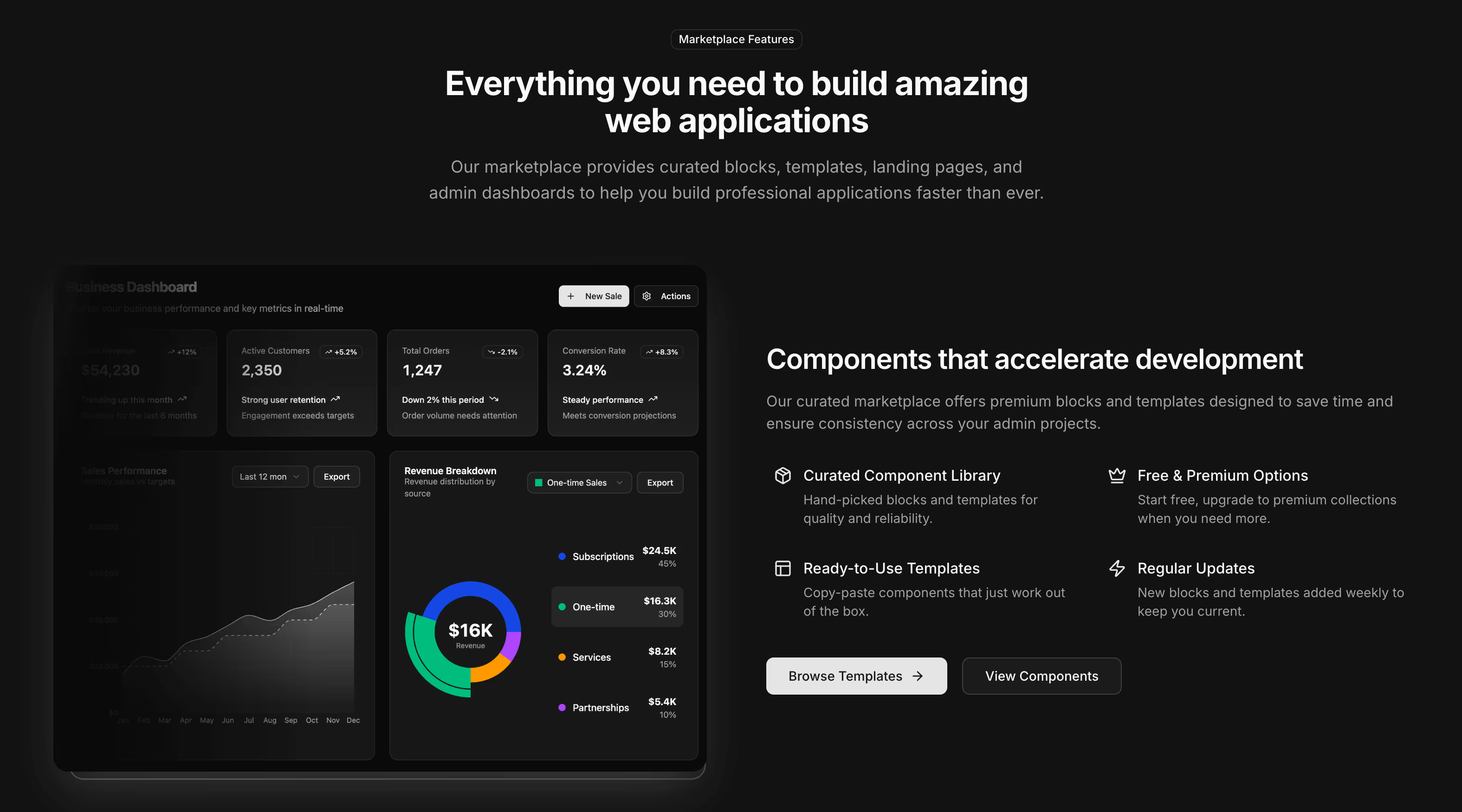
- Feature 1: a four-up grid of icon cards under a badge heading, closing on a call to action. Free.
- Feature 2: a two-column list paired with an image and no card chrome. Free.
- Feature 3: a dual-image layout with four benefit rows beside the photography.
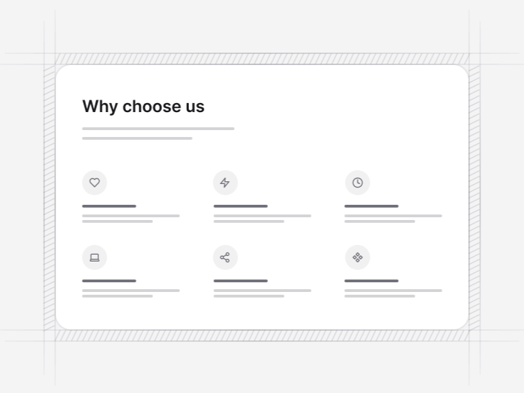
- Feature 4: a two-by-three grid, the largest set that still scans in one pass.
- Feature 5: three cards on a dot-pattern surface, where the pattern does the separating a border would otherwise do.
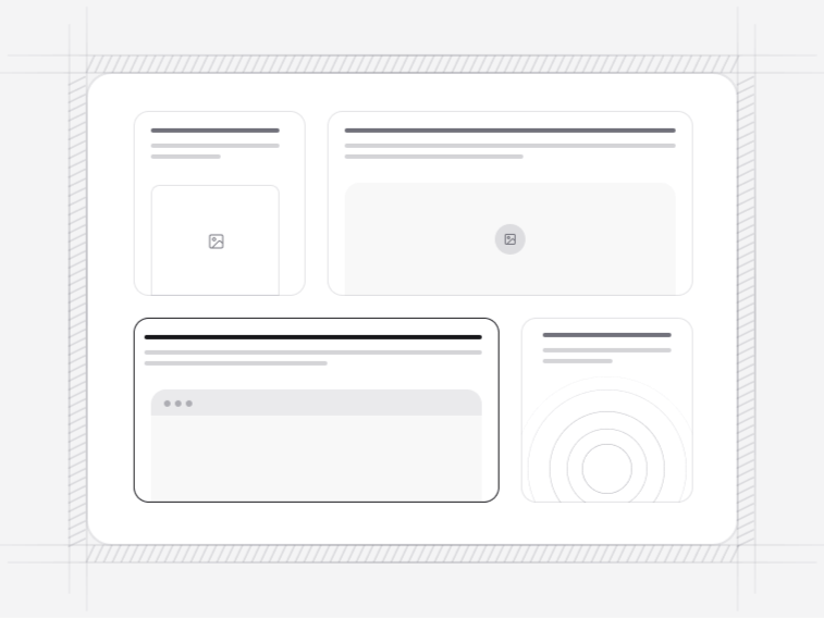
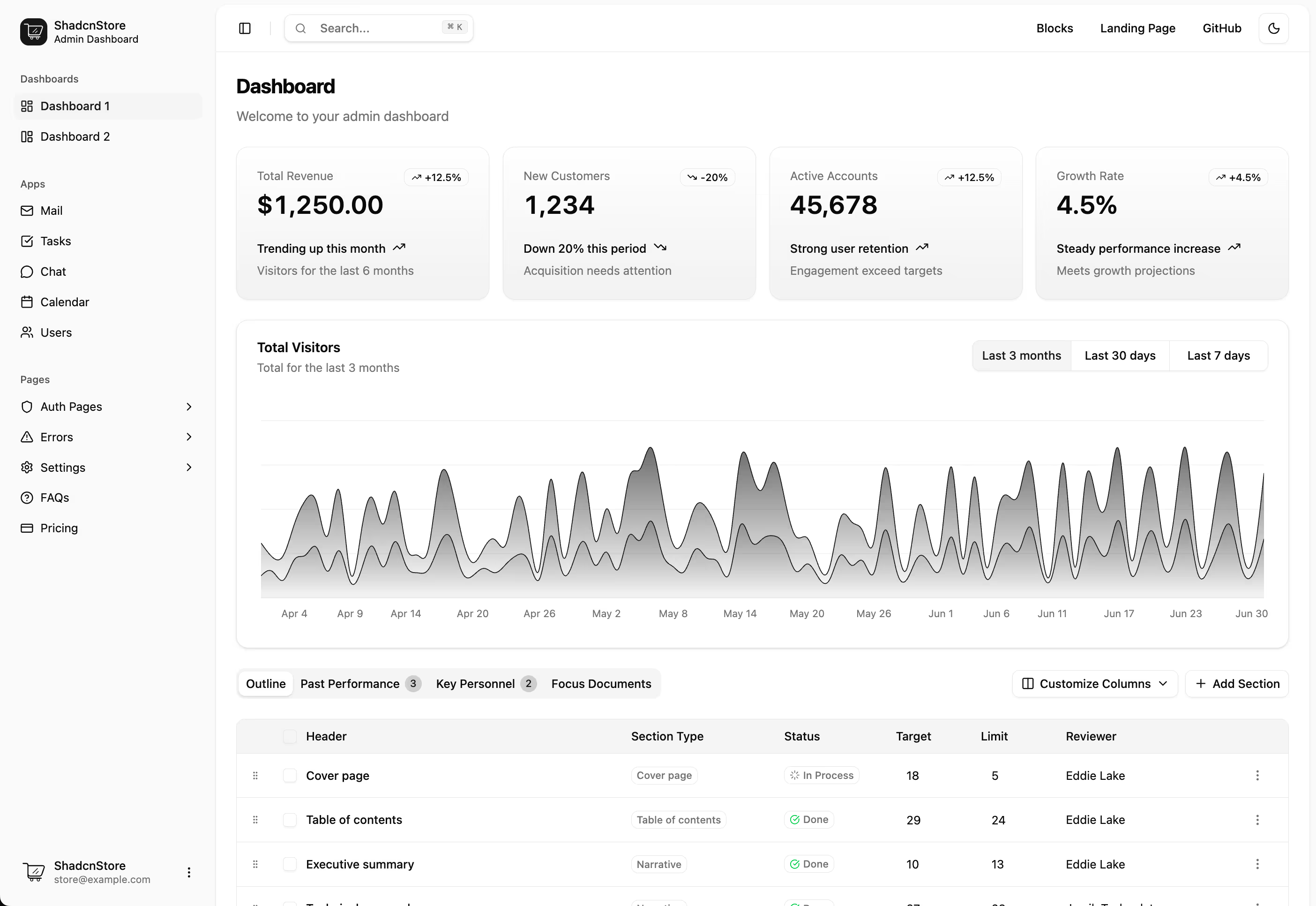
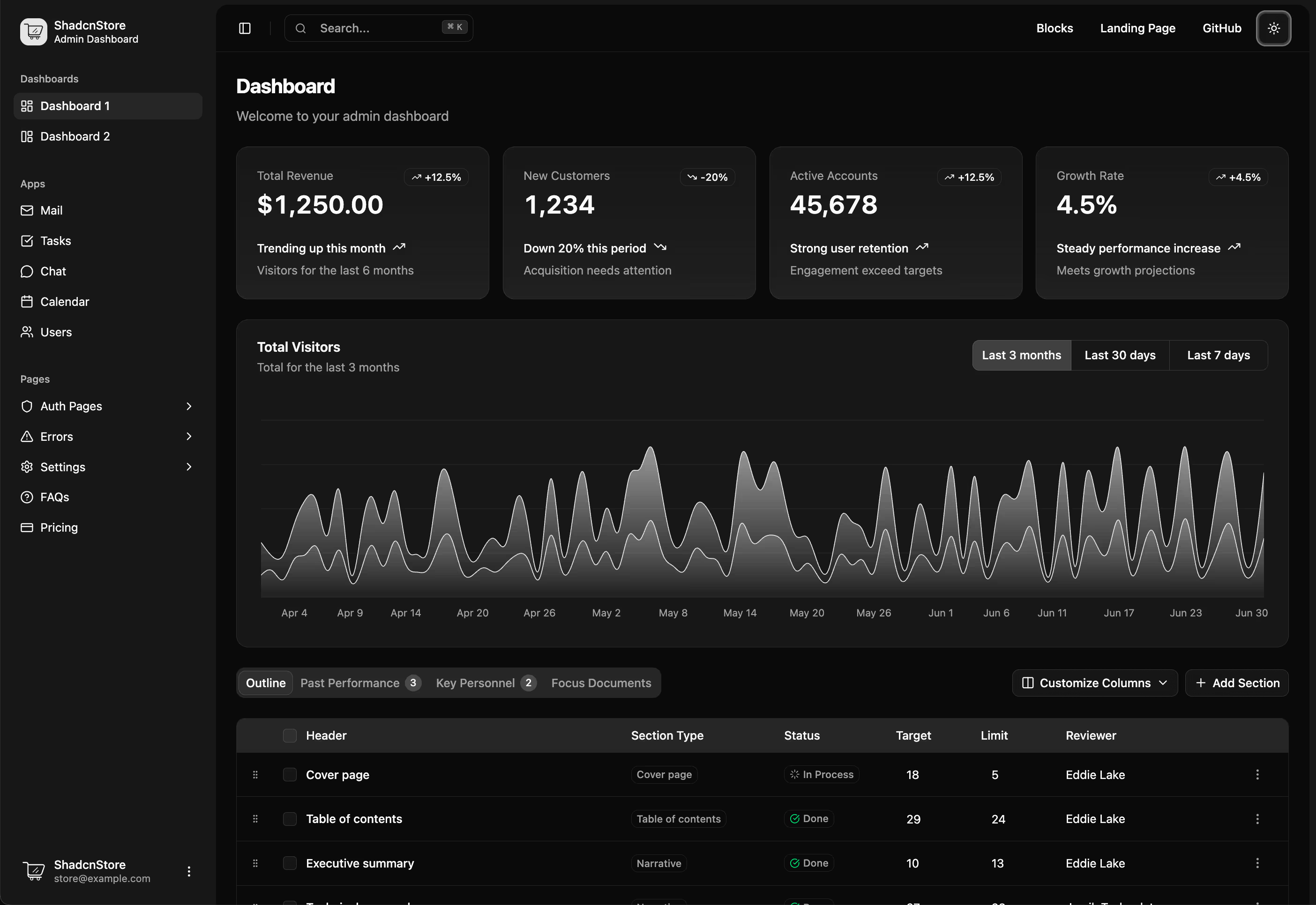
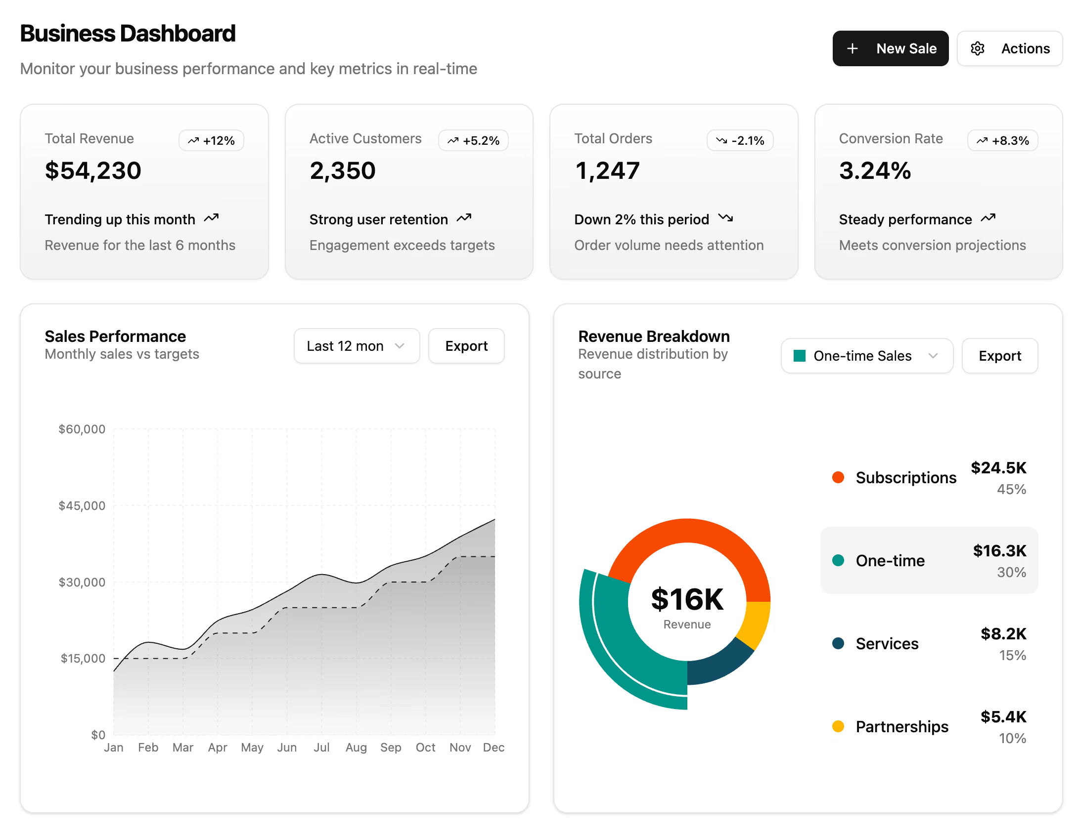
- Feature 10: a mixed-width board pairing metric cards with data-table and dashboard previews, so one item leads the row.
- Feature 6: cards over decorative grid backgrounds.
- Feature 7: a dual image showcase with a feature grid beneath.
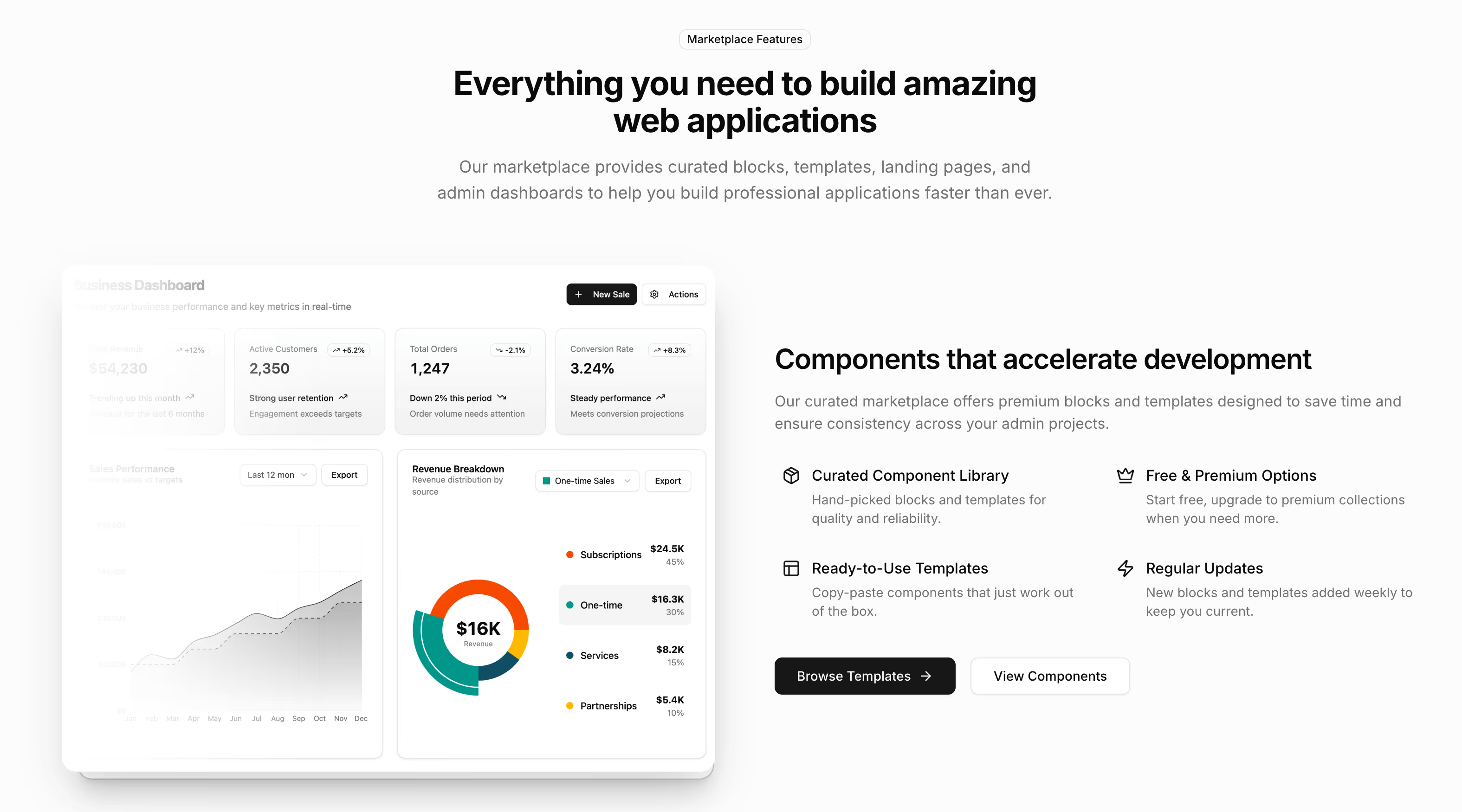
- Feature 8: four capability rows beside a dashboard image and two actions, for a product best explained by showing the interface.
- Feature 9: a six-item grid arranged over two images with no cards, for an ecosystem story rather than a checklist.
- Feature 11: a scroll-pinned reel that dissolves one photograph into the next beside a numbered step rail.
- Feature 12: scroll-stacked benefit cards that pin in turn, each pairing a live mini interface with a proof checklist.
How many features to show#
Three to six. Three when each needs a paragraph, six when each needs a sentence. Past six the type shrinks, the grid stops scanning, and the reader takes away nothing rather than six things. If the list is genuinely longer, split it across two sections with different headings, or move the detail into a comparison table where a long list is the correct shape.
Feature grid or bento grid#
A feature grid treats every item as a peer, which is right when they genuinely are. A bento grid deliberately breaks that symmetry so the layout itself says which capability matters most. Choose the bento only when you can defend which tile deserves the extra space, because an asymmetric layout with an arbitrary winner reads as a mistake rather than a decision.
Writing the feature copy#
- Lead each item with the outcome, not the mechanism. What it lets somebody do, then how.
- Keep the headings parallel in grammar and roughly equal in length, or the grid looks broken even when it is not.
- Use the icon to aid scanning, not to carry meaning; almost no icon survives being the only explanation.
- Write to the longest item. A layout tuned to a four-word heading falls apart when the fifth needs nine.
Scroll-driven feature sections#
Feature 11 and Feature 12 tie their progression to scroll position. Both need real content to justify the motion: 11 wants a genuine sequence of photographs, 12 wants working mini interfaces rather than screenshots. If the copy is not written yet, start from a static grid, because a pinned section with placeholder content is more obviously unfinished than a plain one.
Where features sit on the page#
After the hero and any immediate proof, before pricing. Features answer what the product does; pricing answers what it costs, and asking the second question before the first is answered is why some pages convert badly despite good copy.