App shells, the frame every signed-in screen sits in#
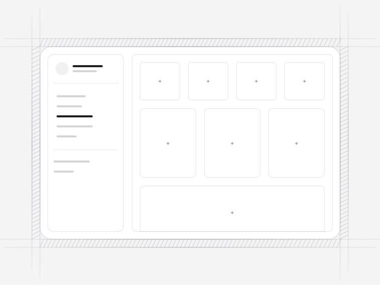
The shell is the decision every other screen inherits. It sets where navigation lives, how much room content gets, where context is shown, and what happens at 375 pixels. Get it right once and new pages are quick; get it wrong and every page after it argues with the layout.
The five application shells#
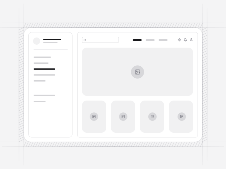
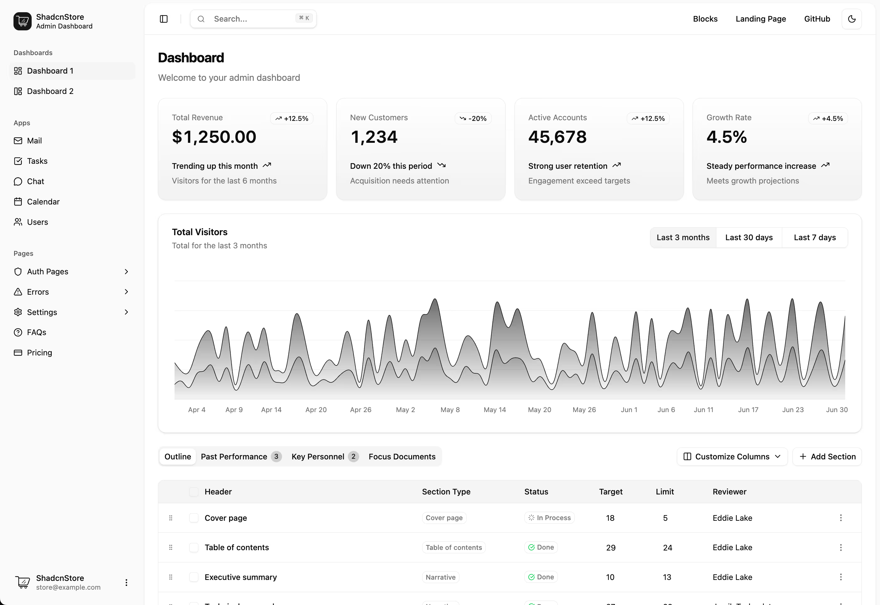
- App Shell 1: a responsive sidebar with a breadcrumb header, workspace navigation and a calm content frame. Free, and the right default for most products.
- App Shell 2: a collapsible icon rail that persists its state, with accessible tooltips on the collapsed icons, a mobile sheet, and content that reflows rather than being squeezed.
- App Shell 3: two-level top navigation with workspace context and a scrollable sub-navigation, for products with a wide top-level and shallow depth.
- App Shell 4: a multi-tenant workspace shell with a switcher, persisted nested navigation, breadcrumb context and a seam for a command palette.
- App Shell 5: resizable list, detail and inspector panes with keyboard selection and a designed mobile stack.
Sidebar, icon rail or top navigation#
A sidebar suits a product with more than about six destinations, because vertical space is cheaper than horizontal. An icon rail suits one where people work in a single area for long stretches and want the room back. Top navigation suits a shallow product, or one where the content genuinely needs the full width.
The collapse state is worth persisting either way. Somebody who collapsed the sidebar did so because they wanted the space, and re-expanding it on the next page load is a small daily insult.
The three-pane layout#
App Shell 5 is list, detail and inspector, which is the shape most inbox, issue tracker and file browser interfaces settle on. Two details make it work: panes that resize and remember, and keyboard selection that moves through the list without touching the mouse. On a phone it becomes a stack rather than three crushed columns, because three panes at 375 pixels is not a layout.
Multi-tenant products#
App Shell 4 carries a workspace switcher, navigation that persists per workspace, and breadcrumb context showing which tenant you are in. That last one matters more than it sounds: the most expensive mistake in a multi-tenant tool is doing the right thing in the wrong workspace, and the shell is the only place that can prevent it.
Navigation state, routing and the active item#
The shells take their navigation from a typed data file and mark the current item from the path, so wiring them to Next.js, React Router or an Inertia app is a matter of passing the current location rather than editing the component. Nested items expand to reveal the active child on load, which is the behaviour people expect and the one most hand-built sidebars forget after a full page reload.
The current item is marked with aria-current as well as a visual state. That matters in a product more than on a marketing site, because a sidebar with twenty items is exactly the case where somebody navigating by screen reader needs to know where they already are.
What goes inside the shell#
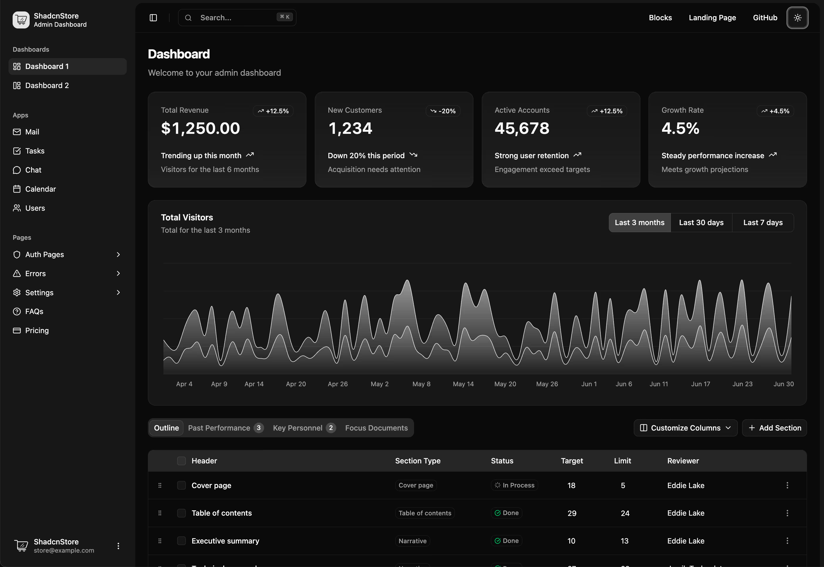
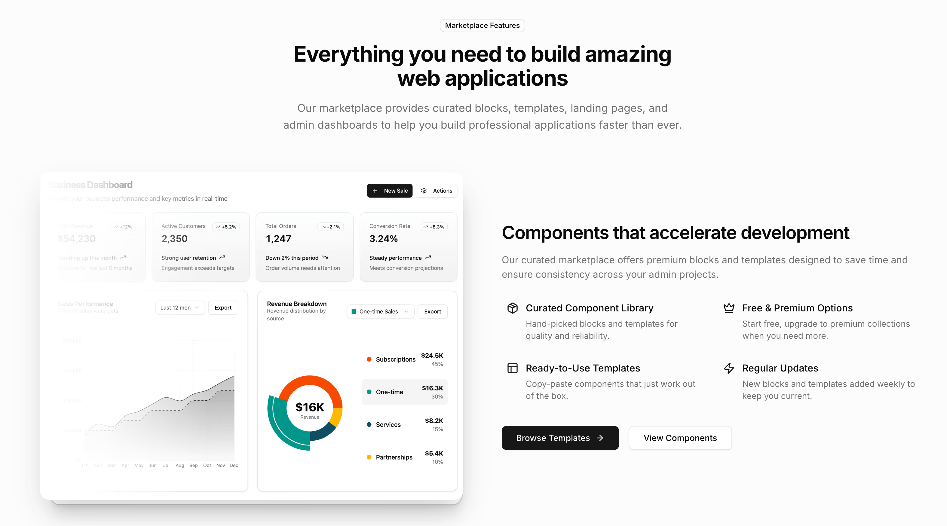
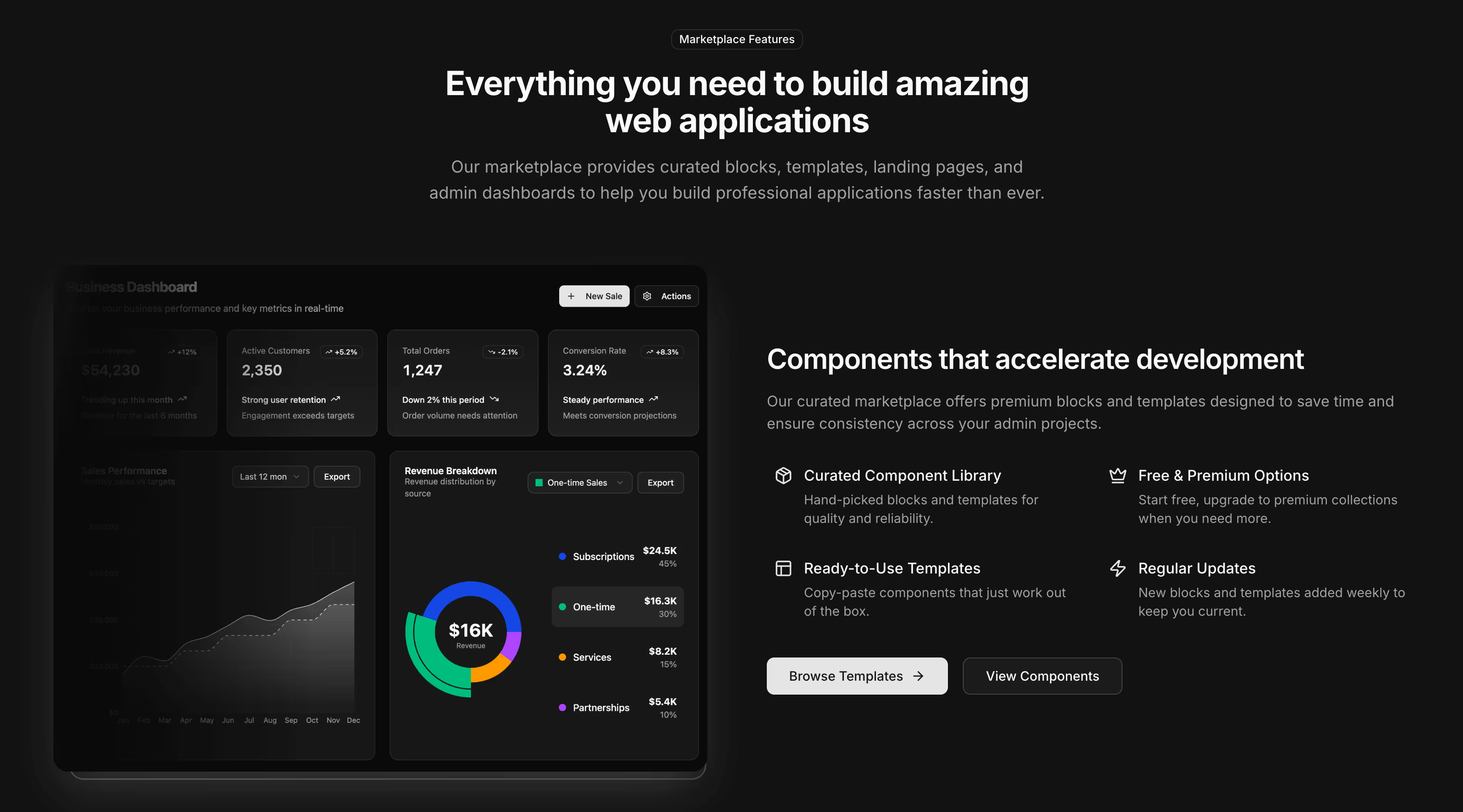
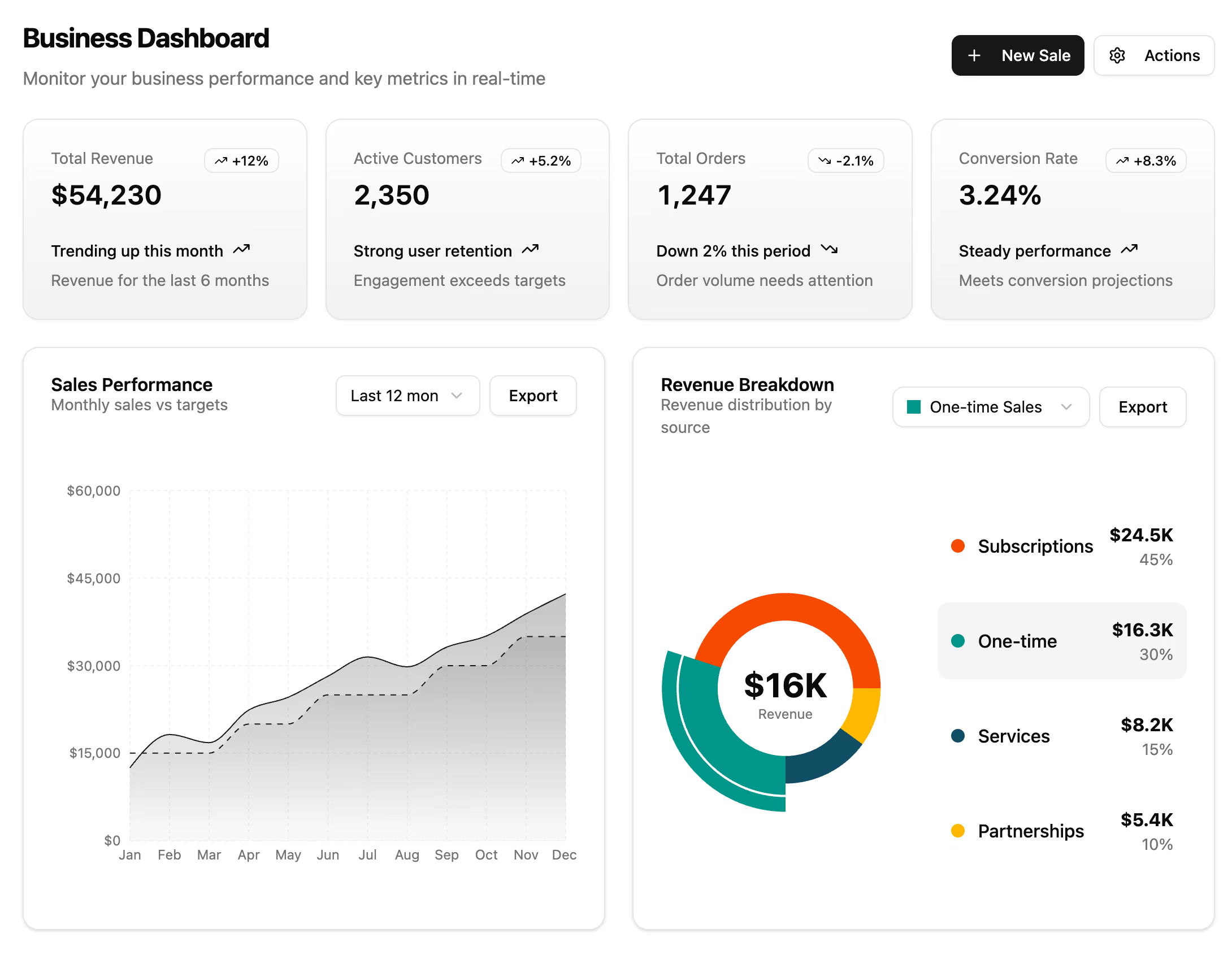
Start with the frame, then fill it: KPI cards across the top, charts for trends, a datatable for records, and complete app screens where a whole surface needs designing rather than assembling. The error pages should sit inside the same shell, so a failure still looks like your product.