Card lists for records people scan and pick from#
Some content is not a product and not an article. It is a record: a property, a job, a course, an event, a service, a directory entry. It has attributes rather than a price, and the decision needs reading rather than looking. These layouts are built for that.
The six listing layouts#
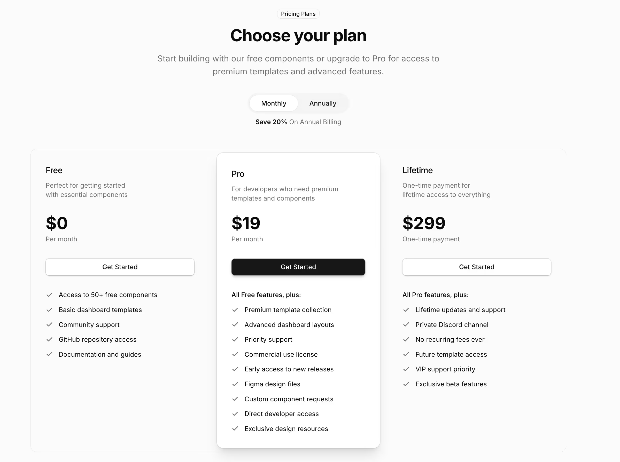
- Listing 1: a three-up service listing with category badges and a get-started action. Free.
- Listing 2: a horizontally scrolling category listing, for browsing rather than comparing. Free.
- Listing 3: a two-column course listing with instructor avatars and category labels.
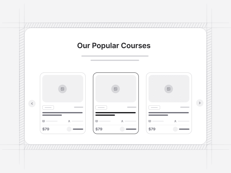
- Listing 4: a three-up course listing with a category badge on each card.
- Listing 5: a property listing with bed, bath and area counts and a view-details action.
- Listing 6: a category carousel with a progress indicator across a long set of subjects.
What separates a listing card from a product card#
A product card is built around an image, a price and an add-to-cart action, and the picture does most of the selling. A listing card leads with attributes and offers a single detail action, because the decision depends on facts that have to be read: how many bedrooms, which city, what salary band, how many hours.
The practical consequence is layout. A product grid can go four across with small images; a listing card needs the width to print three or four attributes without wrapping them into an unreadable column.
Articles are a third shape again. If the record is a post with an author, a date and an excerpt, the blog card grids are built for it and these listing cards are not.
Connecting a listing to your data#
Each card takes a record object with a title, an image, a set of attributes and one action, so mapping a response from a CMS, a database query or a search index is a transformation rather than a rewrite. Nothing in the card assumes where the record came from or what it is called.
Two details are worth handling at the mapping step rather than in the markup. Missing images should resolve to the neutral fallback instead of an empty box, since an older record almost always predates whatever image policy you have now. And attributes should be formatted before they reach the card, because a number rendered raw in one card and formatted in another is what makes a grid look assembled by three different people.
Using these for search results#
The layouts hold their shape at any row count, and the whole card is the link target rather than just the title, which is what makes a results list comfortable on touch. Titles clamp to a fixed number of lines so a long name does not push one card taller than its neighbours and break the grid baseline.
Types of listing these suit#
- Property and rentals: Listing 5, where bed, bath and area counts are the deciding attributes.
- Courses and training: Listing 3 and Listing 4, which carry an instructor, a category and a level.
- Services and agencies: Listing 1, where each card is an offer with a category and one action.
- Directories and marketplaces: any of the grids, since the card is a link target as a whole.
- Browsable categories: Listing 2 and Listing 6, for sets too long to show at once and not worth a page of their own.
What a listing page needs around the cards#
Filters, most of the time. The filter bars and sidebars work over any card grid, not just products, and the faceted version handles the counting correctly. Above the results, a search-led hero is the natural opening for a directory, and the contact sections close the loop when the next step is an enquiry rather than a purchase.