Home / Blocks / Marketing / Testimonials
10 blocks in this section

Shadcn Testimonial Components

Present customer stories with rotating carousels, a video-testimonial modal, a featured quote hero, or a grid testimonial wall built on shadcn/ui.

How it works

Three steps to working code

Install a block and the files land in your repository. Nothing calls back to us.

  1. terminal

    $ npx shadcn@latest add @shadcnstore/testimonial-1

    ✓ Checking registry

    ✓ Installing dependencies

    01

    Run one command

    Every preview above prints its own. The CLI writes the block and the components it needs into your project.

    Installation docs
  2. your project 3 files added

    components/

    ├─ ui/

    ├─ button.tsx

    └─ navigation-menu.tsx

    └─ testimonial-1.tsx

    02

    Get real files

    React, TypeScript and Tailwind v4, with no framework imports. Next.js, Vite, Remix and Astro all work.

  3. testimonial-1.tsx

    <Menu.Trigger

    - asChild

    + render={<button />}

    />

    03

    Edit it as your own

    Built on Base UI, not Radix, so keyboard and focus behaviour come from the primitive.

Blocks that hold state already carry the use client directive the Next.js App Router needs.

Guide

Testimonial sections and the proof they carry#

A testimonial only works if it is believable, and believability comes from specifics rather than enthusiasm. These layouts differ mainly in how much room they give a quote, which determines whether it can carry a specific.

The ten testimonial layouts#

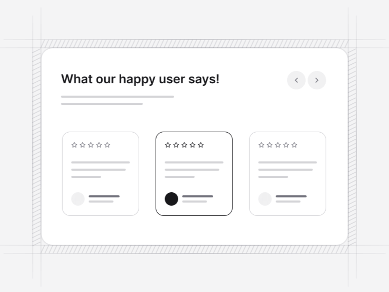
  • Testimonial 1: a quote carousel with an avatar, a role and a short headline per review. Free.
  • Testimonial 2: a featured quote given hero treatment with supporting cards beside it.
  • Testimonial 3: a grid wall showing every quote at once.
  • Testimonial 4: a two-column carousel with a photograph and a dialog for the full quote.
  • Testimonial 5: a three-column carousel above satisfaction, rating and uptime figures.
  • Testimonial 6: a mosaic of mixed-width quote cards.
  • Testimonial 7: a student carousel carrying an avatar, a role and a rating on every card.
  • Testimonial 9: a carousel sized for course and training pages, with arrows and avatars.
  • Testimonial 8: a borderless wall under a badge heading, with a load-more action.
  • Testimonial 10: a draggable board of real tweets, Slack messages, emails and reviews, each keeping the chrome of the app it came from.

A wall shows everything and lets the reader choose, which suits a page where volume is itself the argument. A carousel keeps the section short when there is more proof than vertical space, and it suits a page that has other work to do below. The wall is the safer default, because a carousel only shows what somebody bothers to advance to.

What makes a quote worth publishing#

  • A specific outcome, ideally with a number, rather than a general compliment
  • A named person with a role, or an honest role-and-industry attribution if the name cannot be used
  • Language that sounds like the person, not like your marketing copy
  • A short enough excerpt that it can be read at a glance, with the full quote available if it is longer

Testimonial 10 takes this furthest by keeping the original chrome of the tweet, message or review, which reads as evidence rather than as copy you wrote about yourself.

Attribution you cannot fully make#

Do not invent a name, a job title or a company logo to fill a slot. Attribute to a role and an industry, or leave the avatar empty. Fabricated proof is the single fastest way to turn a testimonial section into a liability, and review markup on invented quotes is a policy violation rather than a shortcut.

Where testimonials belong on a page#

Next to the claim each one supports, not gathered into one block at the end. A quote about onboarding belongs beside the features section that describes onboarding; a quote about value belongs near the pricing table. For proof without words, a logo cloud does the same job with names, and the product reviews are the shop equivalent with ratings attached.


FAQ

Testimonials questions, answered

What people ask before choosing a block from this collection.

Yes, several layouts rotate quotes rather than listing them, which suits a page that has more proof than vertical space. If you would rather show everything at once, the grid wall puts every quote on the page and lets the reader choose.
Do not invent a name or a company logo. Attribute the quote to a role and industry, or leave the avatar slot empty. Fabricated proof is the one thing that turns a testimonial section into a liability, and search engines increasingly treat invented review data as a quality signal against the page.
Testimonial 10 is a board of real tweets, Slack messages, emails and reviews, each keeping the chrome of the app it came from, arranged so the reader can drag the board around. It reads as evidence rather than marketing copy, which is why it keeps the original styling instead of normalising everything into one card.
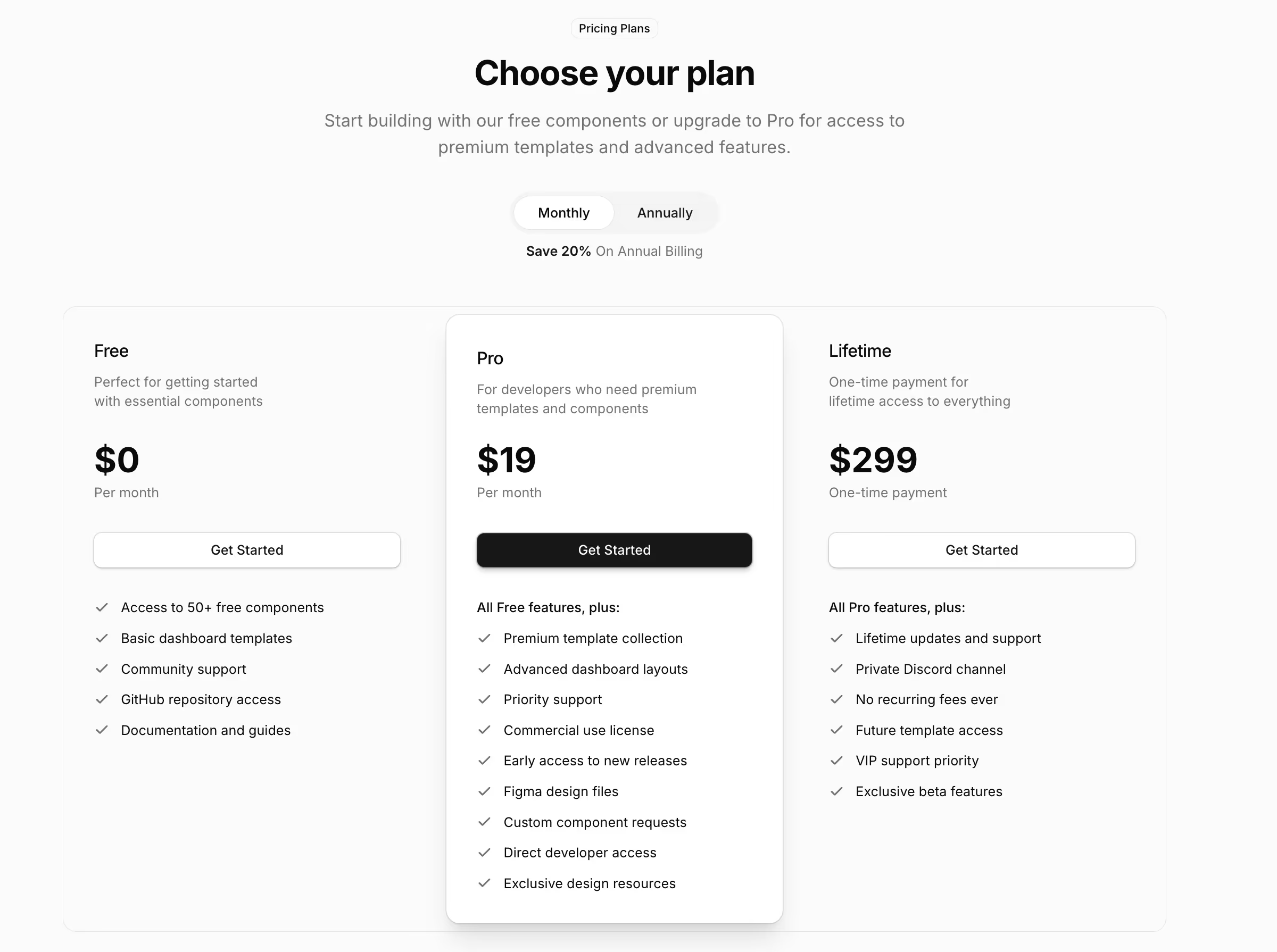
Testimonial 1 is free. The featured-quote hero, the grid wall, the rotating layouts and the proof board are Pro items covered by the licence on the pricing page.
Next to the claim they support, not in one block at the bottom. A quote about onboarding belongs beside the features section that describes onboarding, and a quote about value belongs near the pricing table.

Documentation

The components behind these blocks

How to install, customise and combine the shadcn/ui components this collection is built from.

Free & Premium Templates

Launch Faster with Complete Templates

Love these blocks? Get our free dashboard and landing page templates with 30+ pre-built pages and all the components you need. Premium templates with advanced features launching soon at $69.

Free Templates Now
30+ Pages Included
Premium Coming Soon