Login forms, including the parts that go wrong#
A login screen is short, which makes people assume it is simple. The complexity is in the failure paths: a wrong password, a locked account, a slow network, a browser autofilling the wrong entry, and an error message that must be helpful without telling an attacker which half was correct.
The six login layouts#
- Login Page 1: a card with remember-me, a forgot-password link and three social buttons. Free.
- Login Page 2: a clean form with social authentication given the prominent position.
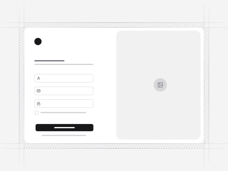
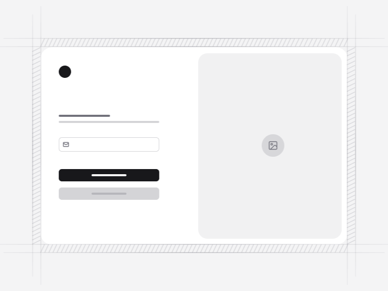
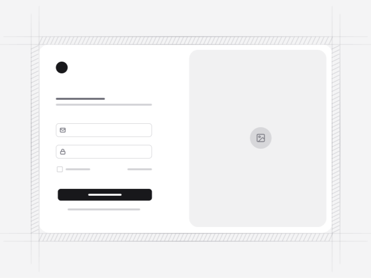
- Login Page 3: a split-screen layout with a background image.
- Login Page 4: a labelled card with social buttons above the email and password fields.
- Login Page 5: a two-column layout with an illustration.
- Login Page 6: a split-screen login with the card beside a product panel.
Error messages that help without leaking#
An invalid sign-in returns one message whether the email is unknown or the password is wrong. Saying which turns the form into an account enumeration tool, and it does not help the person anyway, since somebody who mistyped their password does not need to be told their email exists.
What does help: keeping the entered email in the field, focusing the password rather than the whole form, and offering the reset link in the error rather than only in the corner.
Social sign-in without the wall of buttons#
Where social options are shown, one reads as the default rather than presenting six equal choices. A row of identical provider buttons hands somebody a decision they did not want and, worse, invites them to create a second account with a provider they did not use last time. Showing which method was used before solves that, and the buttons here call whatever handler you pass, so no provider is baked in.
Remember me, sessions and autofill#
The remember-me control is present in most layouts and it should map to session length rather than to storing anything in the browser. The fields carry the right autocomplete attributes so password managers recognise them, which sounds trivial and is one of the most common reasons a login form annoys the people who use it every day.
What these forms leave to your server#
They validate, disable the submit while a request is in flight, render the error state and the success path. No credential is checked, no session is created, no token is issued. That boundary is what keeps the same screens usable over your own backend, a managed identity provider or a framework starter kit, and it is why the work here went into the states rather than the plumbing.
The screens around the login#
A second factor follows through the verification pages, anybody locked out goes to password recovery, and new arrivals come from the signup form. All four share a layout language so the flow does not change design halfway through, and a successful sign-in lands inside the app shell.