



Shadcn dashboard blocks for working applications#
The signed-in half of a product is where people spend their time, and it is the half most component libraries stop short of. These sections cover the frame, the data surfaces inside it and the account screens around it, as React components that hold real state rather than pictures of interfaces.
What is a shadcn application block?#
An application block is a complete product screen or a complete piece of one. A data grid with sorting, filters, row selection and a bulk action bar, not a Table primitive. A settings suite that keeps unsaved work while you move between tabs. The shadcn CLI copies each one into your project, so the behaviour is yours to change rather than a prop you hope exists.
A block in this collection generally provides:
- State that actually works: selection, sorting, filtering, drag and drop, unsaved changes
- The states an internal tool lives in: loading, empty, error, permission denied, offline
- Column and pane priorities for small screens, chosen per block rather than a scrollbar
- Focus management and escape handling from the Base UI primitives underneath
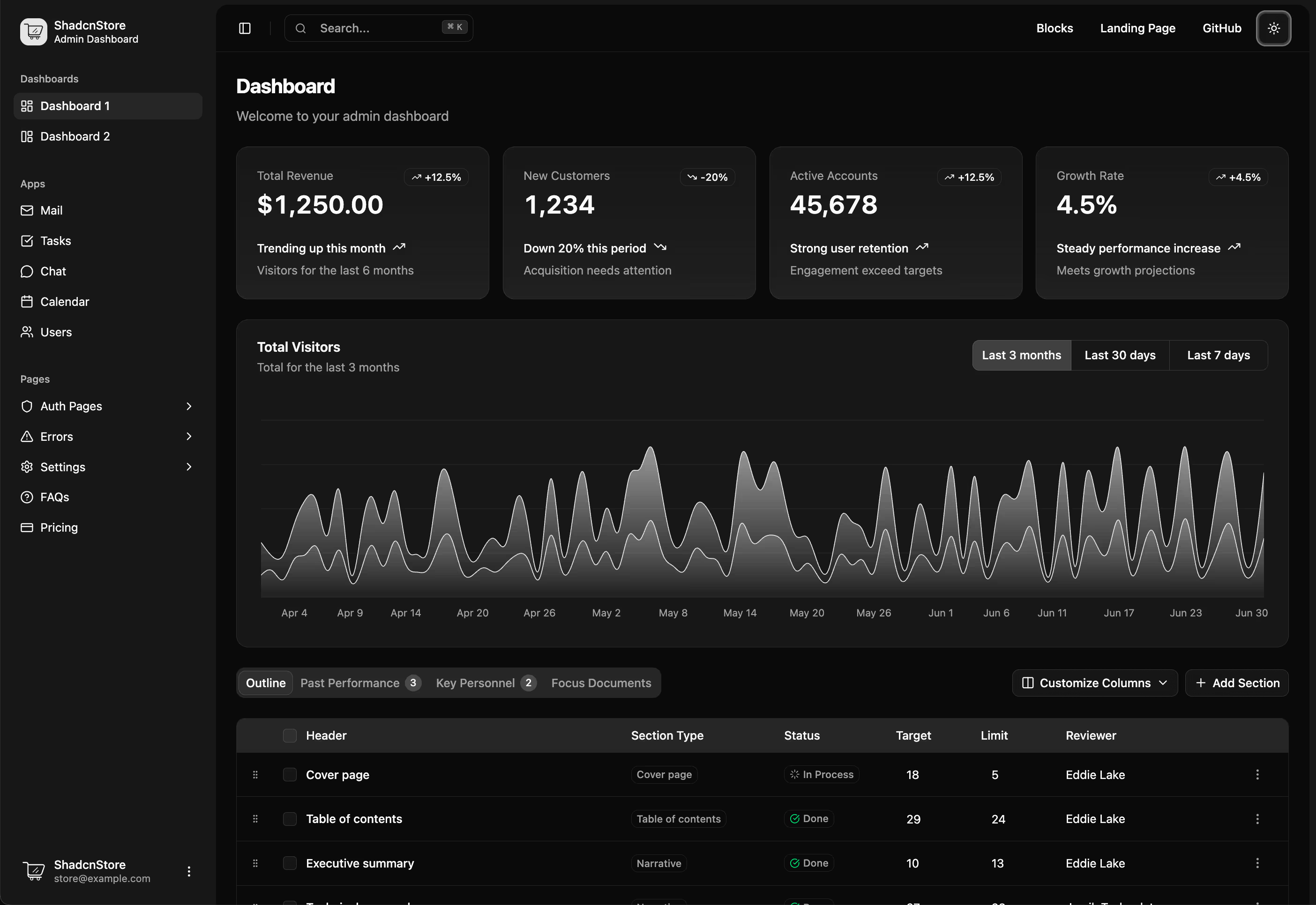
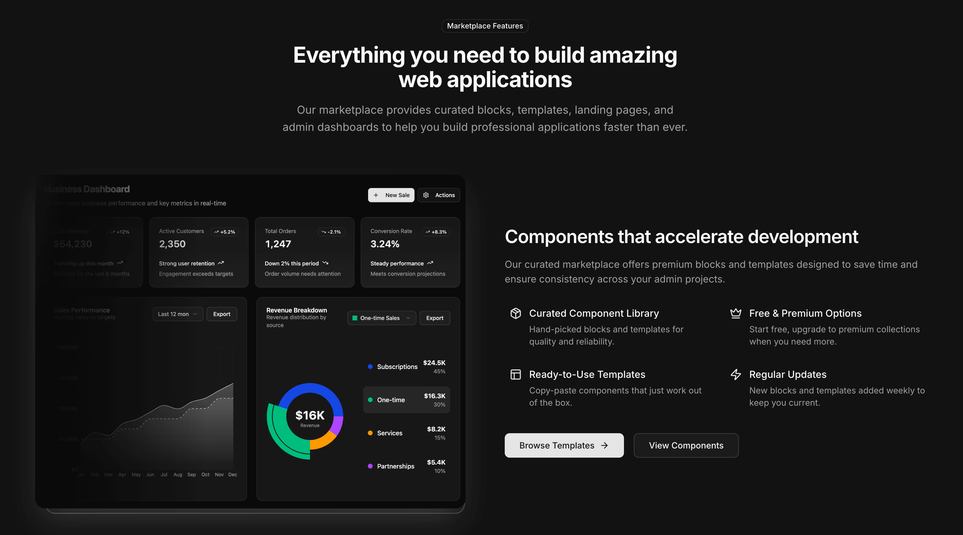
- Theme tokens throughout, so charts and cards change with the rest of the interface
Start with the shell, then fill it#
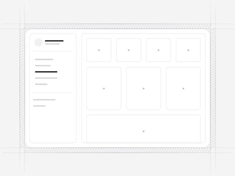
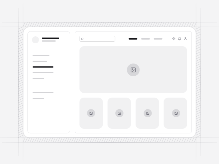
The app shells come first, because the shell decides how everything inside it is sized. Pick between a sidebar, a collapsible icon rail, a two-level top navigation, a multi-tenant workspace or a three-pane list and detail layout.
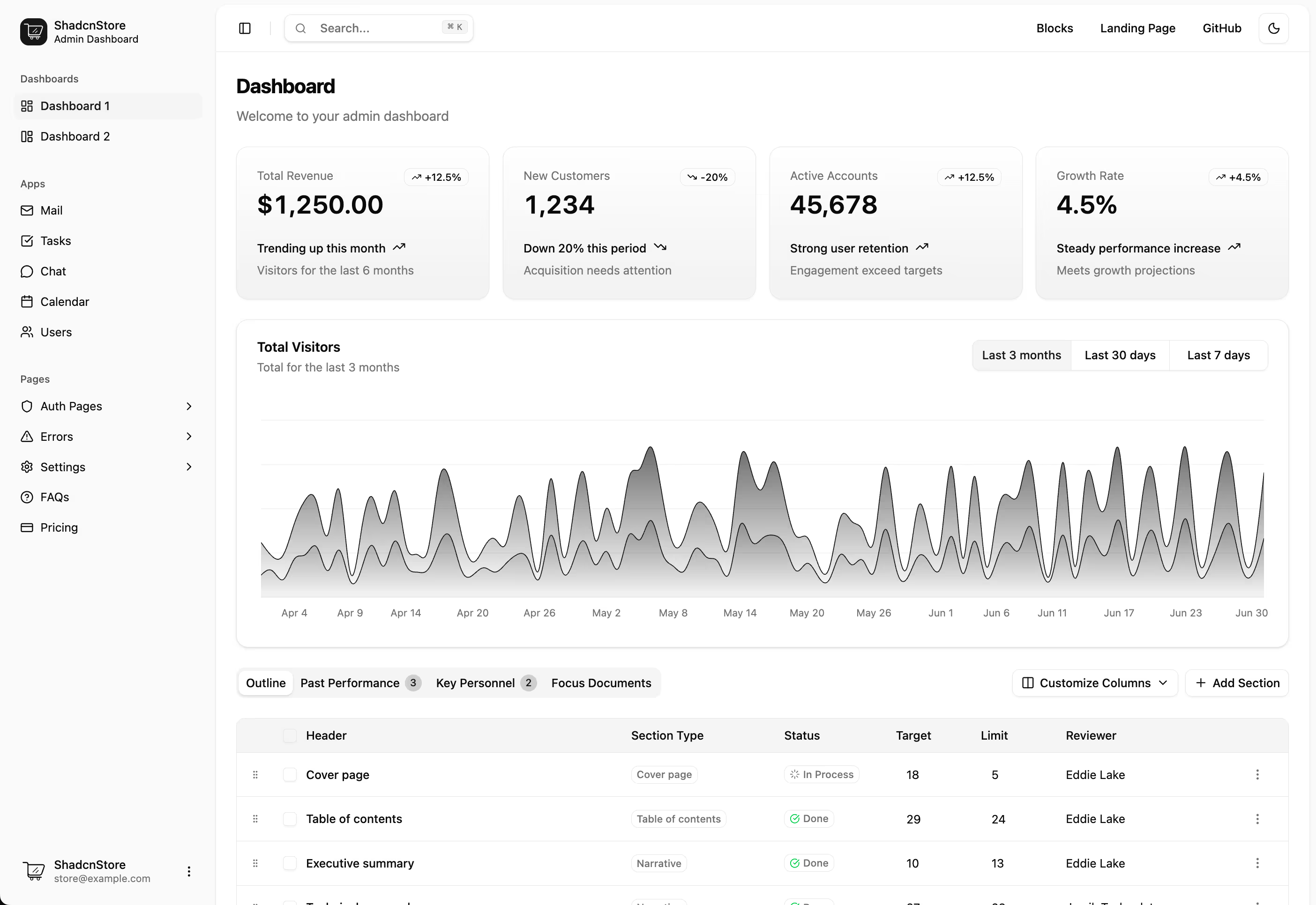
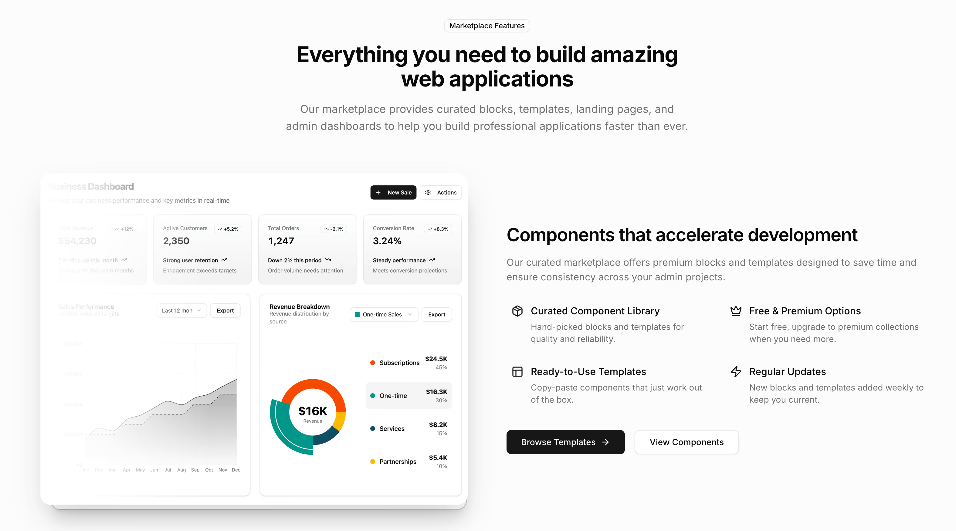
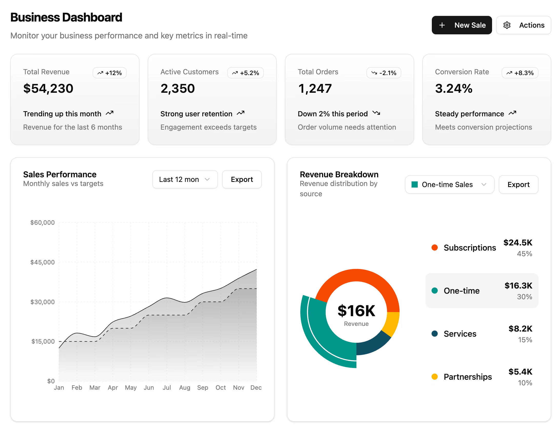
Then fill it. KPI cards for the numbers at the top, charts & graphs for the trends, datatables for the records, and complete app screens such as a kanban board, a chat thread, a file manager or an issue list when you need the whole surface rather than a part.
The account screens around the product#
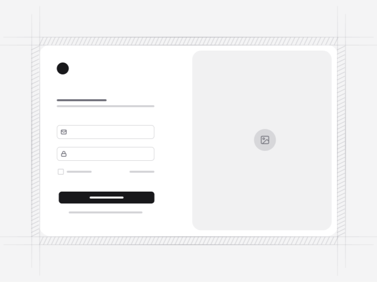
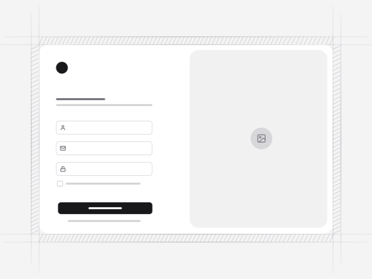
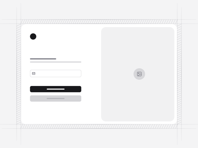
A product needs a way in and a way back in. Login forms and signup forms cover the entry, including a multi-step wizard that blocks per step rather than failing at the end. Verification pages handle two-factor codes, email confirmation and passkeys with their fallbacks, and password recovery covers the reset, including the expired link that most flows skip.
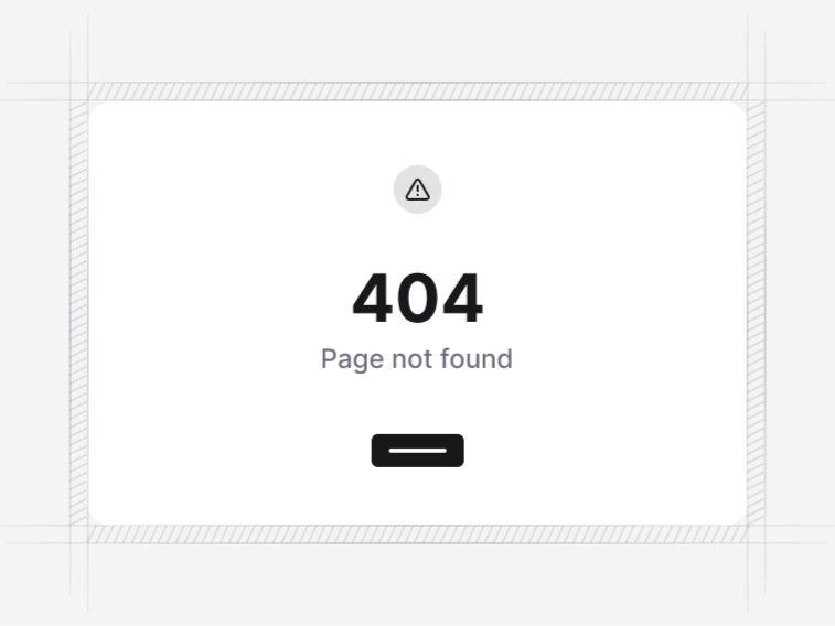
Error pages catch what goes wrong, and calendars cover scheduling, from a plain month grid to a resource timeline that splits overlapping bookings into lanes.
What these blocks leave to your server#
No block here authenticates anybody, queries a database or calls an API of its own. The login form validates, disables its submit while a request is in flight, and renders an error that does not leak whether an account exists, but the credential check stays with you. The datatable can drive its sort and filter state from the URL, but where those values are computed is your decision.
That boundary is what keeps the same blocks usable over Laravel, Rails, a Next.js route handler or a third-party auth provider, and it is why the interesting work here went into the states rather than the plumbing.
Where application blocks are used#
- Analytics dashboards: a sidebar shell, KPI cards with honest trend context, and charts that read your theme rather than shipping their own palette.
- Admin and operations tools: the server-state datatable with saved views and URL-synced filters, where a filtered view has to be shareable as a link.
- Multi-tenant SaaS: the workspace shell with a switcher, persisted nested navigation and a seam for a command palette.
- Internal team apps: the kanban board, the issue list and the file manager, which are the three screens most internal tools rebuild badly.
- Scheduling products: the booking calendar with timezone-aware slots and a waitlist, or the resource timeline for rooms and equipment.
Take a finished dashboard instead#
If you want the assembled product rather than the parts, the dashboard and admin templates wire these blocks together with routing, navigation and a theme already in place, and the free dashboard template is the fastest way to see how the pieces fit.