Home / Blocks / E-commerce / Product Lists
5 blocks in this section

Shadcn Product Lists and Grids

Choose a shadcn/ui product card grid for visual browsing or a sortable comparison table for specification-heavy catalogs.

How it works

Three steps to working code

Install a block and the files land in your repository. Nothing calls back to us.

  1. terminal

    $ npx shadcn@latest add @shadcnstore/product-card-1

    ✓ Checking registry

    ✓ Installing dependencies

    01

    Run one command

    Every preview above prints its own. The CLI writes the block and the components it needs into your project.

    Installation docs
  2. your project 3 files added

    components/

    ├─ ui/

    ├─ button.tsx

    └─ navigation-menu.tsx

    └─ product-card-1.tsx

    02

    Get real files

    React, TypeScript and Tailwind v4, with no framework imports. Next.js, Vite, Remix and Astro all work.

  3. product-card-1.tsx

    <Menu.Trigger

    - asChild

    + render={<button />}

    />

    03

    Edit it as your own

    Built on Base UI, not Radix, so keyboard and focus behaviour come from the primitive.

Blocks that hold state already carry the use client directive the Next.js App Router needs.

Guide

Product grids and the table view#

Most shops need one grid that scans well and one view that compares well. These five cover both: image-led cards for browsing, and a table listing for catalogues where the buyer is reading numbers rather than looking at photographs.

The five product listing blocks#

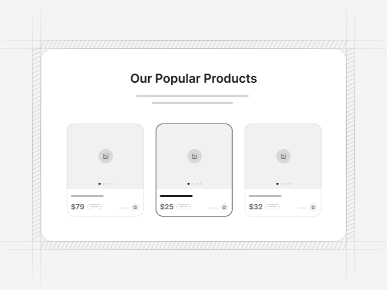
  • Product Listing Card 1: a deals grid with an add-to-cart action on each card. Free.
  • Product Listing Card 2: a three-up grid carrying image, name and price only. Free, and the cleanest starting point.
  • Product Listing Card 3: a grid with low-stock badges and a view-similar action.
  • Product Listing Card 4: a carousel and grid combination across a longer set.
  • Product Listing Card 5: the table-style listing with comparison and sorting.

Grid or table#

Grid when the picture sells the item, which covers most fashion, homeware and food. Table when the buyer is comparing specifications, which covers components, tools, tyres and anything with a model number. Product Card 5 is the table, and it wins outright in those categories because a grid forces somebody to open five tabs to do what a table does in one screen.

Details that keep a grid tidy#

  • Titles clamp to a fixed number of lines, so one long name does not push a card taller than its neighbours
  • Badges sit in a reserved slot, so a card with a sale badge is the same height as one without
  • Struck original prices sit beside the current price rather than replacing it
  • The whole card is the link target, not just the title, which matters most on touch
  • Images hold a fixed aspect ratio, so a portrait photograph does not stretch the row

These sound small and they are the difference between a grid that looks designed and one that looks generated.

Add to cart from the grid#

Product Card 1 puts the action on the card. That works for repeat purchases and single-variant products, and it works badly for anything needing a size or a colour, because the choice then has to happen somewhere. For those, a quick view is the better pattern, and the product detail collection includes a quick view dialog built to open from a grid without losing the shopper place in the list.

Sorting, pagination and how many to show#

Show enough rows that scrolling feels productive and few enough that the page stays fast. Around twenty-four is the usual compromise. Prefer a load-more control over infinite scroll if the footer contains anything a customer needs, since infinite scroll makes a footer unreachable in practice.

What a product grid needs around it#

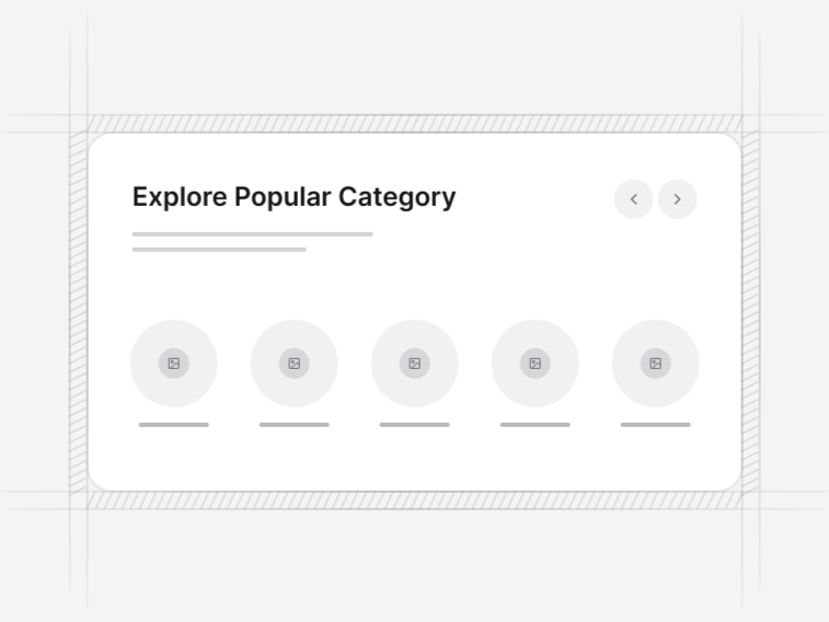
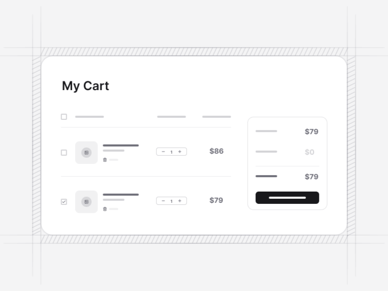
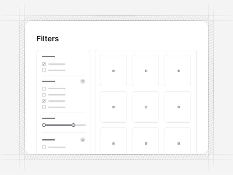
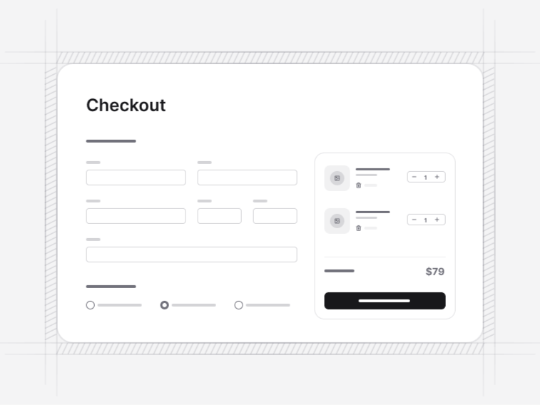
A filter bar or sidebar above or beside it, category blocks upstream when the catalogue is wide, and a cart downstream. Those four plus a checkout are a working storefront.
FAQ

Product Lists questions, answered

What people ask before choosing a block from this collection.

Grid when the picture sells the item, which covers most fashion and homeware. Product Card 5 is the table-style listing with sorting and comparison, and it wins for specification-led catalogues where a buyer is comparing numbers rather than looking at photographs.
Titles clamp to a fixed number of lines so the grid stays on a baseline, and the full name is still available to assistive technology. A grid where one card is two lines taller than its neighbours is the usual sign this was left to chance.
Yes. Sale, new and low-stock badges sit in a reserved slot so a card with a badge is the same height as one without, and struck original prices sit beside the current price rather than replacing it.
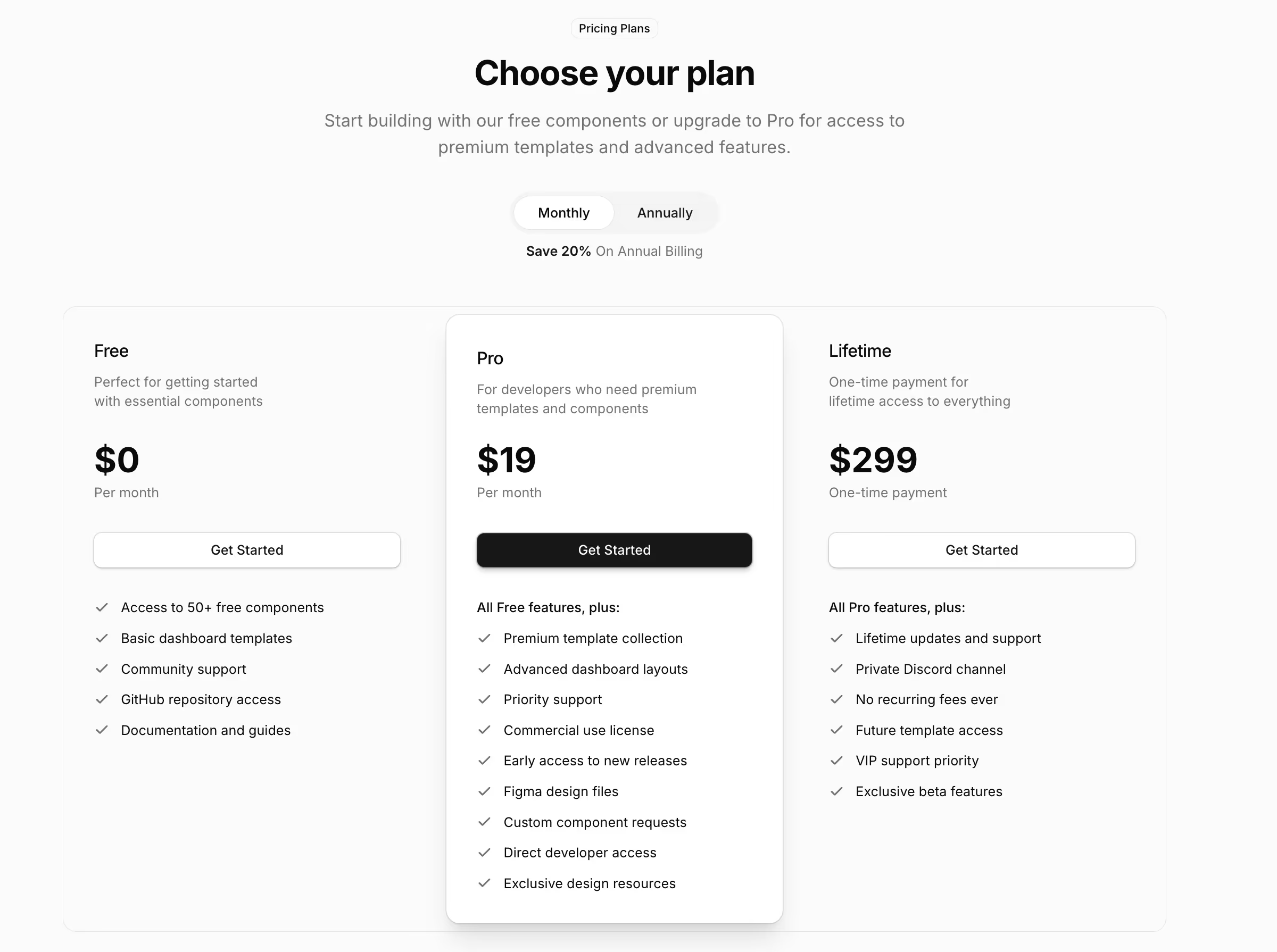
Product Card 1 and Product Card 2 are free. The remaining cards and the comparison table view are Pro. See the pricing page for what the licence covers.
A filter bar or sidebar above or beside it, and a product detail page as the destination. Those three make up a working storefront browse flow.

Documentation

The components behind these blocks

How to install, customise and combine the shadcn/ui components this collection is built from.

Free & Premium Templates

Launch Faster with Complete Templates

Love these blocks? Get our free dashboard and landing page templates with 30+ pre-built pages and all the components you need. Premium templates with advanced features launching soon at $69.

Free Templates Now
30+ Pages Included
Premium Coming Soon