
Theming in Figma
One of the best parts about the shadcnstore Figma kit? You can completely customize the look and feel without touching a single component. Change colors, adjust spacing, switch between light and dark modes - all through the power of Figma Variables.
This isn't just about making things look pretty. The theming system is built to match shadcn/ui's approach exactly, which means your Figma designs can translate directly to working code.
How Theming Works
The shadcnstore kit uses Figma Variables to power its entire theming system. Instead of hardcoding colors and styles into components, everything references variables. This means:
- Change once, update everywhere - Modify a color variable, and every component using it updates instantly
- Multiple themes - Switch between Neutral, Clean Slate, or your own custom themes in seconds
- Light & Dark modes - Toggle between modes to see how your designs look in both
- Code alignment - Variables map directly to CSS custom properties in shadcn/ui
The Theme System Structure
Shadcnstore's theming works across three variable collections:
1. Themes Collection
Contains the actual color values for your brand - things like background-light, primary-dark, accent-light. This is where you define what colors your brand uses.
Think of it as: Your design system's color palette
2. Mode Collection
References the Themes collection and automatically swaps between light and dark variants. When you toggle modes, this collection handles all the switching for you.
Think of it as: The automatic translator between light and dark
3. Tailwind Collection
Has all the base Tailwind colors (blue-500, red-600, etc.) if you need them for one-off cases or custom work.
Think of it as: Your fallback utility colors
Switching Between Themes
Shadcnstore comes with three built-in themes: Neutral, Clean Slate, and Claude. Here's how to switch between them:
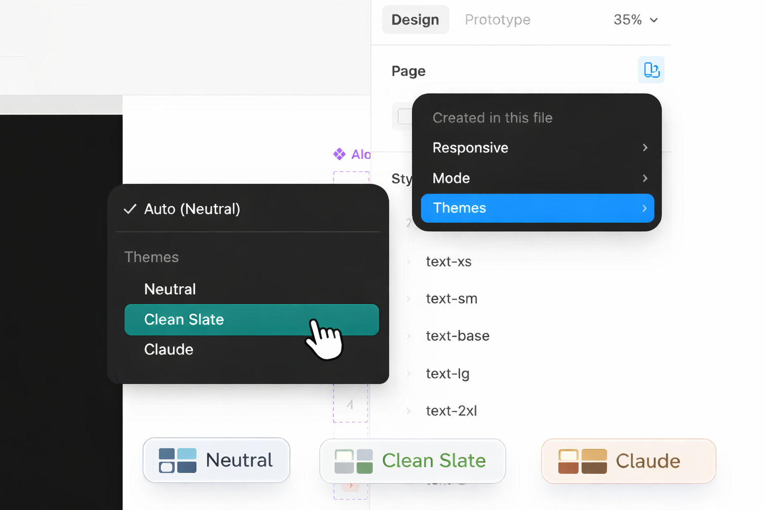
- Select any frame or component in your design
- Look for the right sidebar (Design panel)
- Find the "Apply variable mode" section
- Click the theme dropdown next to "Themes"
- Select Neutral, Clean Slate, or Claude
- Watch everything update instantly
Switching Between Light & Dark Modes
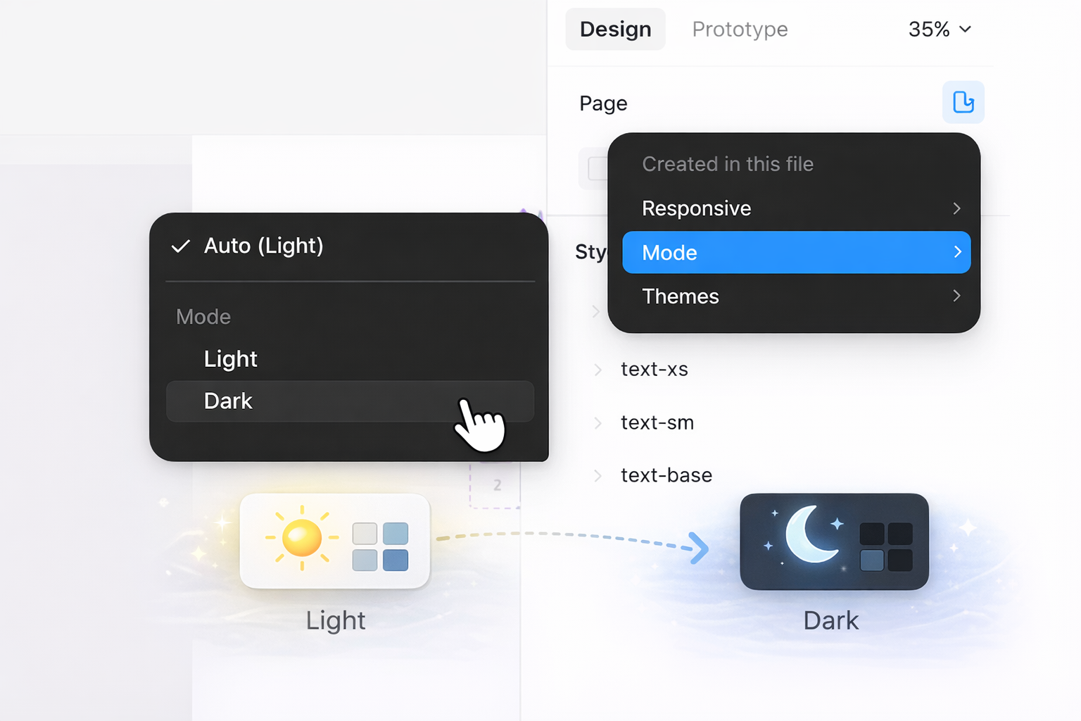
This is where the magic happens:
- Select your frame or component
- In the right sidebar, find "Apply variable mode"
- Look for the "Mode" dropdown
- Toggle between Light and Dark
- Your entire design updates automatically
Customizing an Existing Theme
Want to tweak the Neutral theme to match your brand? Easy:
Step 1: Open the Themes Collection
- Open the Variables panel (right sidebar)
- You will get collections of variables for shadcnstore
- Find and click "Themes" collection
- You'll see all theme modes (Neutral, Clean Slate, Claude)
Step 2: Modify Colors
- Select the theme mode you want to edit (e.g., Neutral)
- Browse through the colors group
- Find the color you want to change (like
primary-light) - Click the color swatch to open the color picker
- Pick your new custom color, from library or enter a hex value
- Boom - every component using that color updates automatically
Example Changes
Change your primary brand color:
- Edit
primary-lightfor light mode buttons - Edit
primary-darkfor dark mode buttons - Edit
primary-foreground-lightandprimary-foreground-darkfor text on those buttons
Adjust background colors:
- Edit
background-lightfor the main light mode background - Edit
background-darkfor the main dark mode background
Tweak accent colors:
- Edit
accent-lightandaccent-darkfor hover states and highlights
Creating a New Theme
Want to create a completely custom theme? Here's how:
Step 1: Duplicate an Existing Theme
- Open the Themes collection in Variables panel
- Click the "+" button next to the mode tabs
- Give it a name as your preferences (e.g., "Brand Blue", "Client Theme", "Dark Pro")
- Figma creates a copy of the current mode
Step 2: Customize Your New Theme
- Make sure your new theme mode is selected
- Go through each color variable
- Update them to match your brand:
primary-light/primary-dark- Your main brand colorsecondary-light/secondary-dark- Your secondary accentaccent-light/accent-dark- Hover and highlight colorsbackground-light/background-dark- Surface colorsforeground-light/foreground-dark- Text colors- And so on...
Step 3: Test It Out
- Select a frame with components
- Switch to your new theme in the Themes dropdown
- Toggle between Light and Dark modes
- Make sure everything looks good in both
Understanding Semantic Colors
Shadcnstore uses semantic naming for colors, which means names describe purpose rather than appearance. Here's what they mean:
background - Main canvas/page background color
foreground - Default text color that contrasts with background
card - Background color for card components
card-foreground - Text color for content inside cards
popover - Background for popovers, dropdowns, and modals
popover-foreground - Text color inside popovers and dropdowns
primary - Your main brand color (buttons, links, key actions)
primary-foreground - Text/icons that sit on primary backgrounds
secondary - Secondary actions and less prominent elements
secondary-foreground - Text/icons on secondary backgrounds
muted - Subdued colors for disabled states and placeholders
muted-foreground - Text for muted content
accent - Accent color for highlights and hover states
accent-foreground - Text/icons on accent backgrounds
destructive - Error and danger colors (usually red)
destructive-foreground - Text/icons on destructive backgrounds
border - Border and divider colors
input - Input field borders and backgrounds
ring - Focus ring colors for accessibility
Why semantic naming? It makes theming easier. You don't need to remember if buttons use "blue-500" or "blue-600" - they just use "primary". Change primary once, and all buttons update.
Theming Radius and Shadows
Colors aren't the only thing you can theme:
Border Radius
The radius group controls how rounded your components are:
- Open Themes collection
- Find the radius group
- Adjust values:
sm- Small corners (buttons, inputs)md- Medium corners (cards)lg- Large corners (modals)full- Completely round (avatars, badges)
Pro tip: Want sharp, modern designs? Set everything to 0px. Want friendly, approachable? Use larger radius values.
Shadows
The shadow group controls elevation and depth:
- Open Themes collection
- Browse shadow , inset-shadow and drop-shadow groups
- Adjust shadow values for different elevation levels
Most components already have the right shadows applied - you usually don't need to touch these.
Syncing Themes with Your Code
Here's the best part: shadcnstore themes are designed to match shadcn/ui's theming exactly.
Exporting Theme Values
When you're happy with your theme in Figma:
- Note down your color values (or take screenshots)
- In your code project, open your CSS file (usually
globals.cssorapp.css) - Update the CSS custom properties to match your Figma variables
Example CSS Structure
Your code theme will look like this:
:root {
  --background: 0 0% 100%;
  --foreground: 222.2 84% 4.9%;
  --primary: 221.2 83.2% 53.3%;
  --primary-foreground: 210 40% 98%;
  /* ...and so on */
}

.dark {
  --background: 222.2 84% 4.9%;
  --foreground: 210 40% 98%;
  --primary: 217.2 91.2% 59.8%;
  --primary-foreground: 222.2 47.4% 11.2%;
  /* ...and so on */
}The variable names match Figma exactly, making handoff seamless.
Using shadcn/ui Themes
You can also go the other way:
- Pick a theme from shadcn/ui themes
- Copy the CSS values
- Update your Figma theme variables to match
- Now your Figma designs match the code theme perfectly
Tips & Best Practices
Start with Neutral Theme
The Neutral theme is the closest to shadcn/ui's default. Customize this one first before creating brand new themes.
Always Test Both Modes
Every time you change a color, toggle between Light and Dark modes to ensure both look good.
Use Semantic Colors in Components
When building custom components, always use semantic colors (primary, background, foreground) instead of Tailwind colors (blue-500, gray-800). This ensures your components work across all themes.
Name Themes Meaningfully
Instead of "Theme 1" and "Theme 2", use descriptive names like "Brand Primary", "Marketing Site", or "Dashboard Dark".
Keep Contrast in Mind
Make sure foreground colors have enough contrast with background colors for accessibility. Aim for at least 4.5:1 contrast ratio for normal text.
Document Your Theme
If you're sharing themes with your team, add notes about color purposes and when to use each semantic color.
Common Theming Workflows
Creating a Client Theme
- Duplicate the Neutral mode in Themes collection
- Name it after your client (e.g., "Acme Corp")
- Update primary colors to client's brand colors
- Adjust secondary and accent as needed
- Test in both light and dark modes
- Export values to your code
Seasonal Themes
- Create new theme modes for different seasons/campaigns
- Switch between them as needed
- Keep the Mode collection the same (light/dark still works)
- Only update the Themes collection colors
A/B Testing Themes
- Create multiple theme variations
- Switch between them quickly in Figma
- Share prototypes with stakeholders
- Pick the winner and implement in code
Troubleshooting
"My components aren't updating when I change theme colors"
- Ensure you're editing the correct theme mode
- Make sure the components are not detached from the main component
- Check if variables are detached - reattach them if needed
"Dark mode looks broken"
- Double-check that all
-darkvariants have proper values - Make sure foreground colors contrast with dark backgrounds
- Test with actual dark mode enabled, not just looking at the variables
"Some components still look wrong"
- Check if those components are using variables or hardcoded colors
- Look for hardcoded values that should be variables
- Ensure the component is updated to use the theme system
Advanced: Creating Theme Presets
Want to quickly switch between multiple brand themes?
- Create several theme modes (Brand A, Brand B, Client 1, Client 2)
- Set up each with complete color sets
- Document which theme is for which project
- Switch between them using the dropdown
- Export each theme's values separately
This is super useful for agencies or design teams working on multiple projects.
Learn More
Want to dive deeper into theming?
- Figma Variables Guide - Official Figma documentation
- shadcn/ui Theming - See how themes work in the actual components
- tweakcn Theming - Learn about theming in the codebase
- Variables Documentation - Deep dive into shadcnstore's variable system
Remember: Theming is about making the design system yours while maintaining consistency. Start with small changes, test thoroughly, and don't be afraid to experiment. You can always duplicate a theme mode and try something new without breaking your existing work.