
shadcn/ui Kit for Figma by shadcnstore
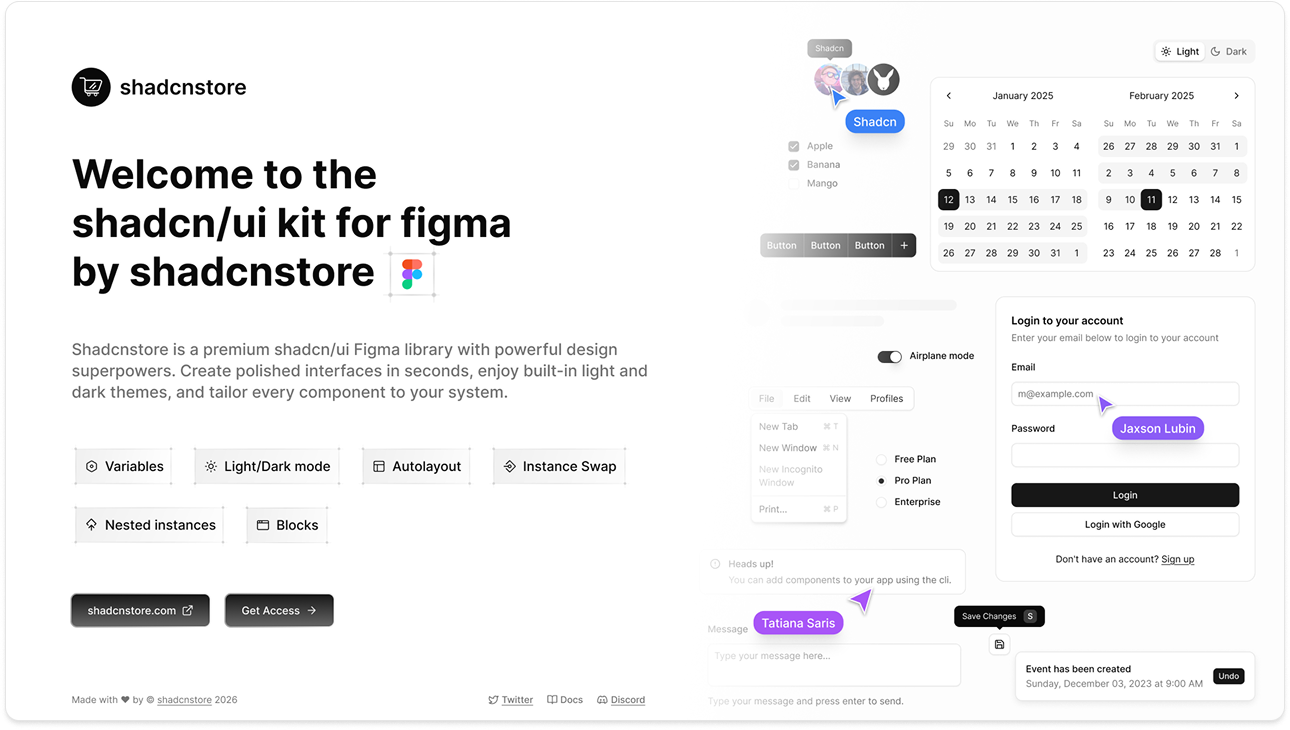
Hey there! We've built a premium shadcn/ui Figma library with Base UI that'll make your design life so much easier. You get beautiful light and dark mode out of the box, plus every component is fully customizable to match your design system. Everything works seamlessly with shadcn/create.
Current Version: March 2026 release, built on shadcn/create and Tailwind v4
Who Can Access This?
The shadcnstore Figma kit is available to:
- Pro Plan users
- Team Plan members
- Enterprise Plan users
Access is tied to your active subscription. No subscription = no access.
If you are planning to upgrade your license, You just need to pay difference. Also if you have access you can get started with the kit right away.
Why You'll Love This Kit
We've obsessed over every detail to make sure your Figma designs actually match what gets built in code. No more "it looked different in the design" moments - everything translates pixel-perfect to real shadcn/ui components.
Whether you're sketching out a quick idea or designing a full app, you'll have everything you need to move fast and ship something beautiful.
Designers and Devs, Finally Speaking the Same Language
Here's the thing - our Figma kit isn't just inspired by shadcn/create based on base UI, it's a 1:1 match. Every button, every spacing value, every interaction mirrors exactly what developers will implement.
What's Inside
Once you open the file, here's what you'll find:
- 500+ UI Components - Every shadcn/ui component, ready to use
- Ready to use blocks - Pre-built sections and layouts for common use cases
- Drag & Drop Builder - Rapid prototyping tool for composing layouts with ready blocks
- Light & Dark Mode - Toggle between themes instantly with Variables
- Responsive Layouts - Mobile, tablet, and desktop variants for everything
- Design Tokens - Colors, typography, spacing - all organized and ready
- Tailwind CSS Alignment - Direct mapping to Tailwind classes and shadcn/ui code
- Well Documented - Detailed documentation on how to use and customize each component
What This Means for You
- Ship Faster: Developers can grab shadcn/ui components that match your designs exactly. No custom building from scratch.
- Better Teamwork: You and your dev team are literally using the same components, so communication just... works.
- Less Back-and-Forth: Bye bye endless revision cycles trying to match the design to the code.
- Real Components: These aren't just pretty rectangles. They're actual, tested patterns that work in production.
Honestly? This setup has saved teams weeks (sometimes months) of that painful design-to-development ping-pong. You design it, they build it, everyone's happy.
Don't Miss the Good Stuff
We're always adding new blocks, templates, pages and improving the kit. Here's how to stay in the loop:
- Updates Page - See what's new (we ship often!)
- Follow on discord - Get updates straight discord and chat with community
- Follow on X - Behind-the-scenes updates and community vibes
Need Help? We've Got You
Getting Started
- Documentation - Everything you need to know, in plain English
- Installation Guide - Get up and running in 5 minutes
License Stuff
- Upgrade Your License - Need Pro, Team, or Enterprise? We'll credit what you already paid
- Licensing Terms - The boring but important legal bits
Stuck on something? Our docs are actually helpful (we promise). Covers everything from "how do I start" to "how do I customize everything."