
Variables in Figma
Variables are one of the most powerful features in the shadcnstore Figma kit. They let you change entire design systems with a single click - switch from light to dark mode, adjust spacing across all components, or swap color schemes instantly.
Think of variables as design tokens that control everything from colors and spacing to responsive behavior. Change one variable, and every component using it updates automatically.
Our Variable Collections
The shadcnstore kit includes 4 main variable collections, each serving a specific purpose:

1. Mode Collection (65 variables)
Controls the light and dark mode switching throughout the design system. This collection defines how colors change when you toggle between themes.
2. Themes Collection (175 variables)
Contains all the semantic color tokens following shadcn/ui conventions. These are the color variables you'll use in your designs (like background, foreground, primary, secondary, etc.).
3. Responsive Collection (6 variables)
Handles responsive design behavior - different spacing, text sizes, and layouts for mobile vs desktop views.
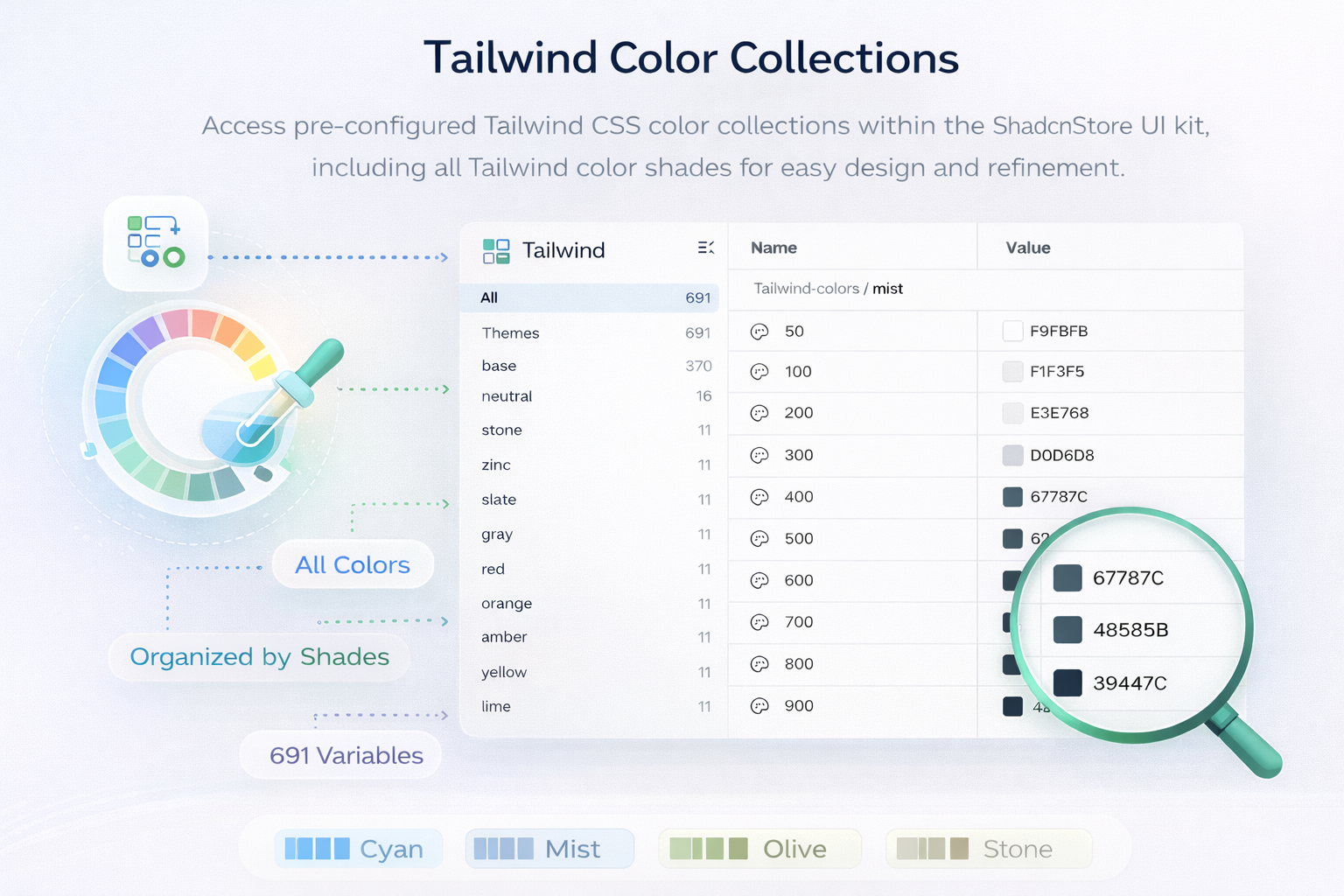
4. Tailwind Collection (691 variables)
A complete set of Tailwind CSS values mapped directly to Figma. Every spacing unit, color shade, and utility value from Tailwind v4 is available here.
Tailwind Collection
This is your complete Tailwind CSS design system in Figma. If you're familiar with Tailwind, you'll feel right at home.
What's Inside
tailwind-colors (246 variables) - Every Tailwind color from the palette: base colors (white, black, transparent), neutral shades (50-950), stone, slate, and all color scales (red, blue, green, etc.) with their full 50-950 range. New in Tailwind CSS v4: includes the extended color palette with taupe, mauve, mist, and olive - each with their complete 50-950 shade range for more nuanced neutral and earthy tones.
New Extended Colors:
- taupe - Warm gray with brown undertones, perfect for sophisticated neutral palettes
- mauve - Soft purple-gray blend, ideal for elegant and muted designs
- mist - Cool gray with blue-green hints, excellent for modern, airy interfaces
- olive - Natural green-gray, great for organic and earthy design themes
typography (49 variables) - Font families, sizes, weights, line heights, and letter spacing values matching Tailwind's typography system.
border-radius (10 variables) - Rounded corner values from none to full, matching Tailwind's radius utilities.
gap (37 variables) - Spacing values for flex and grid gaps, covering all Tailwind spacing scales.
padding (72 variables) - Horizontal and vertical padding values, organized into:
- px (36 variables) - Horizontal padding values
- py (36 variables) - Vertical padding values
margin (72 variables) - Horizontal and vertical margin values, organized into:
- mx (36 variables) - Horizontal margin values
- my (36 variables) - Vertical margin values
width (25 variables) - Width values including percentages, fixed widths, and special values like auto and full.
min-width (14 variables) - Minimum width constraints for responsive layouts.
max-width (15 variables) - Maximum width constraints, including container widths.
height (25 variables) - Height values including percentages, fixed heights, and viewport-based values.
border-width (35 variables) - Border thickness values from hairline to thick borders.
container (13 variables) - Container max-widths for different breakpoints.
breakpoint (5 variables) - Screen size breakpoints (sm, md, lg, xl, 2xl) matching Tailwind's responsive system.
blur (8 variables) - Blur effect values for backdrop filters and blurs.
opacity (21 variables) - Opacity values from 0 to 100 in increments.
Responsive Collection
Handles how your designs adapt between mobile and desktop views.
What's Inside
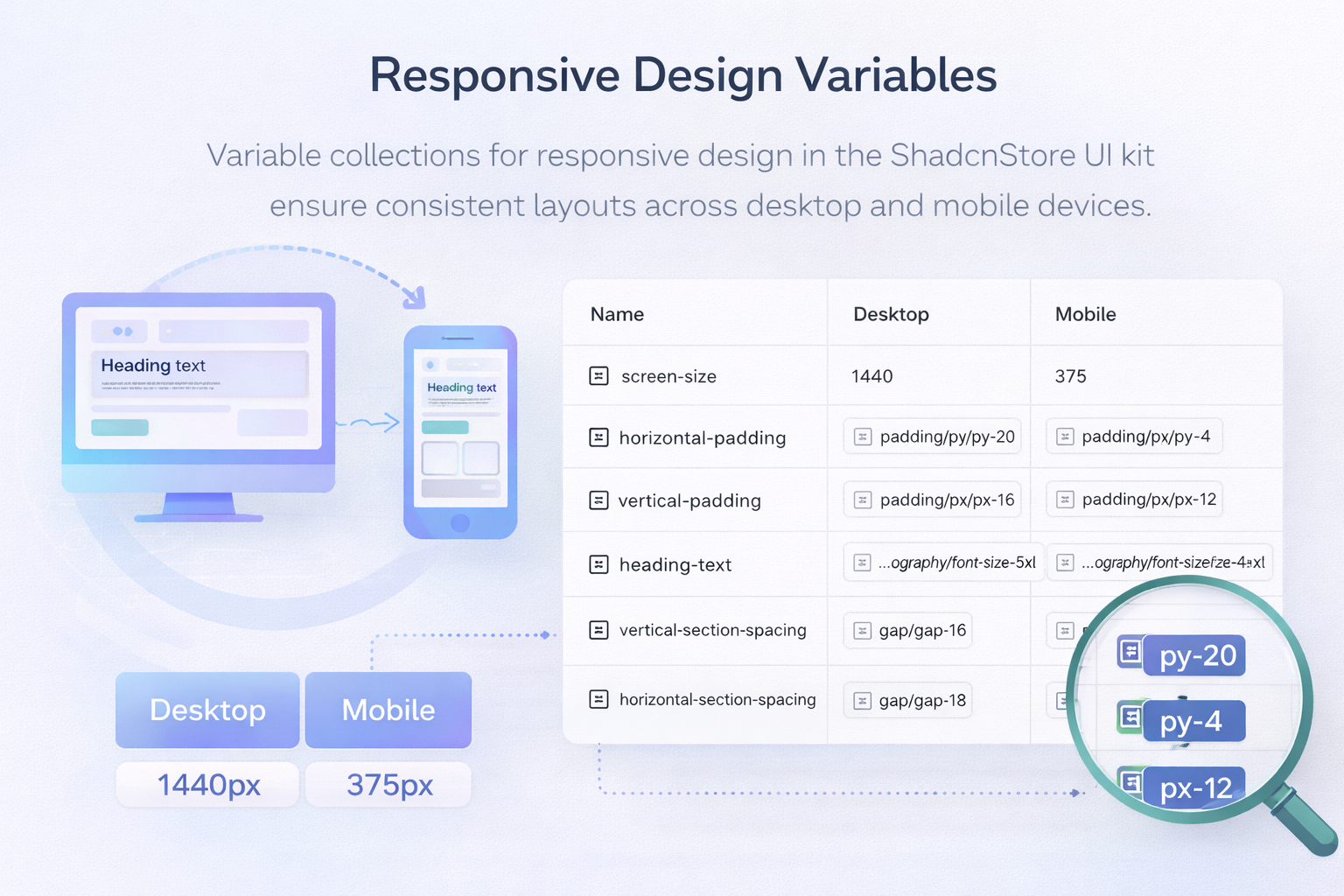
screen-size - Defines the viewport width for desktop (1440px) and mobile (375px) preview modes.
horizontal-padding - Left/right spacing that changes between devices (py-20 for desktop, py-4 for mobile).
vertical-padding - Top/bottom spacing that adapts responsively (px-16 for desktop, px-12 for mobile).
heading-text - Typography sizes for headings that scale down on mobile (text-5xl on desktop, text-4xl on mobile).
vertical-section-spacing - Vertical gaps between sections (gap-16 on desktop, gap-12 on mobile).
horizontal-section-spacing - Horizontal gaps between sections (gap-16 on desktop, gap-8 on mobile).
How to use: When designing, you can toggle between Desktop and Mobile modes to see how your layouts automatically adjust using these responsive variables.
Themes Collection
The semantic color system that powers shadcnstore's components. These follow shadcn/ui's color naming conventions exactly.
What's Inside
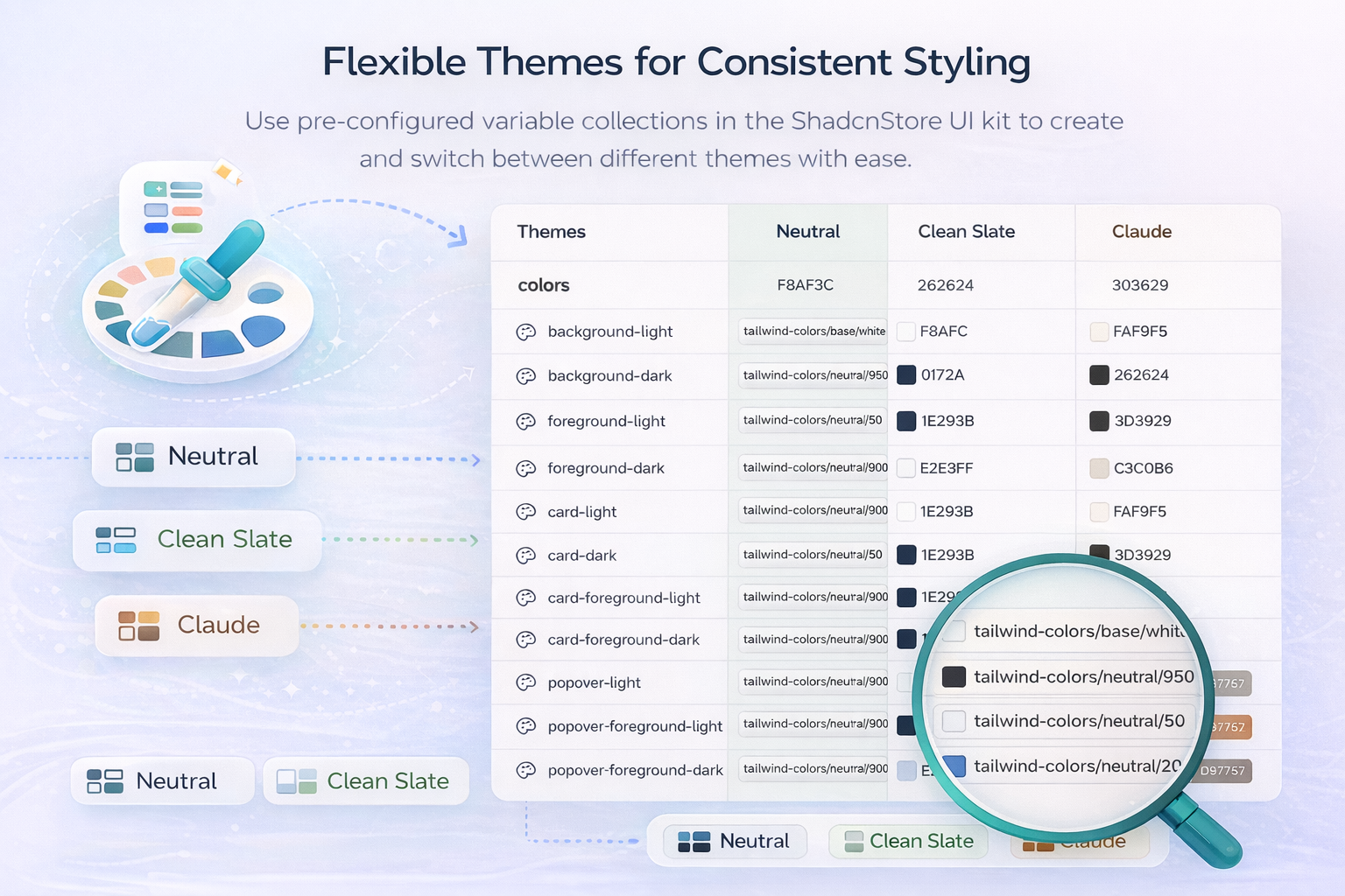
colors (64 variables) - All semantic color tokens organized by their purpose. Each color has both light and dark variants (e.g., background-light, background-dark) for different theme modes. Includes:
- Background and foreground colors for main surfaces and text
- Card colors for card components and their content
- Popover colors for dropdowns and overlay elements
- Primary and secondary brand colors with their foreground pairs
- Muted colors for disabled or less prominent elements
- Accent colors for highlights and interactive states
- Destructive colors for errors and dangerous actions
- Border, input, and ring colors for form elements
- Chart colors (chart-1 through chart-5) for data visualization
font-family (3 variables) - Typography families for different text types across the design system.
radius (8 variables) - Border radius tokens (from small to full roundness) for consistent corner styles across all components.
shadow Options (100 variables)
- shadow (55 variables) - Complete shadow system for elevation and depth effects, organized by intensity levels (sm, md, lg, xl, 2xl, etc.)
- inset-shadow (15 variables) - Inner shadows for pressed states and recessed effects
- drop-shadow (30 variables) - Outer shadows for elevating components above surfaces at various levels
Multiple Theme Support: The collection includes both Neutral and Corporate theme variations, letting you quickly switch between different brand styles.
Mode Collection
Controls the light/dark mode switching for the entire design system.
What's Inside
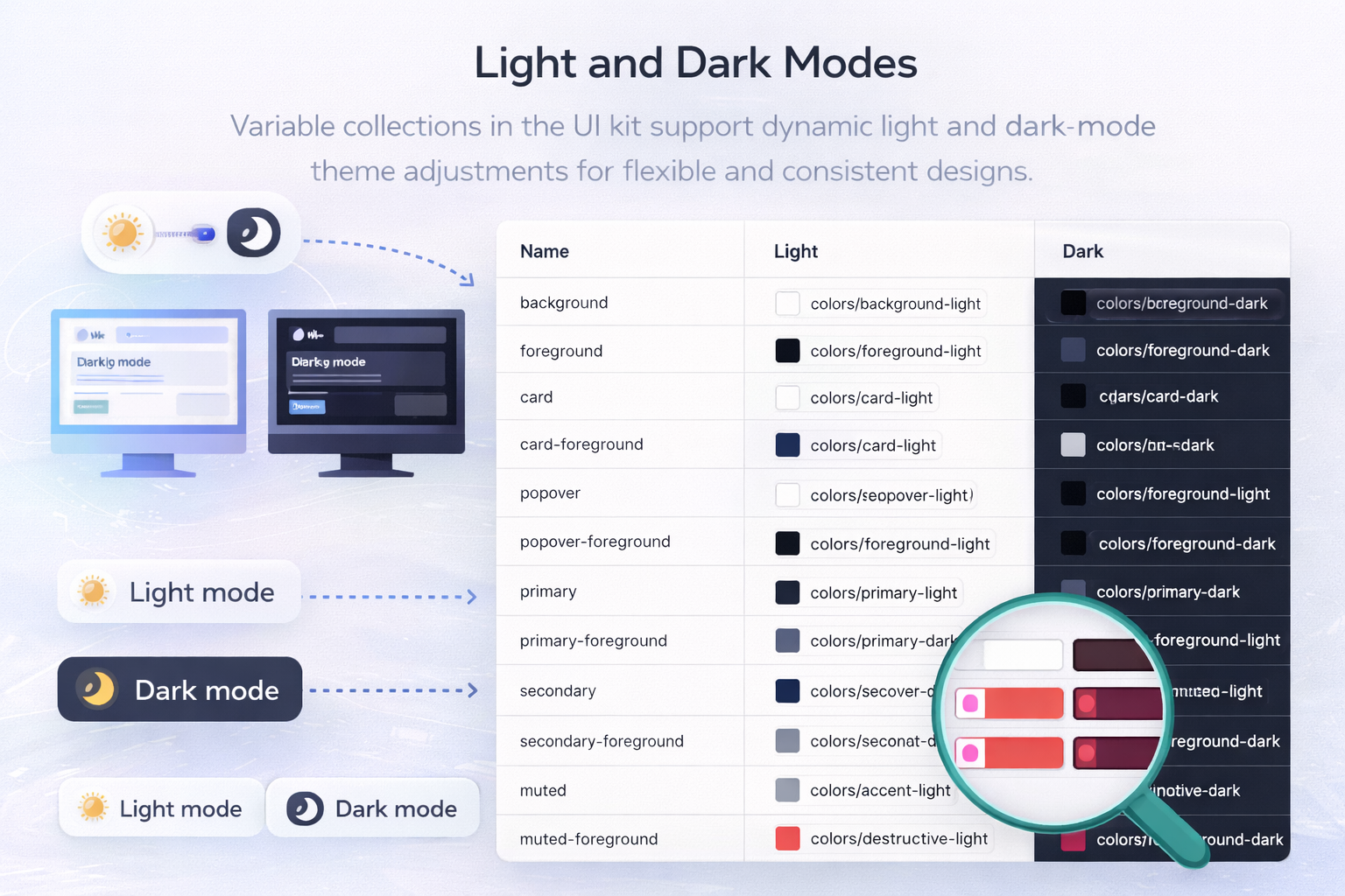
colors (32 variables) - Mode-specific color mappings that automatically change based on light or dark mode. Each variable references the appropriate light or dark variant from the Themes collection. For example:
backgroundmaps tocolors/background-lightin Light mode, orcolors/background-darkin Dark modeprimarymaps tocolors/primary-lightorcolors/primary-darkdepending on the selected modecard,popover,muted,accent,destructiveand their foreground pairs all follow the same pattern- Border, input, and ring colors that adapt to each mode
- Chart colors for data visualization that work in both themes
radius (8 variables) - Border radius values that remain consistent across both light and dark modes.
How it works: When you toggle between Light and Dark modes in Figma, the Mode collection automatically swaps all color references. Components don't need manual updates - they just work.
How to Use Variables
Switching Modes
- Select any frame or component
- In the right sidebar, find the "Applied variables" section
- Click the mode dropdown (usually shows "Light" or "Dark")
- Select the mode you want to preview
- Everything updates instantly
Applying Variables
When customizing components:
- Select the element you want to style
- In the design panel, look for properties with a purple variable icon (⚙️)
- Click the icon to see which variable is applied
- Change it to a different variable if needed
- Or click "Detach variable" to use a fixed value instead
Creating Custom Themes
You can create your own theme variations:
- Open the Themes collection
- Click the "+" next to mode names
- Add a new mode (e.g., "Brand A", "Brand B")
- Customize the color values for your new theme
- Switch between themes using the mode dropdown
Why Variables Matter
Design Faster - Change your entire color scheme in seconds, not hours.
Stay Consistent - Use semantic names like primary instead of remembering hex codes.
Responsive by Default - Components automatically adapt to mobile/desktop using responsive variables.
Match Your Code - Variables map directly to Tailwind CSS classes and shadcn/ui tokens.
Theme Switching - Toggle light/dark mode to see how designs look instantly.
Tips for Beginners
Start with Mode variables - These control light/dark switching and are used most often.
Use Theme colors, not Tailwind colors - When styling components, use semantic colors from the Themes collection (like primary, background) rather than Tailwind colors (like blue-500). This ensures your components work correctly in both light and dark modes.
Don't detach variables unless necessary - Keeping variables attached means your components update automatically when the design system changes.
Explore by hovering - Hover over any variable to see its current value and what it references.
Use Figma's variable search - Press / in the variable panel to quickly find variables by name.
Learn More
New to Figma Variables? Check out these resources:
- Figma's Guide to Variables - Official documentation
- Variables for Beginners - Video tutorial from Figma
Pro tip: Understanding variables is key to unlocking the full power of the shadcnstore kit. Spend 15 minutes exploring each collection, and you'll be designing like a pro.