
Getting Started
Accessing Your Figma Design File
Once you've purchased a plan that includes Figma design file, here's how to get started:
Step 1: Log In to Your User Dashboard
- Sign in to your shadcnstore account
- Navigate to the Purchases section in your dashboard
- You'll see a "Figma Design File" card with your Figma access
Step 2: Open and Duplicate Your File
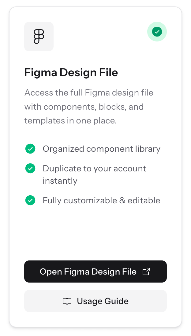
Click the Figma button to open the full design file, if you are logged into your Figma account, it will duplicate the file into your workspace else you will be prompted to log in.
Important: To access and customize the Figma file, you must be logged in to Figma.
If you're not already logged in:
- Make sure you're logged in to your Figma account (create one if needed - it's free)
- Click the Figma access button from your purchases page
- Click the button to copy the file to your Figma workspace
- You can now start designing with your own personal copy
Using shadcnstore as a Figma Library
Here's the thing - you can (and should) set up the shadcnstore kit as a shared library. This means your whole team can access the same components, and any updates you make. Pretty neat.
Want to learn more about how Figma libraries work in general? Check out Figma's official library docs.
Step 1: Publish Your Library
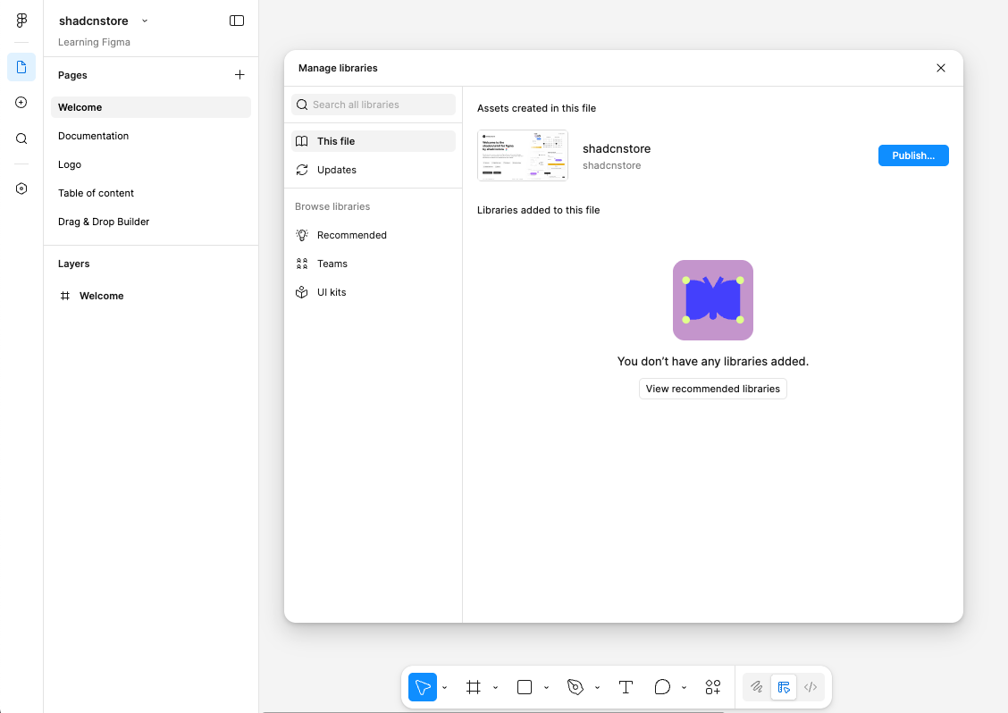
First, turn your shadcnstore file into a library:
- Open your shadcnstore Figma file
- Click on the Assets panel (book icon) in the top toolbar
- Navigate to the Team Library modal
- Hit 'Publish' to make it available as a library
Heads up: Publishing a big library like this takes time - anywhere from 5 to 30 minutes on the first go. That's normal. Don't close Figma while it's doing its thing.
Step 2: Enable the Library in Your Projects
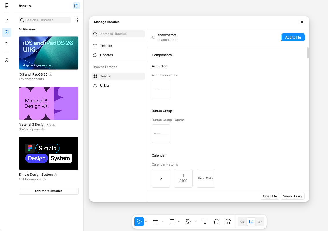
Now you can use it in any of your Figma projects:
- Open the project where you want to use shadcnstore components
- Find the Assets panel in your left sidebar
- Click the plus icon to open it
- Look for shadcnstore in the Team Library section
- Toggle the switch to 'ON'
That's it. All the components are now available in this project.
Step 3: Start Using Components
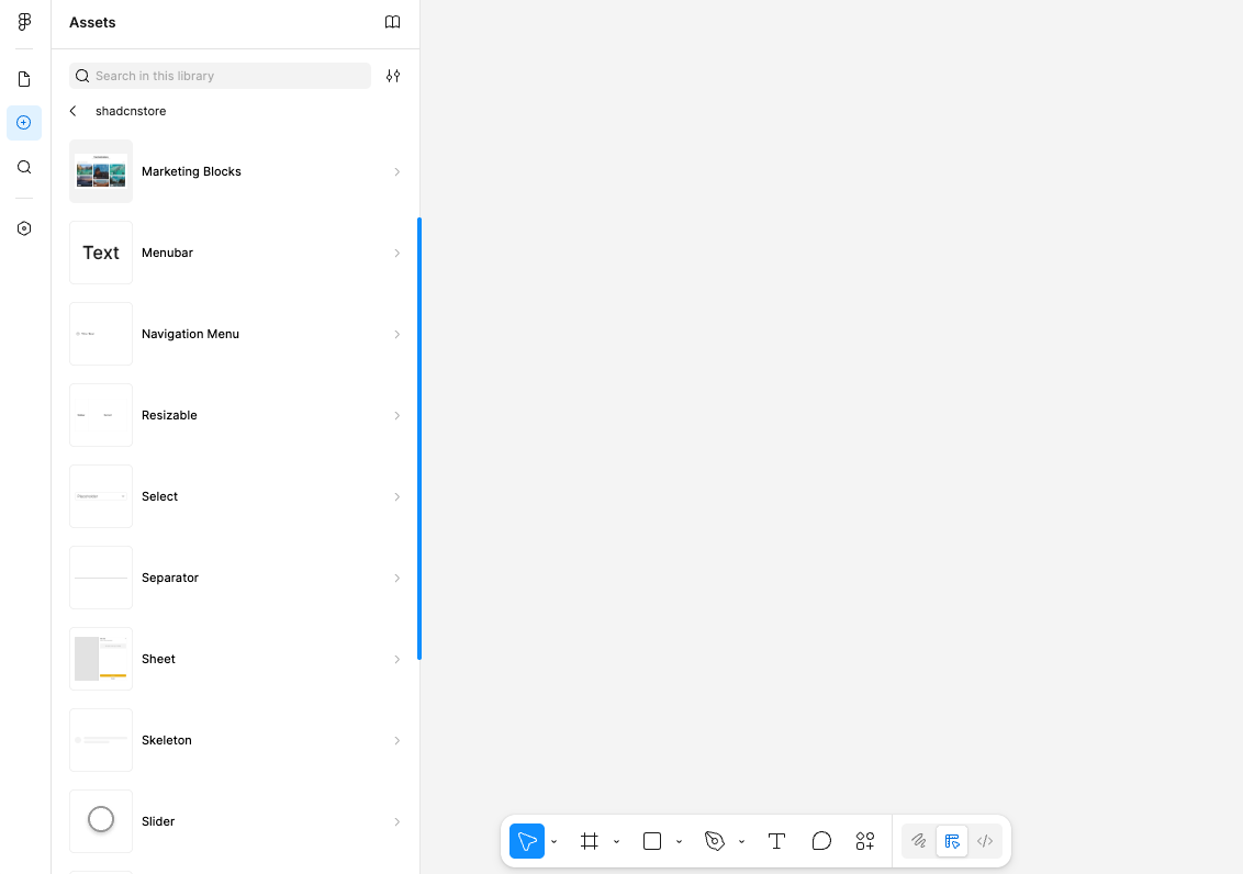
With the library enabled, you'll see all shadcnstore components in your Assets panel. Just drag and drop them into your designs, or browse through to find what you need.
Why Use It as a Library?
- Stay Consistent: Same components across all projects means no design drift
- Work Faster: Stop rebuilding the same button 50 different ways
- Team Collaboration: Everyone uses the same source of truth
- Safe Customization: Override components in individual projects without breaking the main library
Understanding Figma Concepts
New to Figma? No worries. Here's what you need to know about how shadcnstore is built.
Styles
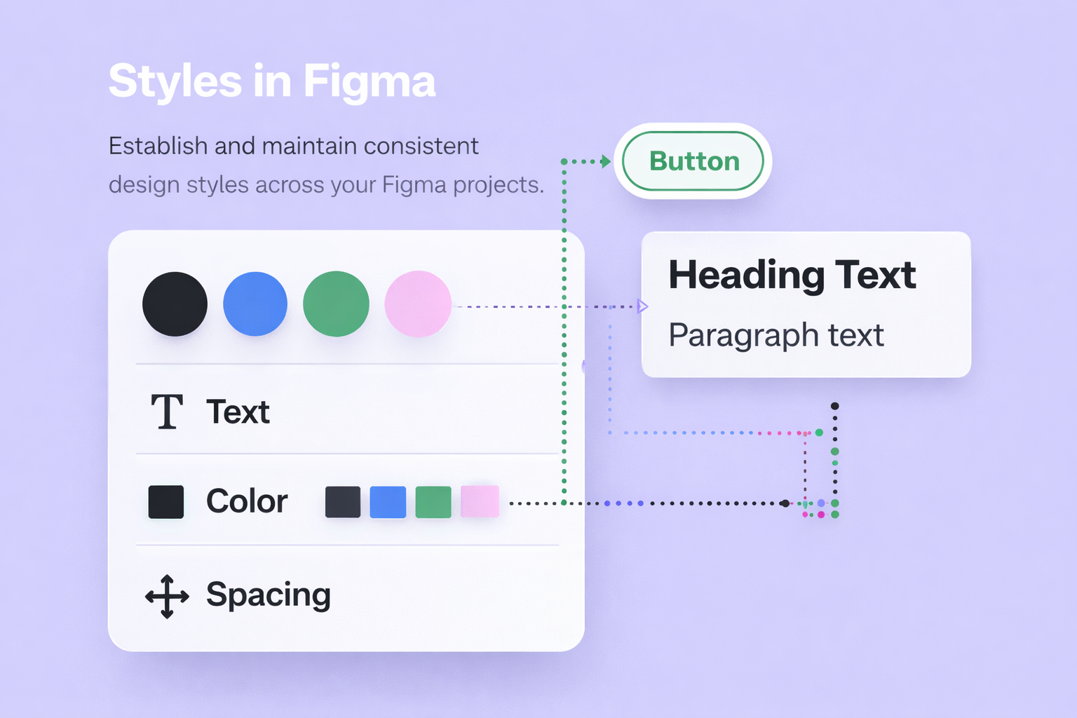
Text styles, color styles, effect styles - they're all set up and ready to use. This keeps your typography and colors consistent without manually checking values every time.
Read more about Figma Styles.
Variables
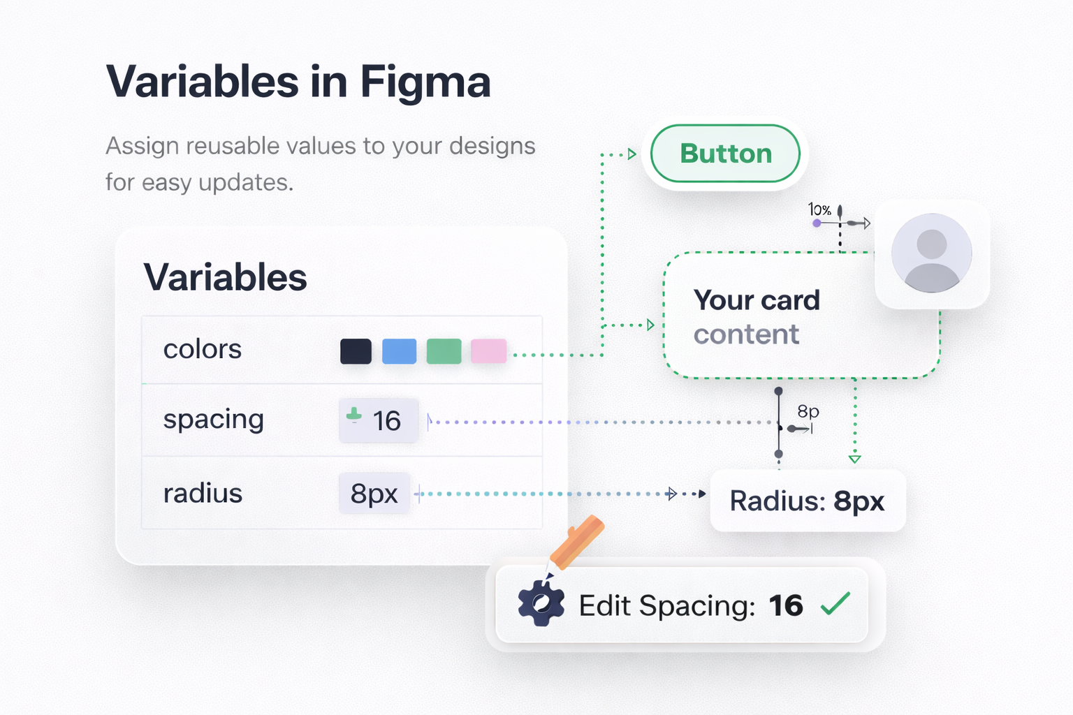
Shadcnstore uses Figma Variables extensively for colors, spacing, and other design tokens. This is what powers the light/dark mode switching and makes theming possible.
Variables are super powerful - they let you change entire color schemes with a single toggle. Learn more about Figma Variables.
Components
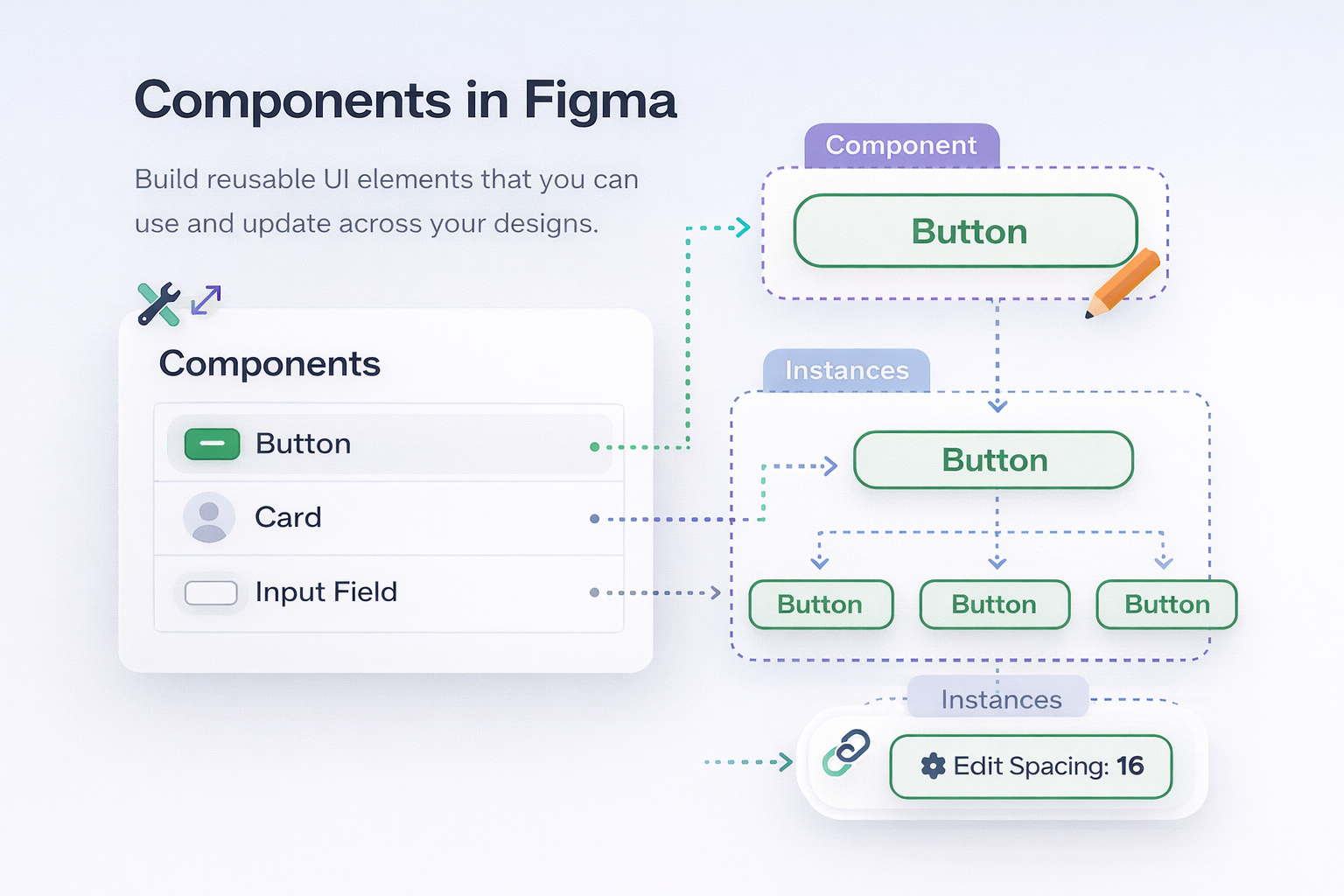
Shadcnstore is built entirely with Figma Components - reusable elements that stay in sync across your designs.
Learn more about Figma Components.
Variants
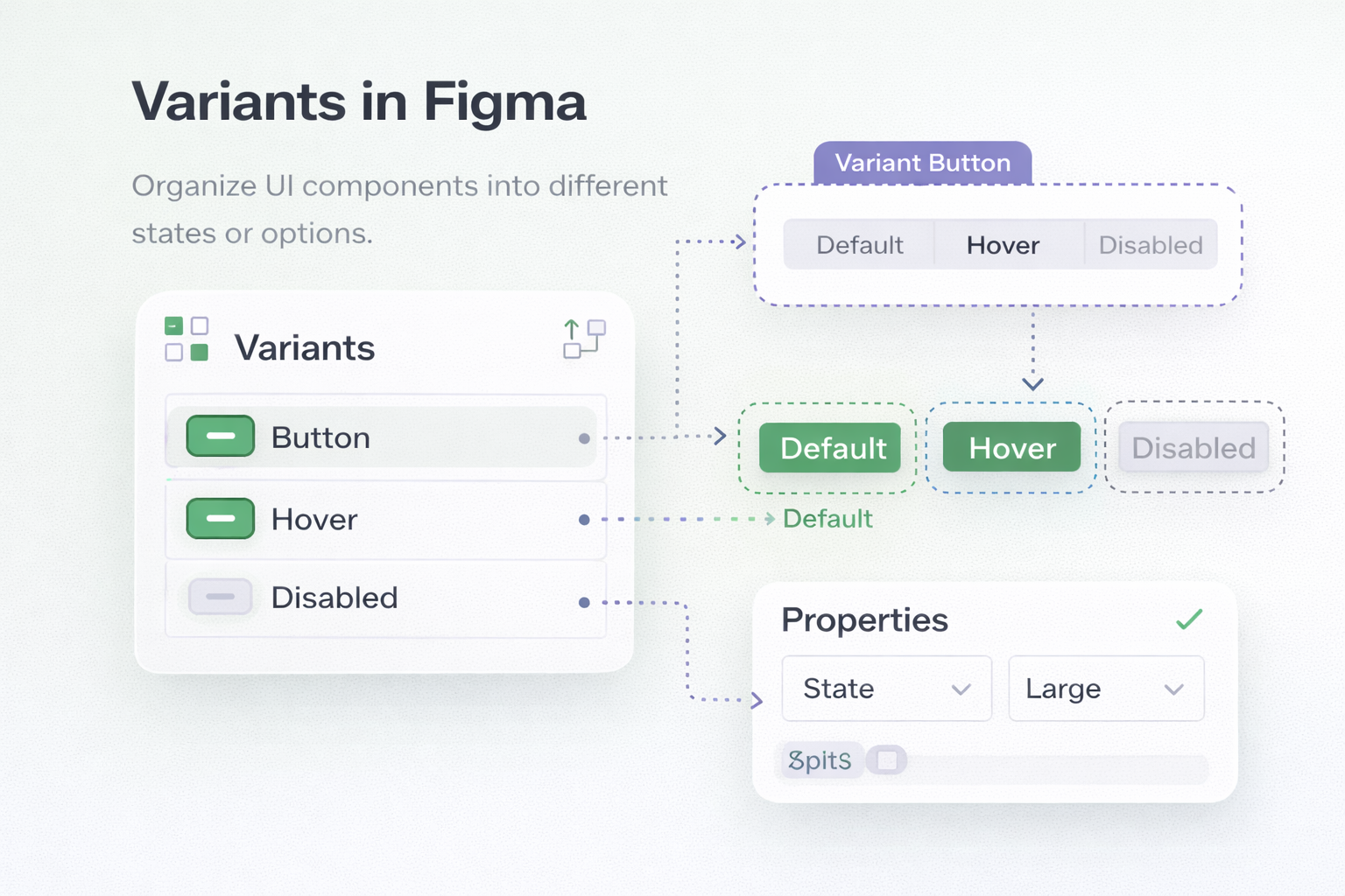
We use Variants to group related components together. Instead of having 20 different button components, we have one Button component with variants for size, style, and state. Makes finding things way easier.
More on Figma Variants.
Auto Layout
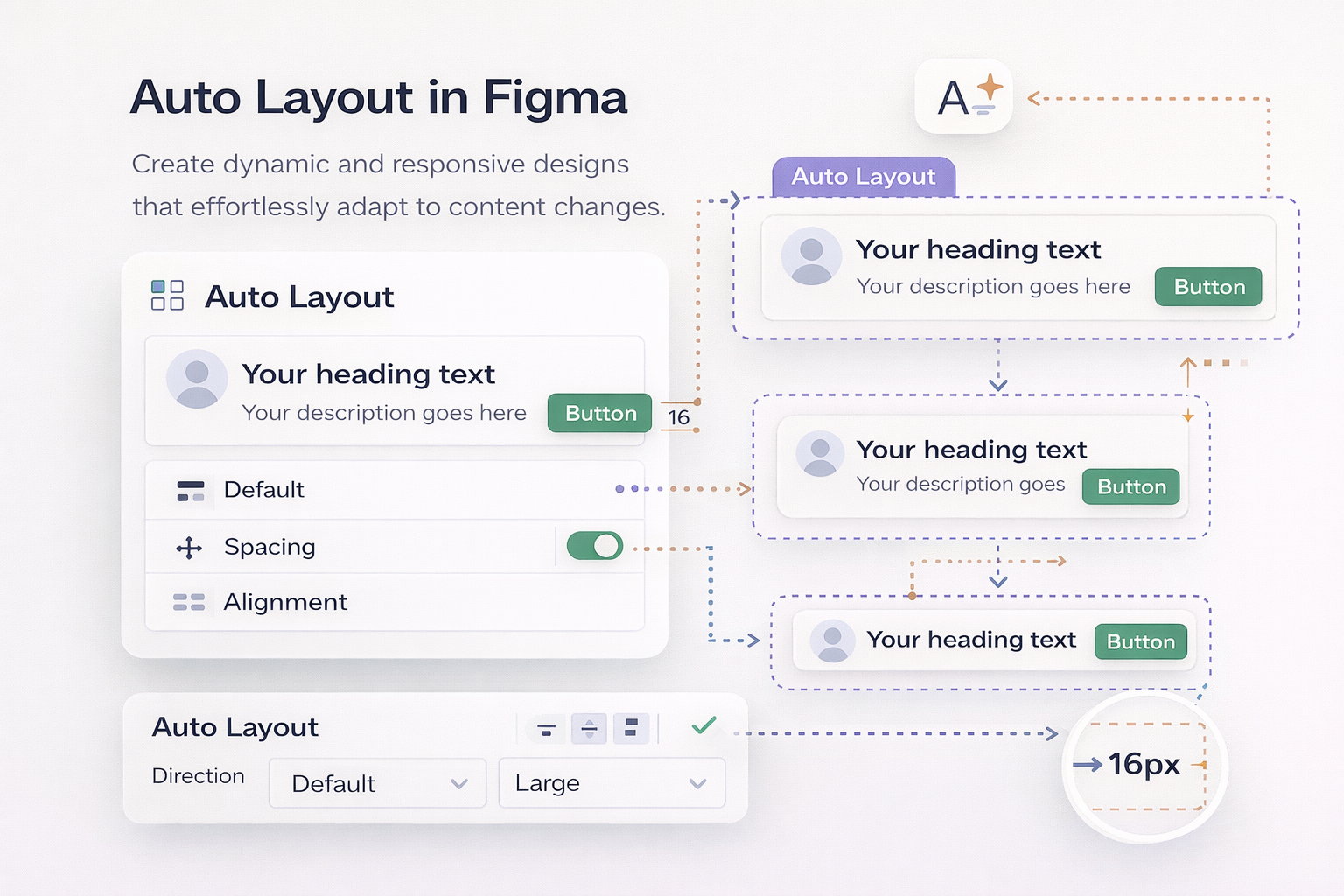
Every shadcnstore component uses Auto Layout, which means they automatically resize and reflow just like real HTML. Add content, and the component grows. Remove it, and it shrinks. This makes prototypes feel way more realistic.
Learn about Auto Layout.
Updates in Figma
Ready to learn how updates work? Check out our dedicated Figma Updates Guide for everything you need to know about keeping your kit current.
New to Figma?
If you're just getting started with Figma itself, we recommend:
Take an hour to go through these, and you'll be up to speed.
Quick Tips
Using a Component
- Find what you need in the Assets panel
- Drag it into your design
- Customize it (change text, colors, size)
- Check the component notes for Tailwind class mappings
Working with Multiple Projects
Set up the library once, use it everywhere. Any project where you enable the shadcnstore library gets instant access to all components.
Need Help?
Stuck on something? Here's where to go:
- Full Documentation - Detailed guides and examples
- Component Reference - Documentation for each component
- Support - Email us if you're stuck
Troubleshooting
"I can't access the Figma file"
- Verify your subscription is active (check the Purchased section of your dashboard)
- Make sure you're logged into Figma before clicking the file link
- If you don't have a Figma account, create one (it's free) or upgrade to a paid plan for team features
- After duplicating the file, it may take a moment to appear in your Figma drafts
- Just upgraded your plan? Try logging out of shadcnstore and back in to refresh your dashboard
- Still stuck? Email [email protected]
"Components won't update when I edit them"
- Make sure you're using library components, not local copies
- Right-click the component → Reset changes to revert to library version
- Check if you have manual overrides applied
"The library isn't showing up in my project"
- Open the Assets panel and check if shadcnstore is toggled ON
- You might need to enable it in the Team Library modal first
- Publishing still in progress? Wait for it to finish
Next Steps
Ready to start designing?
- Try the Drag & Drop Builder - Rapidly compose layouts without code
- Browse the components in your Assets panel
- Explore Theming to customize colors and styles
- Check out Component Reference for detailed component documentation
- Join our community on X to see what others are building